Parsware Platform
A landing page
A public page drawn in the Studio: a hero with a picture under the accent colour, a band of three cards that wraps on a narrower screen, a pricing band whose cards line up, and a top bar drawn once and placed on every page. We opened the landing page sample in the designer and looked at how each part is made to work at every width.
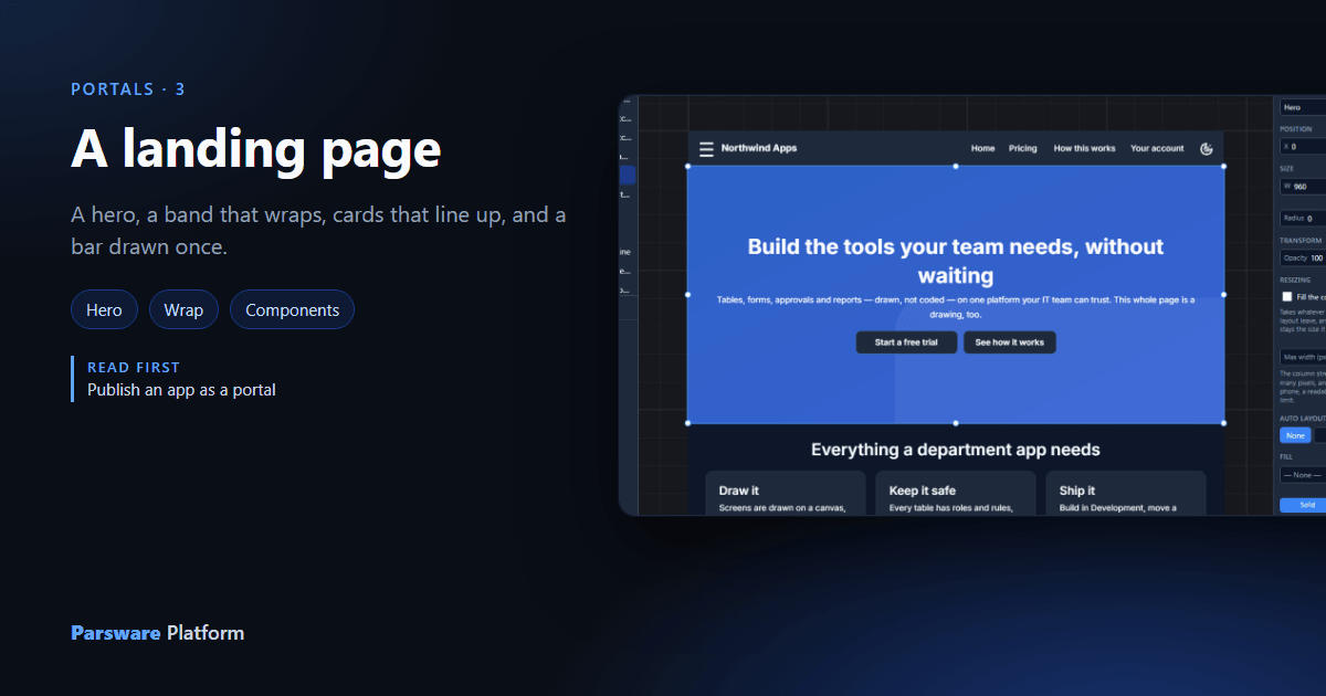
Publishing decides where a page answers. This article is about the page: a product's landing page and pricing page, drawn in the Studio, the shape of parsware.com's own. It's the Portal landing page sample again, opened in the designer (Studio apps → Northwind Apps → Design).
Four techniques carry the whole page, and each one is a setting rather than code.
A hero: a picture under a colour
The hero is one frame holding three layers:
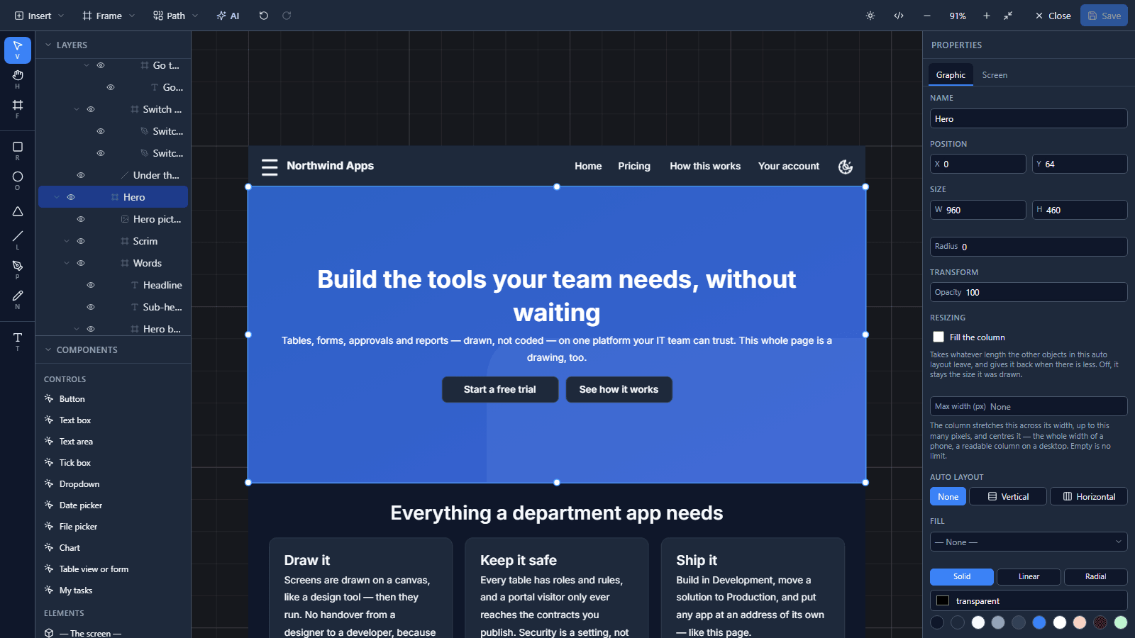
- Hero picture, an image filling the frame.
- Scrim, a frame filled with the accent colour at 55% opacity, so the words read on any picture and the page stays in the brand's colour.
- Words, a vertical auto layout, centred: the headline, one sentence and two buttons. One for the people ready to start, one for the people who aren't yet.
All three are pinned to all four edges, so they stretch with the frame:
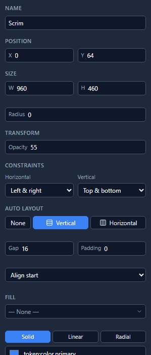
The fill is token:color.primary, not a hex value, so the page follows the portal's theme in light
and dark.
A band of three that wraps
Under the hero sits a band of three feature cards:
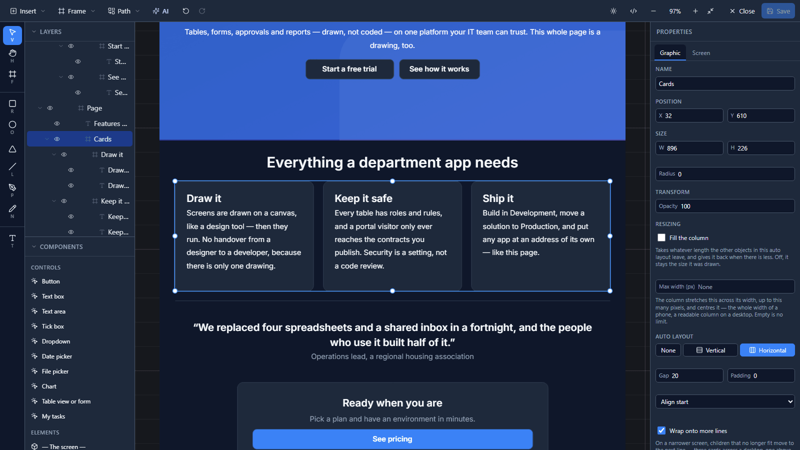
It's one horizontal row with Wrap onto more lines ticked under Auto layout:
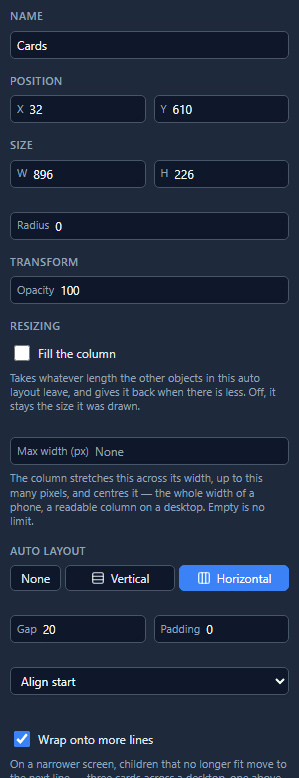
Each card starts at its drawn width and fills what's left. Three fit across a desktop. On a tablet the third card moves to a line of its own and fills it; on a phone each card takes a line:
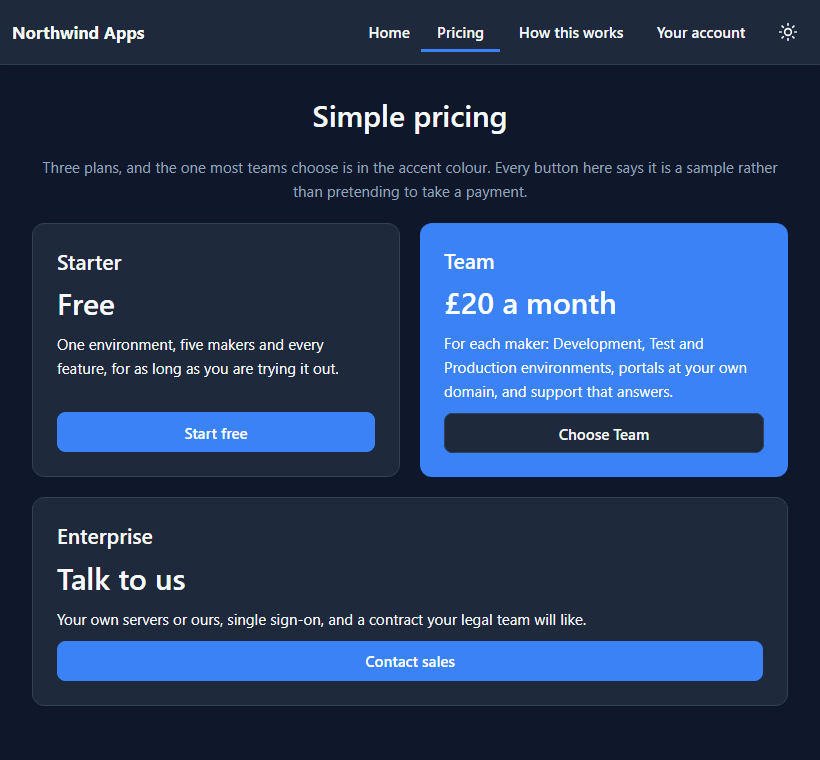
There's one drawing of the band, not a row for desktops and a column for phones, so the words live in one place.
Cards that line up
The pricing page uses the same band, with two more settings:
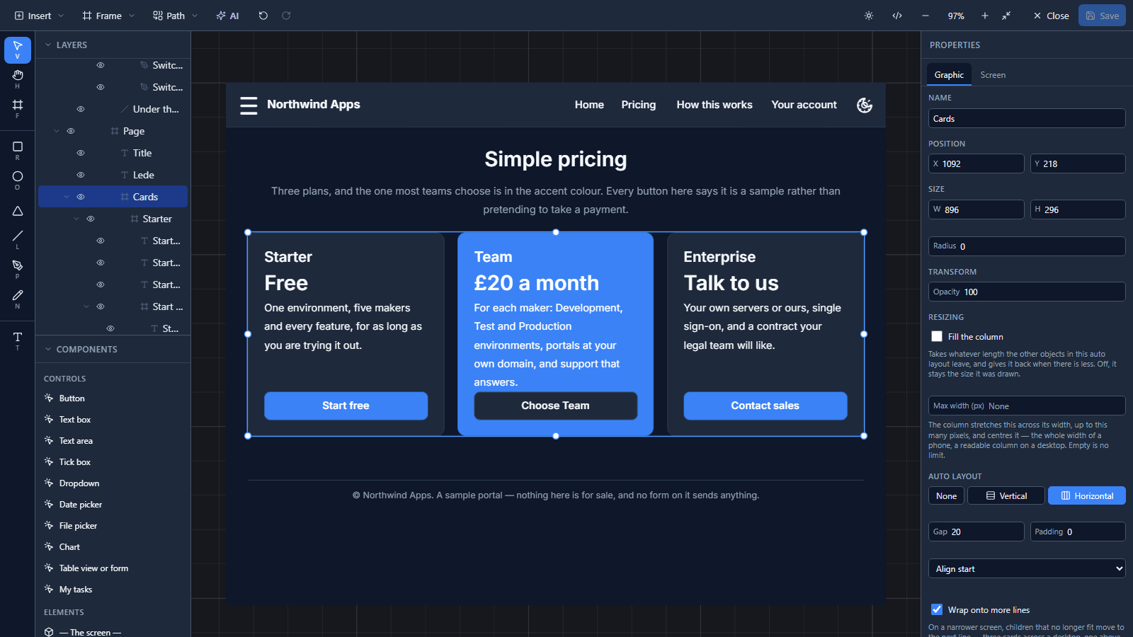
- Every card in a line stretches to the tallest one in it, so three plans read as one band.
- Each plan's sentence fills its card (Fill the column on the Graphic tab), which pushes the buttons to the cards' feet, in a line, whatever each sentence's length.
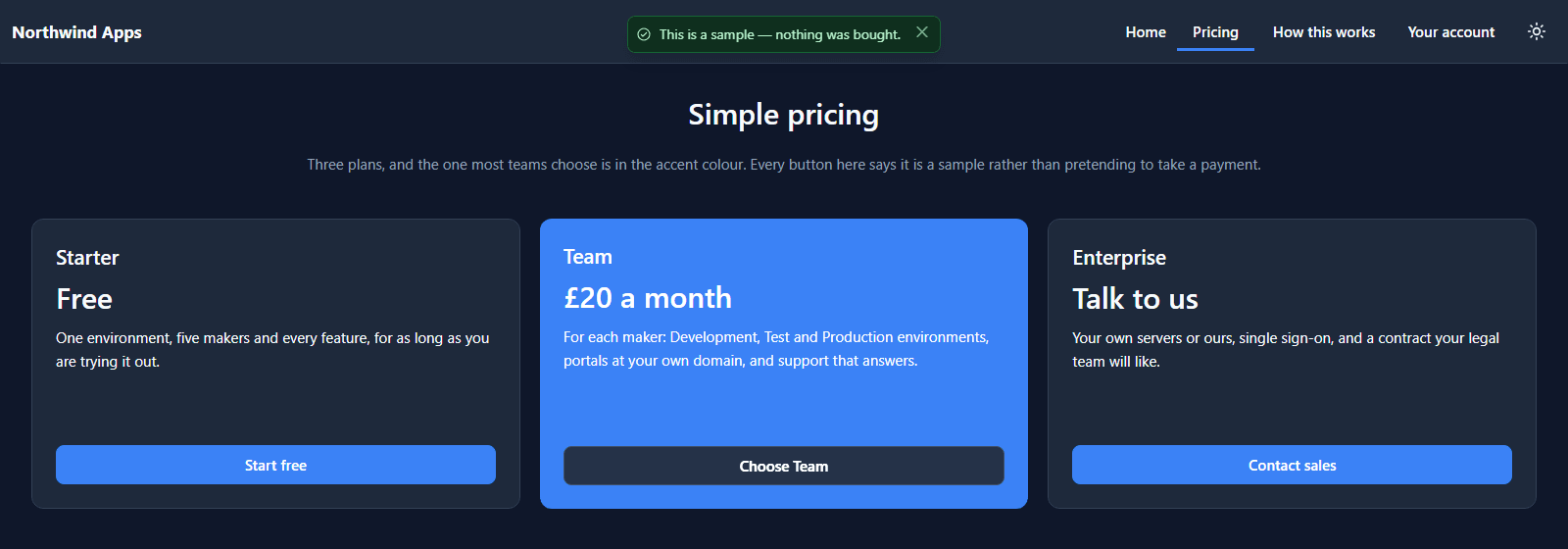
The featured plan is the same card with the accent fill and light words. No separate component. Live, a plan's button says it's a sample instead of pretending to take a payment:
A bar drawn once
The top bar, the phone menu and the footer are components. Their masters sit on a shelf under the screens, and every page places an instance:
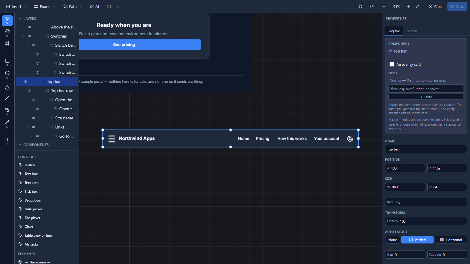
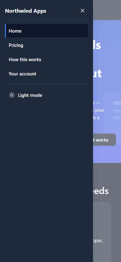
Change the master and every page follows. The bar underlines the page you're on, ends with a light/dark switch, and below 720 pixels shows a menu button that opens the pages in a drawer:
Pages and navigation goes into how a bar knows which page you're on.
What we fixed
- The hero showed only its picture in the designer. The headline, sentence and buttons were there, and selectable, but drawn behind the picture, while the published page showed them correctly. A picture loads a moment after the rest of the drawing, and when the drawing was handed to the designer twice in that moment, the first copy of the picture landed on top of everything and stayed there. Only the latest load of a picture now reaches the canvas.
- The featured plan had an empty line in it. "£20 / maker / month" wrapped at the card's drawn width, and a text box's drawn height is its minimum, so on a wide card the price kept a blank second line that the other plans didn't have. The price now reads "£20 a month", with "for each maker" in the sentence.
- The app's description still said each band was drawn twice. It now says what it is.
Try it
Publish the sample as in the last article, open Pricing, and make the window narrower: the third card moves to its own line, then each card takes one. Then open Studio apps → Northwind Apps → Design and select Cards under Page to see the one tick that does it.
Next: Pages and navigation.