Parsware Platform
Charts in a report
A bar chart of the claimed total by status, added to Claims by status: Insert → Bar chart puts a chart frame on the page, two expressions on the Code page give it values and labels, and the engine draws it, the same in the preview and on the printed sheet.
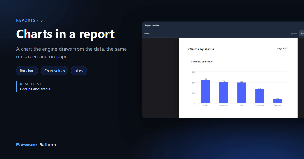
Claims by status already has a table of the claims grouped by status (article 139). This article puts the same numbers in a bar chart, under the table, and follows it onto paper.
1. Insert a chart
With the report page in view, open Insert. Under Charts a report offers two kinds, Bar chart and Line chart:
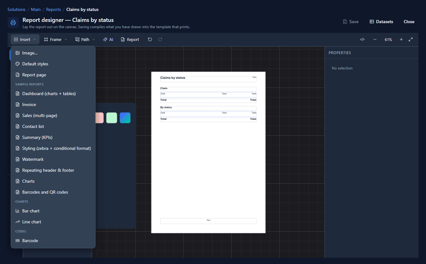
Bar chart puts a chart frame on the page, under the middle of the view, with a title text in its corner:
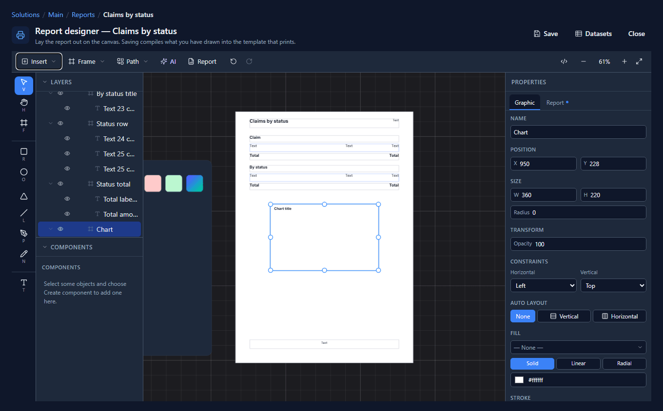
The frame is empty on purpose. A report chart is drawn by the report engine from the data each time the report runs: the scale, the tick marks and the labels are worked out from whatever the numbers are, rather than being shapes somebody arranged once. We moved it under the table, made it the width of the page (499 by 240) and changed its title to Claimed, by status.
2. What kind, and what colour
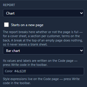
On the Report tab the frame is a Chart. The picker under it switches between bar and line, and Color sets the bars:
3. Values and labels
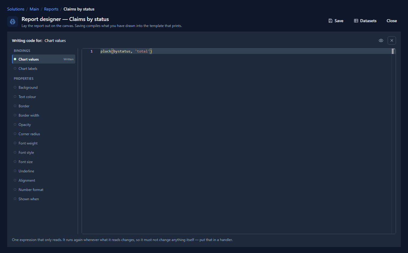
Press Write code with the chart selected. Its Code page has two bindings, Chart values and
Chart labels. A chart wants a list of numbers and a list of names, and pluck gives a list of
one column from a dataset:
- Chart values:
pluck(bystatus, 'total')
- Chart labels:
pluck(bystatus, 'par_status')
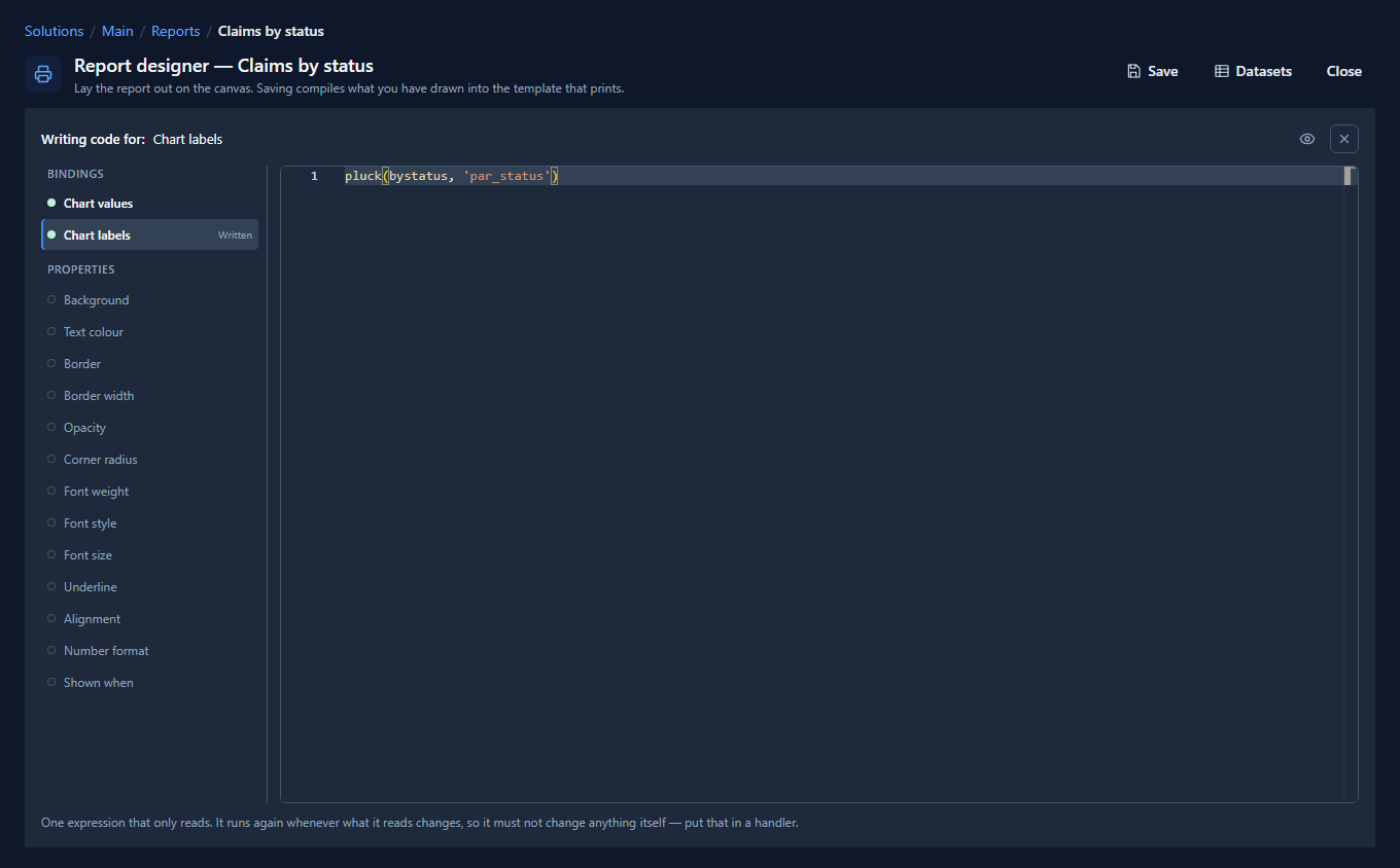
Both come out of the same dataset, bystatus, so the fifth label is always beside the fifth bar.
Taking them from two different datasets is how a chart ends up with the right bars under the wrong
names.
4. The preview
Press Report. The by-status table ended near the foot of page 2, so the chart doesn't fit under it and starts page 3, with the page header above it:

A chart moves to the next sheet when it doesn't fit, the same as any other block. To keep it at the top of a sheet whatever comes before it, tick Starts on a new page on its Report tab.
5. On paper
Print / PDF in the preview opens the pages for the browser's print dialog. The third sheet, as it prints:
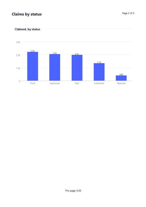
It is the same chart as on screen, drawn from the same definition, and it prints as lines and shapes rather than as a picture of the screen, so it is sharp at any size. The footer's This page: 0.00 is the page total from article 139: no claim rows landed on this sheet.
What we fixed
Building this turned up problems, now fixed:
- Insert → Bar chart on a report gave a drawing, not a chart. It dropped the picture of a chart that a Studio screen gets: rectangles labelled Q1 to Q6 that never read a row, placed outside the report page so it printed nothing. Tagged as a chart afterwards, the rectangles printed on top of the real one. On a report, Insert now offers the two kinds the engine prints, and either gives a chart frame inside the page.
- The chart's Report tab said the same hint twice, and named a button, Code, that is called Write code. It now says the values and labels are on the Code page, once.
Try it
Insert → Charts in any report designer drops a finished page with a bar chart, a line chart and
a table reading the same dataset under them. Open its Code page to see the pluck behind each
chart.
Next: barcodes and QR codes.