Parsware Platform
Run a Studio app on its own
Contact list opened from the Shell's app list, with nothing around it: every screen at its own address, a top bar that says who's signed in and signs them out, and the platform's own bar switched off so the drawing fills the window.
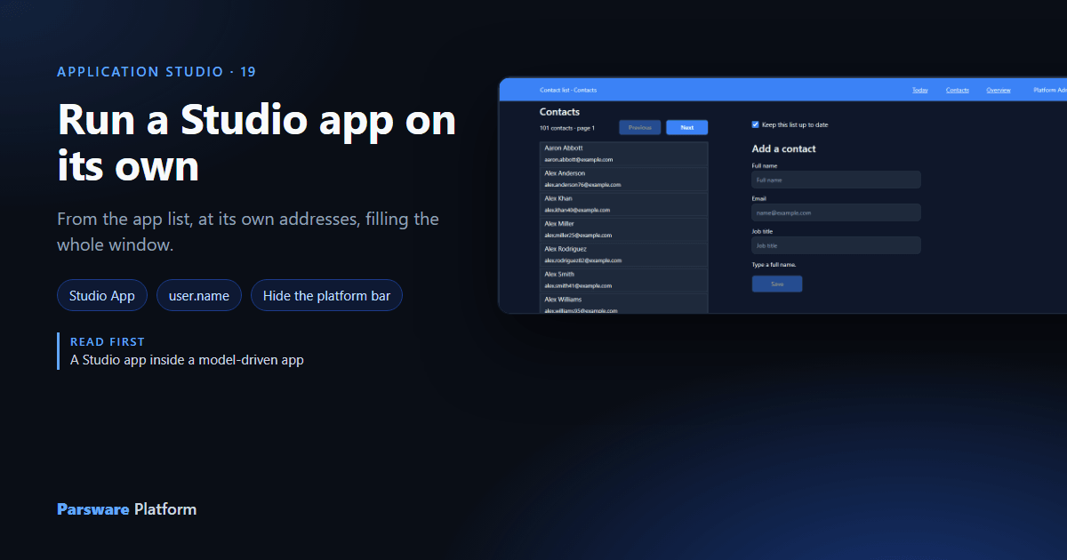
Last time Contact list went inside a model-driven app, beside the Contact table. This time it goes the other way: on its own, with nothing around it, the way a kiosk, a single-purpose tool or the front of a portal would want it.
1. It's already in the app list
A Studio app doesn't need a model-driven app to be reachable. In the Shell's app list, Contact list has a tile of its own, marked Studio App:
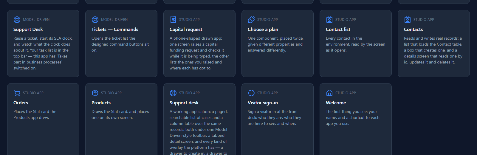
Press it, and the app opens on its start screen, the one named in Opens at in the designer: Today.
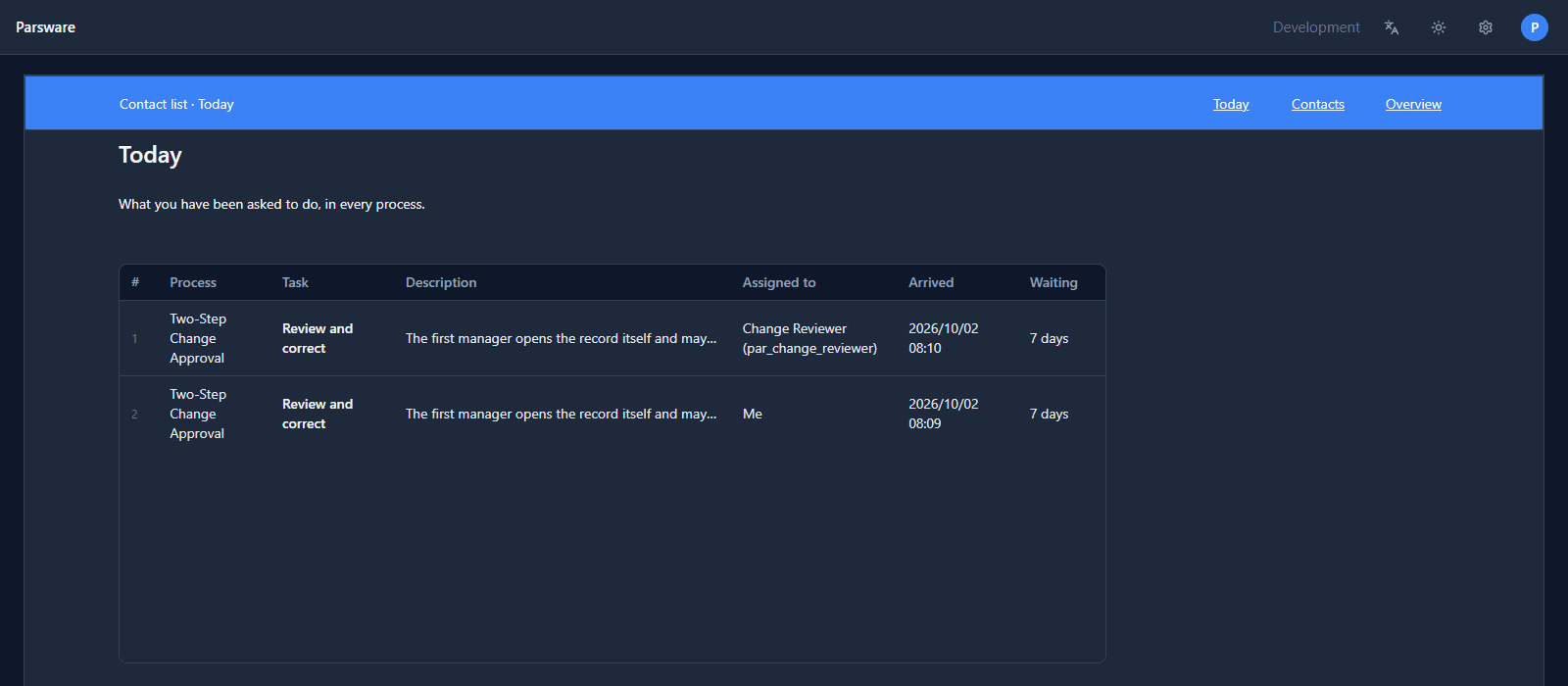
There's no rail and no site map. The app's own top bar, the shared component, is how you move around it.
2. Every screen has an address
Press Contacts and the address becomes /apps/new_contactlist/Contacts. Press a contact and it
becomes /apps/new_contactlist/Contact. That makes the browser part of the app:
- Back returns to the screen before, rather than leaving the app.
- Reload comes back to the screen you were on.
- A link you copy opens that screen for whoever you send it to.
What an address can't carry is a value handed from one screen to the next. Contacts opens
Contact with navigate("Contact", { id: row.id }), and that id travels in the moment. Reload
the Contact screen, and it opens with nothing to show:
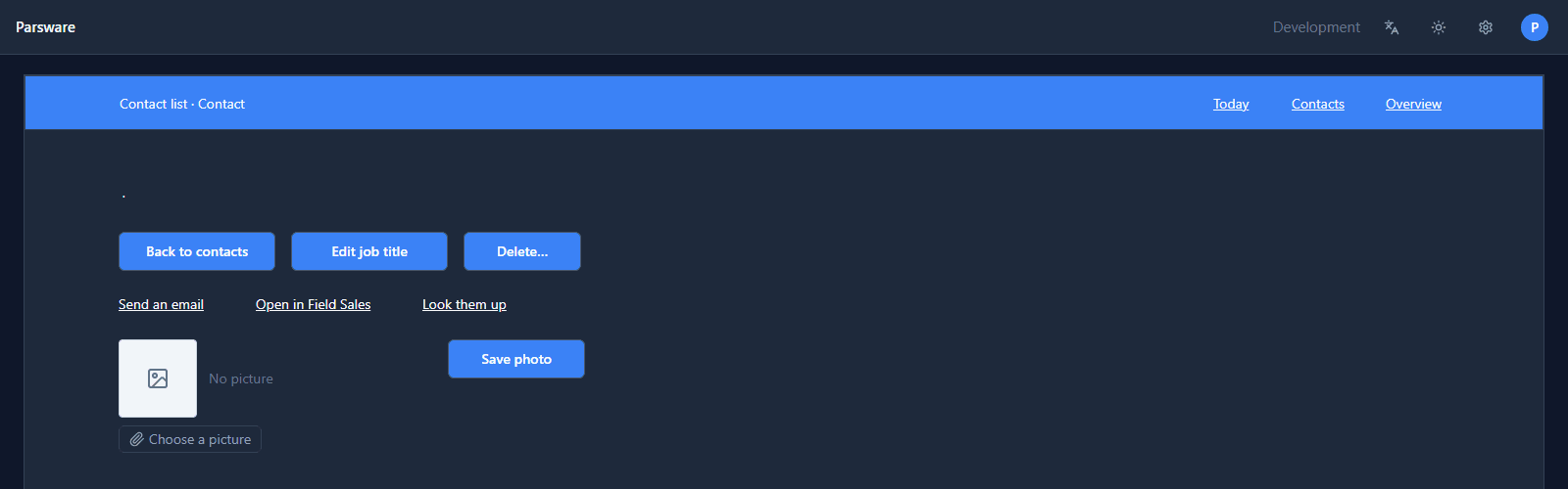
That's expected. A screen that has to be reachable by what it shows is a portal page with a designed address, which comes later in the series.
3. Draw what the platform's bar was doing
Above the drawn bar sits the platform's own: the environment, language, theme and the user menu. An app can ask for that bar to go, and then the drawing fills the window. But that bar is the only way to sign out, so the drawing has to do it first.
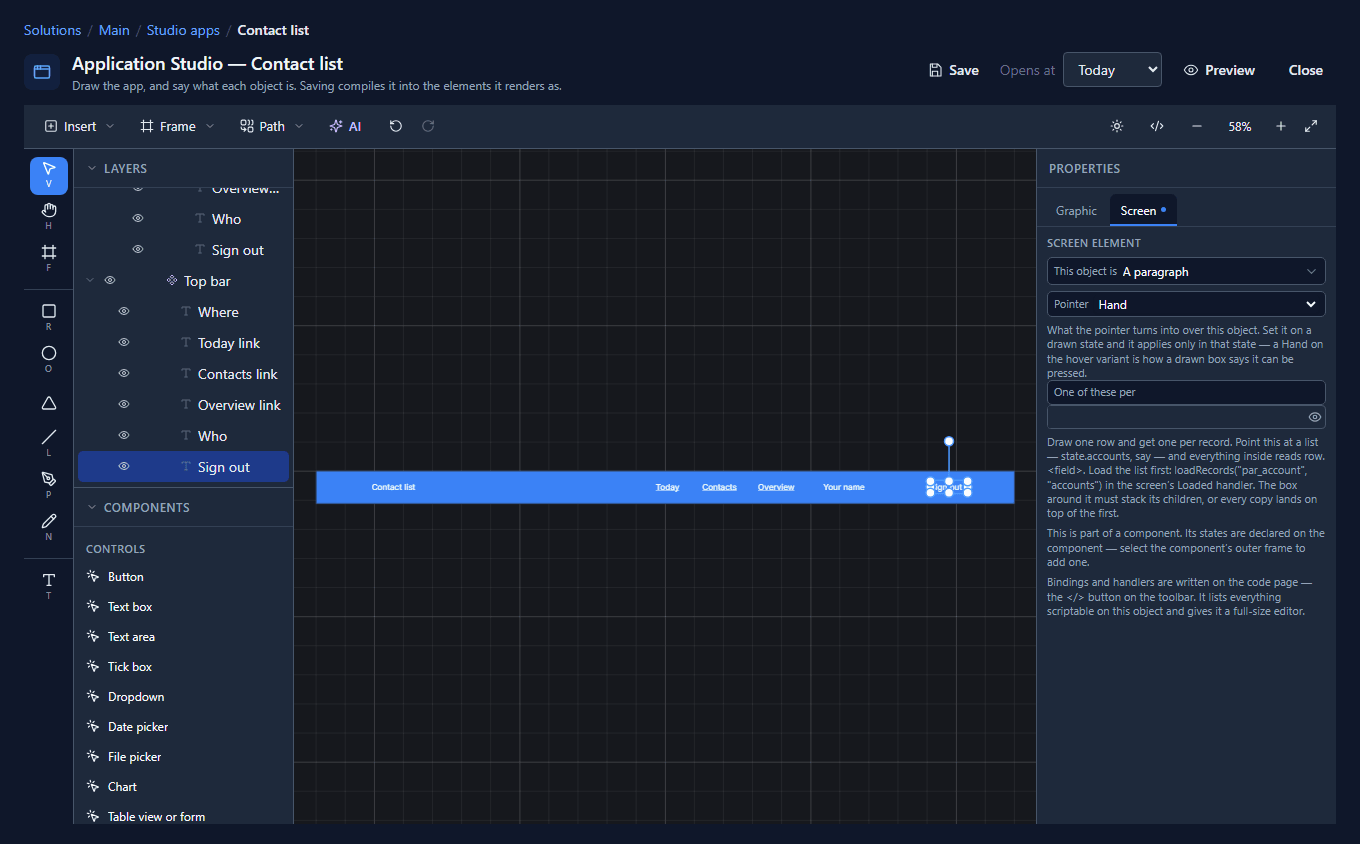
Open Contact list in the designer, select the Top bar master and press Shift+2 to bring it into view. We moved the three links left to make room, then placed two paragraphs from the palette inside the master:
- Who, whose Text binding is
user.name. - Sign out, whose Pressed handler is
signOut();, with Pointer set to Hand so it looks pressable.
Because they're inside the master, they're part of the component, and every screen's bar has them:
The handler is one line on the code page:
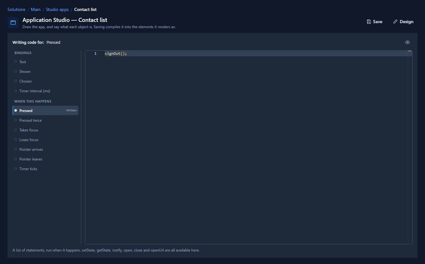
user.name, user.email and user.photo are there for any binding, and setTheme("dark") and
ui.theme cover the light and dark switch if you want that too.
4. Hide the platform bar
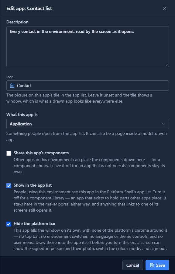
In the solution, open Studio apps, select Contact list and press Edit. Tick Hide the platform bar, and save:
Open it again from the app list. The drawn bar is now the top of the window, and it says who you are:
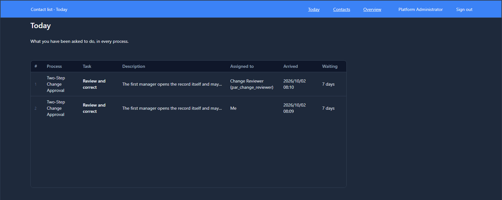
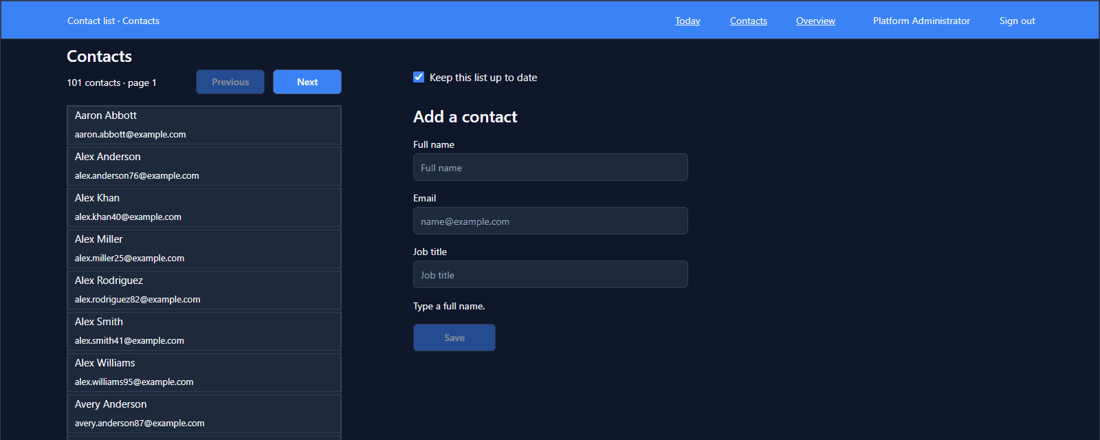
Sign out does what it says and lands on the sign-in page. What the drawing can't replace is the environment picker, so leave the platform bar on for anything a maker uses, and hide it for an app that's a whole thing on its own.
Who can open the app is still a permission, the same one whether it's opened on its own or inside a model-driven app. Select it under Studio apps and press Share to give it to roles (see Your first app, shared).
What we fixed
Building this turned up three problems, all fixed:
- A component couldn't be given a new part. Only what was selected for Make component ever became part of it. Placing Sign out in the top bar's master left it outside the component, so no screen showed it. Something placed from the palette inside a master now joins the component, and every instance gets it. The help page on components says so.
- The new part's pointer stayed on the master. Sign out showed a hand in the designer and an arrow on every screen. An instance's parts now take the master's pointer.
- The copies kept the palette's name. Every screen's bar listed its new parts as A paragraph in the layers panel. They now take the master's names.
Try it
Import the Studio — Starter app sample (studio-starter-app). Its Support desk hides the platform bar and draws the
signed-in person, their photo, a theme switch and Sign out in its own top bar.
Next: capital planning, a whole application, walked through.