Parsware Platform
Roles: what each part of a screen is
Draw a screen with the plain Frame and Text tools, then tell the platform what each part is: the screen, a heading, a paragraph, a text box, a dropdown, a date picker, a button. The role decides what each one becomes when the app runs.
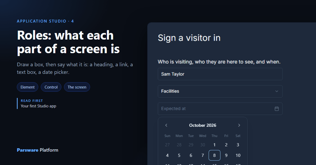
On a canvas, a heading and a paragraph are both just text in a box. A box that looks like a text box is a rectangle with a border. You can see the difference, but the platform can't, and it needs to: a heading should be announced as a heading, and a text box should let people type into it.
So in a Studio app every part of a screen has a role. The role is what you tell the platform the part is, and it decides what the part becomes when the app runs. The last two articles placed parts from the Components panel, which gives them a role as they land. This one draws a screen with the plain Frame and Text tools, so you can see the roles being given one at a time.
We drew a Visitor sign-in screen for a front desk: who's visiting, who they're here to see, and when.
The list
Select anything you've drawn and open the Screen tab. The first field is This object is:
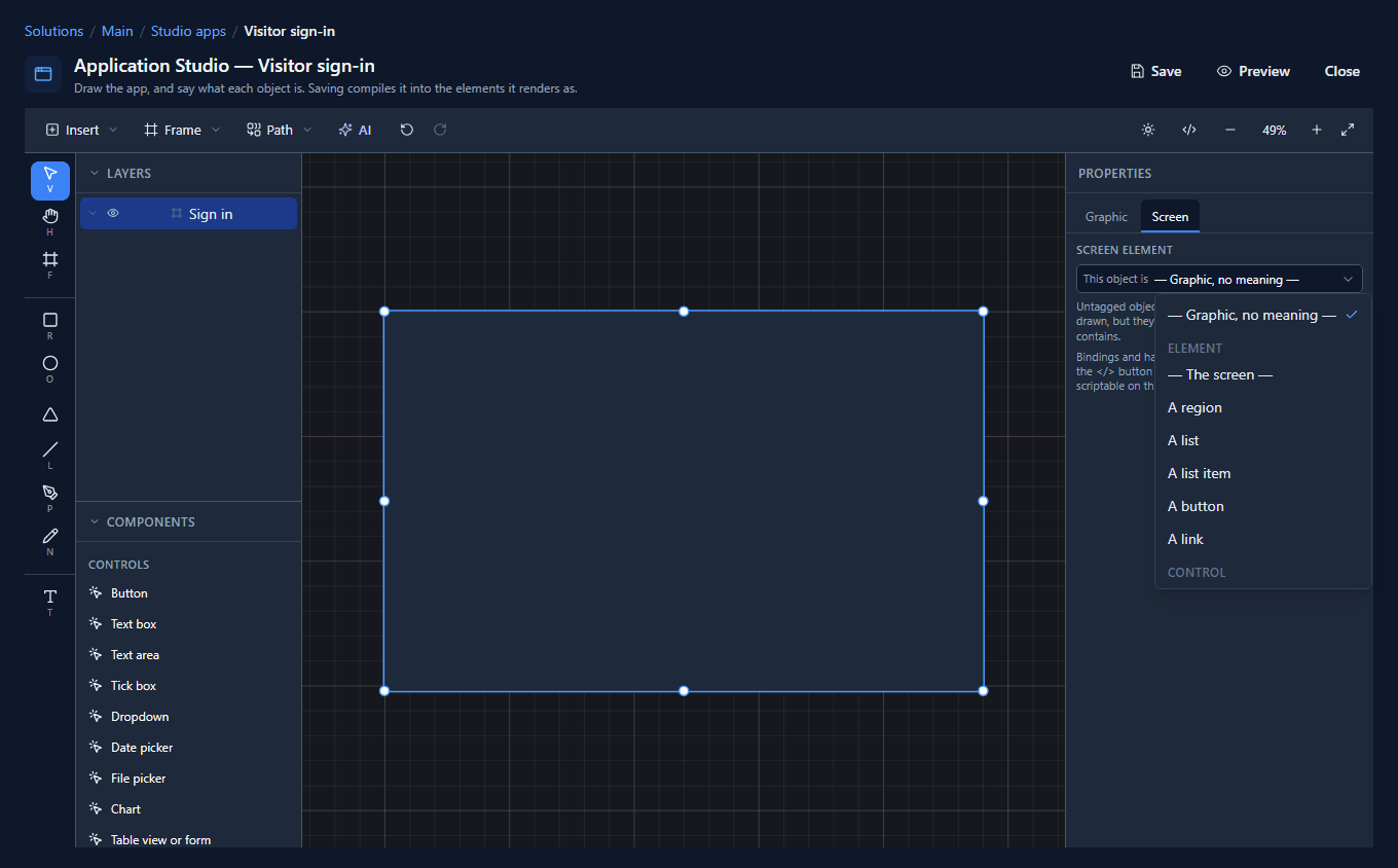
The list has two kinds of answer.
Elements are things you draw and keep drawing: the screen itself, a region, a list, a heading, a paragraph, a link, a button, an image. Everything about how they look is yours.
Controls are the platform's own: a Button, Text box, Text area, Tick box, Dropdown, Date picker, File picker, Chart, Table view or form and My tasks. You draw where they go and how big they are, and the platform supplies the rest. A text box has a caret and keyboard behaviour; a date picker opens a calendar.
Leave something on — Graphic, no meaning — when it's only decoration. It's drawn, but it says nothing about what the screen contains.
The list changes with what's selected. A frame can be the screen; a text can't, because the screen's size is the size of the screen. A line or a shape has no answer at all, and the tab says so instead of showing an empty list.
1. The screen
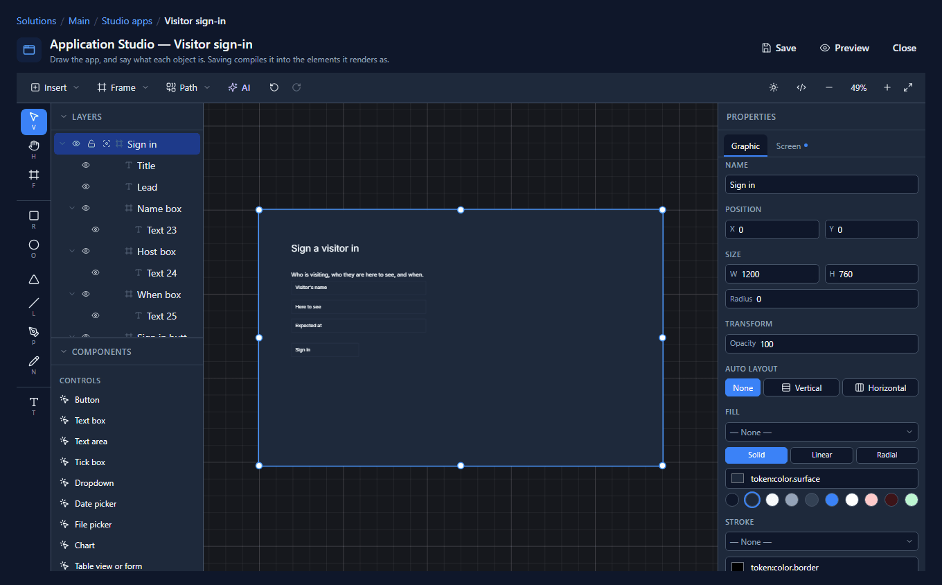
We drew a frame with the Frame tool (F), sized it 1200 by 760, named it Sign in, and chose — The screen —:
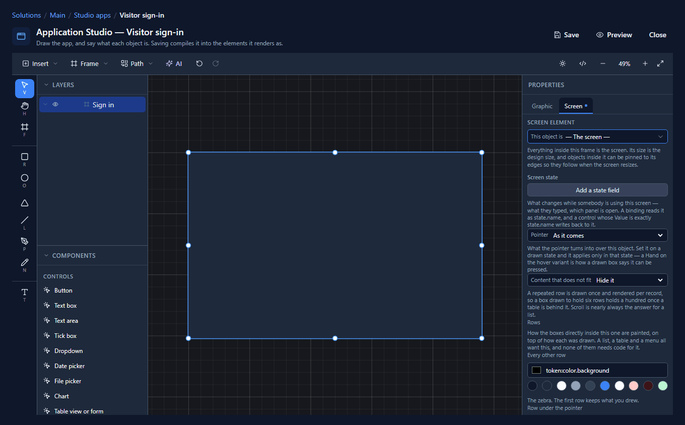
Everything inside this frame is now part of the app. Anything outside it isn't.
2. A heading and a paragraph
With the Text tool (T), click inside the screen and type. We typed Sign a visitor in, made it 28 pixels, and chose A heading. Then a second text, Who is visiting, who they are here to see, and when., at 16 pixels, as A paragraph:
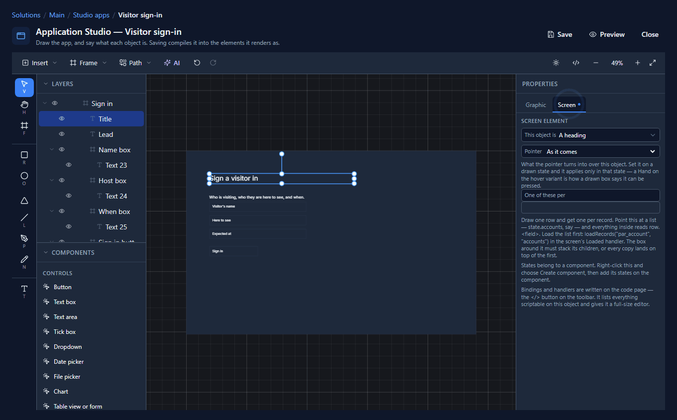
The role doesn't change how they look. You chose the size, and you'll see the same size when the app runs. What the role changes is what they are: the heading becomes a real heading, which a screen reader can jump to and which shows in the page's outline, and the paragraph becomes a real paragraph. You can select their text and find it with Ctrl+F, which you can't do on a picture of a screen.
3. Three controls
A control starts as a frame with words inside it. For each of these we drew a frame 400 wide and 40 high, clicked inside it with the Text tool, typed its words, and then gave the frame its role:
| Frame | Words inside | This object is |
|---|---|---|
| Name box | Visitor's name | Text box |
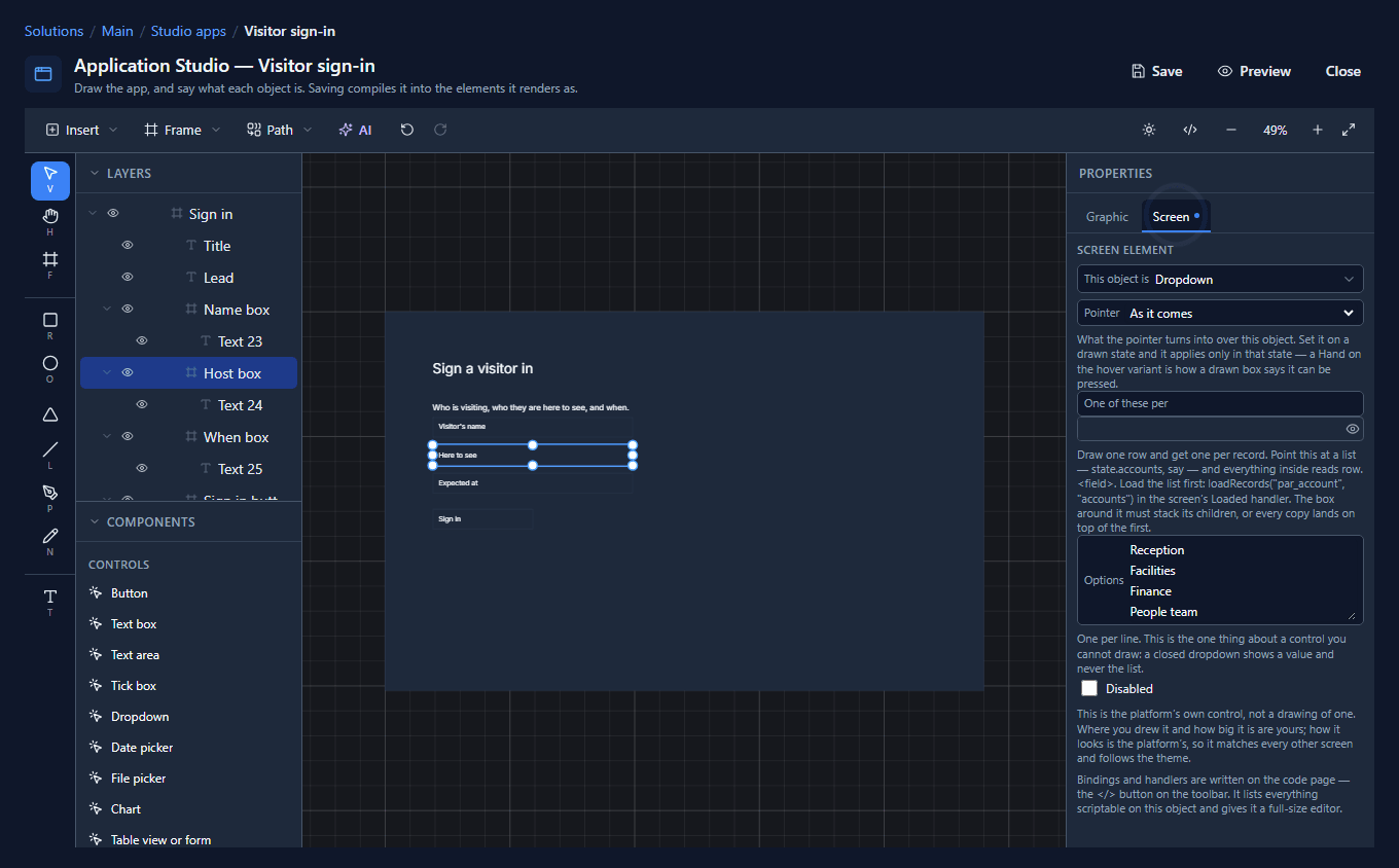
| Host box | Here to see | Dropdown |
| When box | Expected at | Date picker |
The words inside a control are its prompt. In an empty text box they're the grey placeholder. In a dropdown and a date picker they're what shows before anything is chosen.
A dropdown needs one thing you can't draw: its Options, one per line. A closed dropdown only ever shows one value, so the list has to be typed. We typed Reception, Facilities, Finance and People team:
Last, a frame 200 wide with Sign in inside, as a Button.
Here's the whole screen, every part with its role, and Layers showing what is inside what:
4. See what they became
Save, and press Preview:
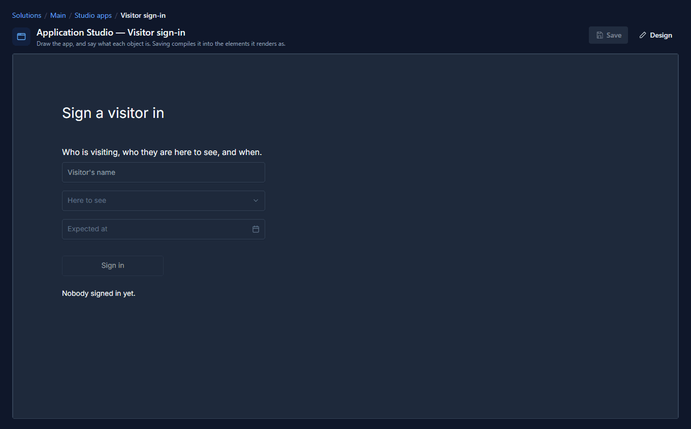
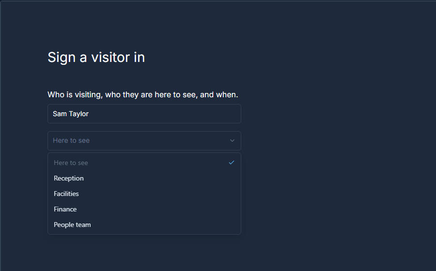
Nothing here is a drawing any more. Click into the text box and type, and it behaves like every other text box. Open the dropdown and the four options are there:
Click the date box and the platform's calendar opens:
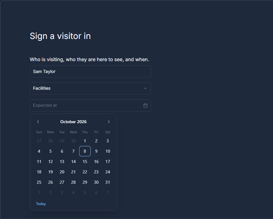
This is the same date picker the record forms use. Switch the platform to Persian and it shows a Persian calendar, with nothing for you to do: because you didn't draw the calendar, you don't have to draw it again.
When to draw it and when to use a control
You could draw a box that looks like a date field: a border, some grey text, a little calendar icon. It would have no calendar. A box drawn to look like a text box has no caret, no selection and no autofill.
So the rule of thumb:
- Use a control when the behaviour is the point: typing, choosing, picking a date.
- Draw it as an element when the look is the point: a heading in your own colours, a card, a call-to-action button with a hover you drew yourself.
A control still takes your paint. Fill its frame, change its border or round its corners and the running control keeps them. Whatever you leave alone stays the platform's, which is why an unpainted control matches every other screen and follows the theme.
What we fixed
Drawing this screen turned up three problems, all fixed:
- The role list was unreadable in the dark theme. This object is was the browser's own dropdown, so its list opened in the operating system's colours: pale words on a white sheet. It's the platform's dropdown now, with the elements and the controls under their own headings, and it sits inside its field like the other fields on the tab.
- A frame drawn on a screen was white. A new frame was white whatever you were drawing, while new text on a Studio screen is the theme's text colour. In the dark theme that's pale words on white: we typed the heading onto the frame and it disappeared as we typed. A frame drawn on a Studio screen now starts in the theme's surface colour, and a report's frames stay white paper.
- A date picker ignored its words. A text box and a dropdown showed the words drawn inside them, but a date picker said Pick a date whatever you'd written. It says Expected at now.
Try it
Draw a frame, make it the screen, and put three things inside it with only the Frame and Text tools: a heading, a text box and a date picker. Preview it, type in the box and open the calendar. Then switch the language to Persian and open the calendar again.
Next: make the screen react: a button that's off until the form is filled in, and a line that says what's been typed.