Parsware Platform
Your own sign-in page
A portal that signs visitors in has a sign-in page of the platform's own. You can draw yours instead, in the same app as the rest of the portal, and the password still goes only to the platform. We switched the members portal back to the standard page, then looked at how its drawn one is made: four settings on the portal, nine shared cards, and one function call.
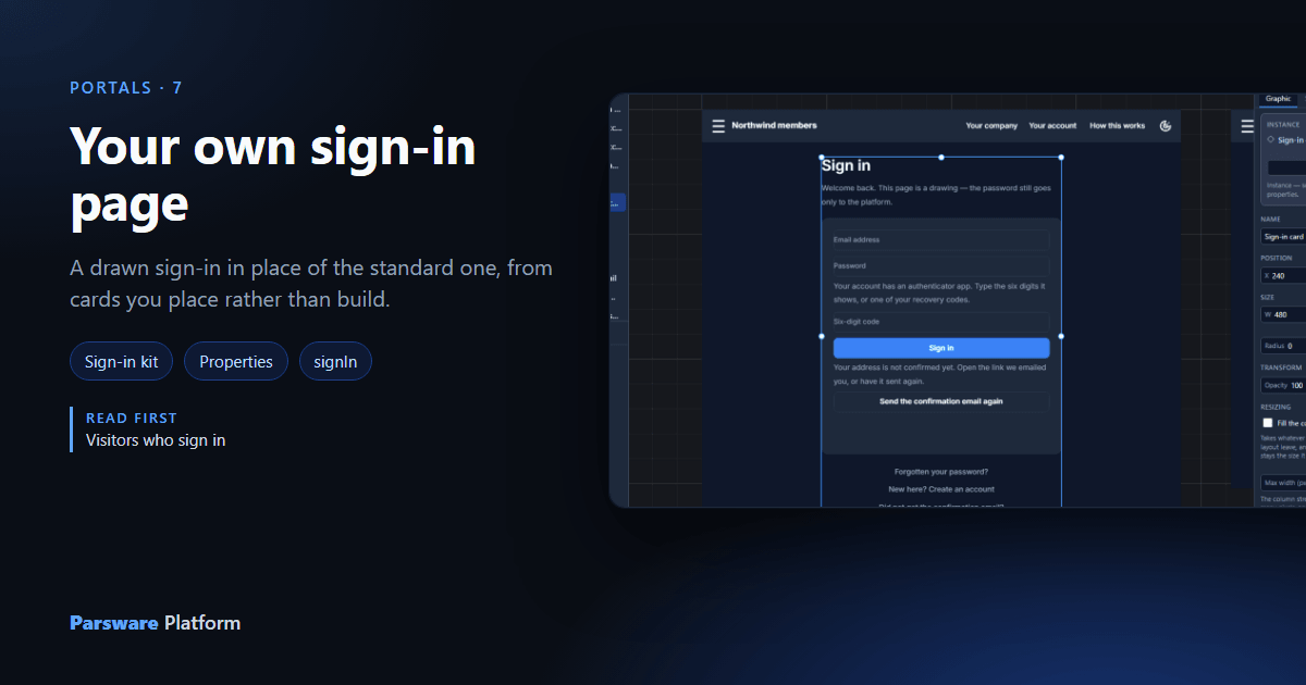
The sign-in page in the previous article was a drawing: the same bar, the same fonts and the same colours as the rest of Northwind members. That's not the default. A portal that signs visitors in has a page of the platform's own, and you choose to draw yours.
The standard page
With nothing chosen, a stranger gets this:
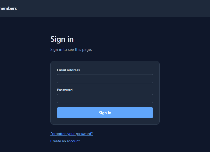
It works: sign up, confirmation, reset, two-step sign-in. It's plain on purpose, and it carries the portal's name and nothing else of yours. For a portal that's mostly records, that's often enough.
Four settings
A drawn way in is set on the portal, under Who can open it:
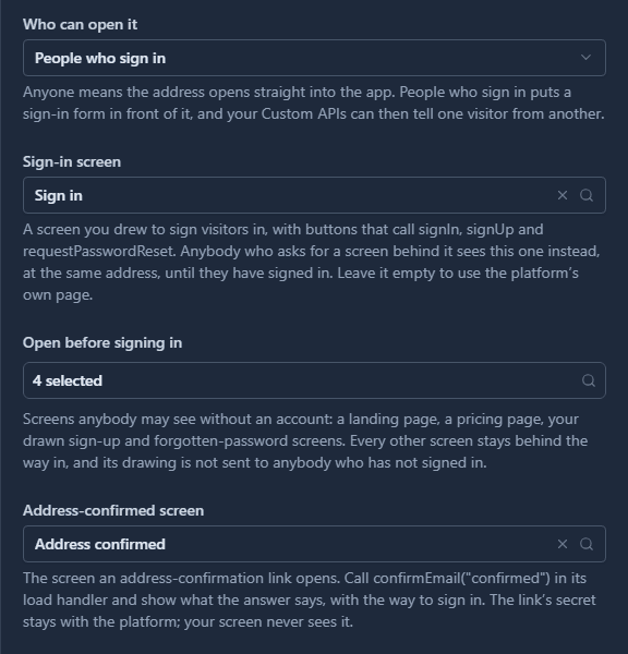
- Sign-in screen is the screen a stranger sees whatever they asked for, at the address they asked for. Once they've signed in, that same address shows the screen they wanted.
- Open before signing in lists the screens a stranger may see without an account: the sign-up page, the forgotten-password page, a page about the site. Every other screen's drawing isn't even sent to a browser that hasn't signed in.
- Address-confirmed screen and New-password screen are the pages the two email links open.
Leave Sign-in screen empty and the standard page comes back.
The cards
Nobody draws a sign-in page from nothing here. The Portal sign-in kit sample,
samples/solutions/portal-sign-in-kit, has nine cards, drawn once: sign in, create an account,
forgotten password, resend the confirmation, new password, address confirmed, your account, change
password and two-step sign-in. Every portal sample that signs visitors in places them as linked
copies.
In the members area's designer, the Sign in screen is the bar and one of those cards:
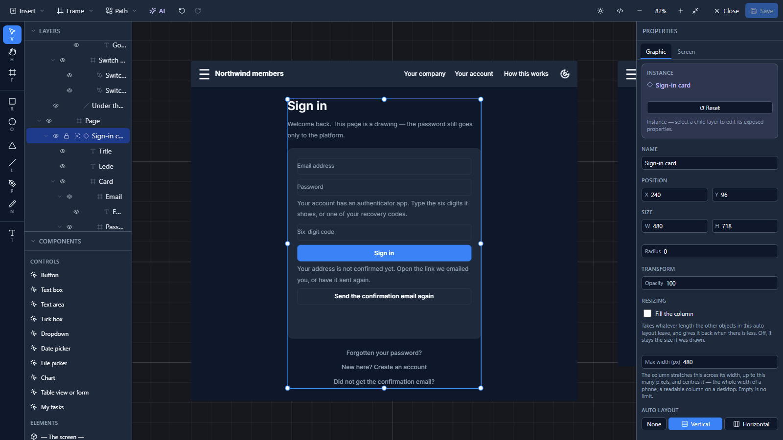
The designer shows every state of the card at once: the code box and the not confirmed yet part only appear on the live page when they apply.
A card reads only its properties
A card that read the screen's state directly couldn't be placed in another app, because it would land on screens whose state it had never seen. So the card has properties, and the screen that places it says where each one comes from:
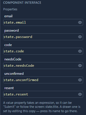
Typing in the card's email box writes through to the screen's state.email. An answer the card
asks for lands the same way.
One call
Here's the card's Sign in button in the kit, on the code page:
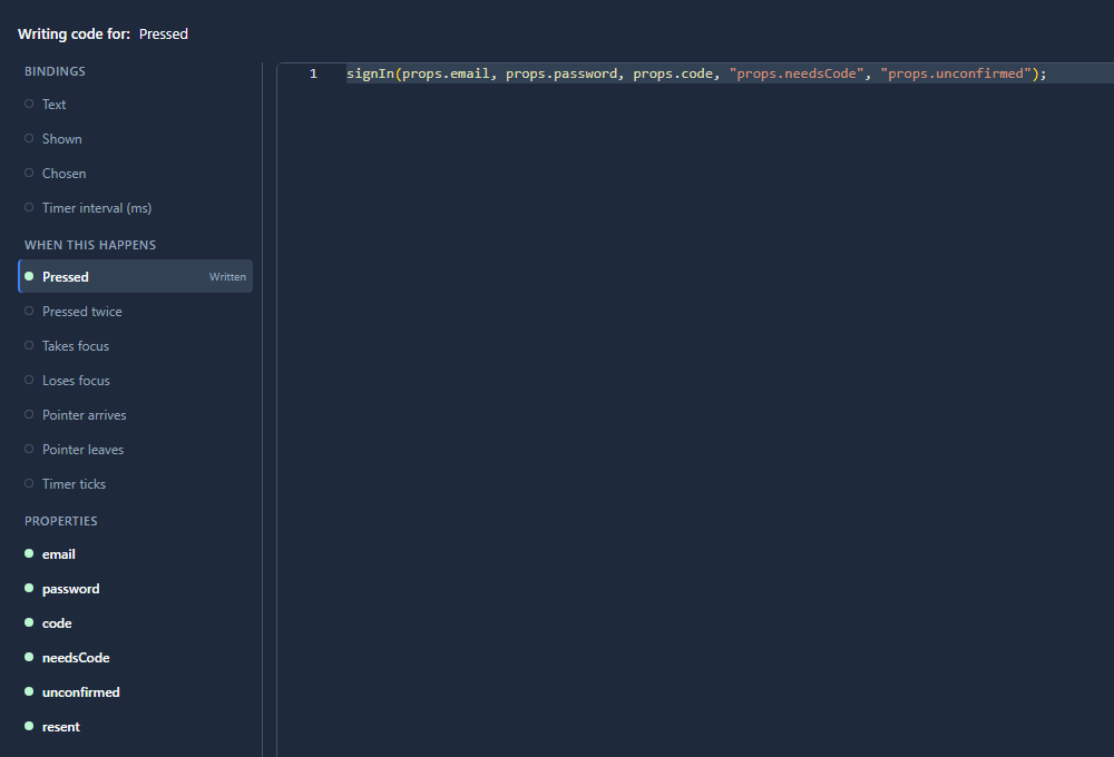
signIn takes the address, the password and a code. The last two arguments name fields to set
when the platform has more to say:
needsCodeis set when the account has an authenticator app, so the card shows the code box and the next press sends the code. That's the article after this one.unconfirmedis set when the address isn't confirmed yet, so the card shows its own sentence and the button to send the link again.
signIn hands the password to the platform, which signs the visitor in and keeps the session in a
cookie the page's scripts can't read. The drawing never sees a token.
Screen names are the contract
The cards link to each other by name: Sign in, Create account, Forgot password, Resend confirmation, New password, Address confirmed, Account, Change password and Sign-in security. Give your screens those names and every link works. A card's Forgotten your password? goes to whatever screen you called Forgot password.
Changing a card
The copies are linked to the kit. Change the Sign-in card in the kit's app and save it, and the next time you open an app that places it, the designer offers to bring its copy up to date. Each copy also travels in full with its own solution, so a portal sample imports and works whether or not the kit is there.
What it doesn't do
- It doesn't make your drawing safe by itself. The password sits in the screen's state while it
is typed, so a screen could pass it somewhere else. The kit's cards hand it to
signInand nothing more; a card of your own should do the same. - It doesn't let you skip the checks. A drawn page signs people in through the same calls as the standard one, with the same lockout and the same confirmation.
- It doesn't draw the two-step set-up for you. The kit has a card for it, and the next article uses it. Without one, a button can open the platform's own panel.
What we fixed
- "Not confirmed yet" was said twice. When
signInwas given theunconfirmedfield, the card showed its own sentence, and the platform also showed Confirm your email address before signing in as an error message above it. With the field named, the card's words are the only ones now. A screen that doesn't name the field still gets the platform's message, since it has nowhere else to say it. The help page says so, in all seven languages.
Try it
Import samples/solutions/portal-sign-in-kit and samples/solutions/portal-sign-in-and-accounts.
On Northwind members, clear Sign-in screen, save, and open the address in a private window
for the standard page. Put it back and you have the drawn one. Then open the Members area in the
designer and select the Sign-in card.
Next: Two-step sign-in for visitors.