Parsware Platform
Build a custom control
A field sometimes needs an editor the platform doesn't ship. A custom control is one React component that stands in for it: it shows the field's value, reports every edit, and leaves saving to the form. We built a badge-number field for the front desk outside the repository, packed it into one file and installed it.
Reception types each visitor's badge number into the Badge number column, a plain text field.
The badges are printed as B- and four digits, and typos are easy: b 2077, B2077 . What the
front desk wants is a field that tidies what's typed and shows the badge it will print.
That's a custom control: one React component that replaces a field's editor on a form. It's built and packed like the custom app from the last article; only the contract is different.
The contract
The form hands a control four things and expects one thing back:
interface ParswareControlProps {
  value: unknown;                    // the field's current value
  onChange: (next: unknown) => void; // report an edit; the form decides when to save
  fieldMetadata: FieldMetadata;      // the field's name, label, type, required flag, length
  context: ParswareRuntime;          // the same runtime an app gets
}
The control is controlled: it draws value and reports edits through onChange. It never
keeps its own copy of the value, and it never saves the record. That's what lets it take part in
the form like any built-in field: Save, Cancel, required checks and business rules all work on
what the control reported.
The control
import type { ParswareControlProps } from '@parsware/runtime-sdk';
import './badge.css';

function tidy(text: string): string {
  return text.toUpperCase().replace(/\s+/g, '');
}

export default function Control({ value, onChange, fieldMetadata }: ParswareControlProps) {
  const badge = typeof value === 'string' ? value : '';

  return (
    <div className="badge-field">
      <input
        aria-label={fieldMetadata.displayName}
        value={badge}
        maxLength={fieldMetadata.maxLength ?? undefined}
        placeholder="B-1042"
        onChange={(e) => onChange(tidy(e.target.value))}
      />
      <div className="badge-field__badge" aria-hidden="true">
        <span>VISITOR</span>
        <strong>{badge || '—'}</strong>
      </div>
      {fieldMetadata.isRequired && !badge && <span className="badge-field__hint">Required</span>}
    </div>
  );
}
- The label, the length and the required flag come from
fieldMetadata. Nothing about the Badge number column is written into the control, so it works on any text column. - An empty or unexpected value draws an empty field, not an error. A control lives inside somebody else's form, and an exception there takes the whole record with it.
See it before you pack it
A control can't open itself in the Shell, so the project has a small development page that holds
the value the way a form would. npm run dev, and type into it:
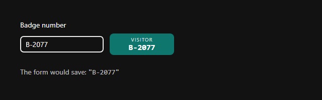
b-2077 went in; B-2077 is what the form would save.
Say what it stands in for
The project is set up exactly like the app's, from the help site's downloads, with two
differences: Module Federation exposes ./Control rather than ./App, and the parsware block
says which kinds of field the control can replace:
"parsware": {
  "logicalName": "nw_badge_field",
  "displayName": "Badge field",
  "description": "Types a visitor badge number and shows the badge it prints.",
  "substitutesFor": ["Text"]
}
substitutesFor is what the form designer reads: it offers this control for text fields and
for nothing else, so nobody can put a badge editor on a date.
Pack it and install it
$ npm run pack

Packaged nw_badge_field 1.0.0
  scope   nw_badge_field
  module  ./Control
  entry   remoteEntry.js
  files   23
  sha256  b44d7dd286d6f67ca498f062d9b388396ee31ede3eeb16a07403aa2e813019f0

  …adge-fieldpackage
w_badge_field-1.0.0.zip  (91.9 KiB)

Upload it in the Admin Control Center: open the solution, then Custom Controls → New.
In the Visitors solution, Custom Controls, New, choose the file:
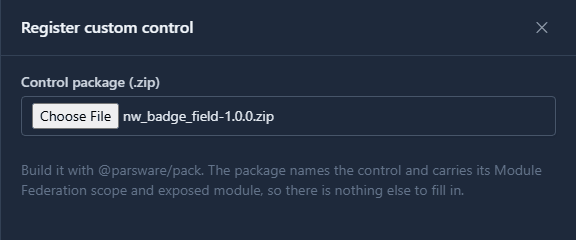
Register custom control, and it's installed:
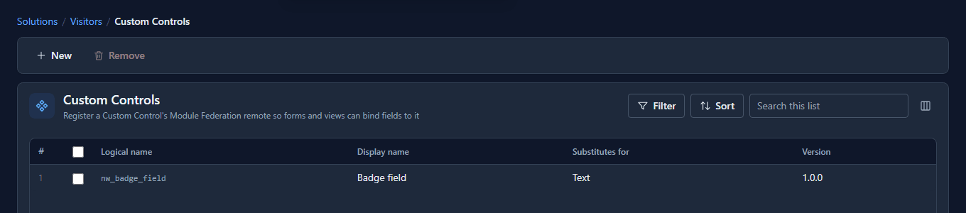
The archive carries the code, so the solution carries the control: export the Visitors solution, import it into Test, and the badge field is there, with nothing outside to keep running.
What we fixed
Following the help page for custom controls in an empty folder stopped four times: its packages only resolved inside our own repository, its Module Federation settings left out what the packer needs, its test used a helper it never defined, and it told makers to type in a module name that the packer has read from the build for months. It's been rewritten and checked by doing exactly what it says, in all seven languages.
Good to know
- The calls a control makes go out as the person using the form.
contextis the same runtime an app gets, with the same rules. - A control is per environment. It's installed with its solution and travels with it.
- Raise
versionbefore you pack again. Uploading the same logical name replaces the control, and the version is how you can tell which build is installed.
Try it
Build a control for a text field you know, pack it, and install it in a solution. Then type something wrong into its development page and see what your control does with it.
Next: Put a custom control on a field.