Parsware Platform
A component library
One Studio app that holds your parts, a toggle, a field that says when it's wrong, a dropdown, and every other app in the environment places them. Change a part in the library and the apps that use it are brought up to date.
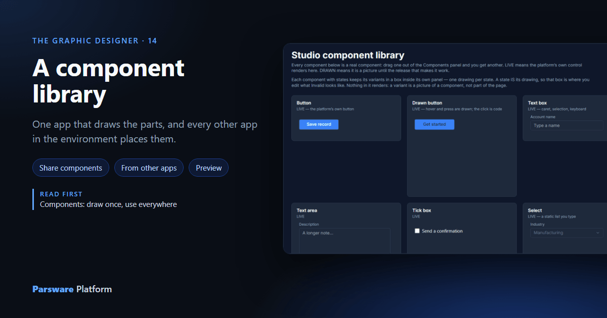
Components let you draw a part once and place it many times. The last part of that article showed one app lending a card to another. A component library takes that one step further: an app whose whole job is to hold parts, so that every other app in the environment can place them.
This article uses the Studio — Component Library sample (studio-component-library). It holds
seventeen parts drawn in the platform's own look: buttons, fields, a toggle, a dropdown, a lookup,
lists, a top bar and a table.
What makes an app a library
Import the sample and open Studio apps in it:
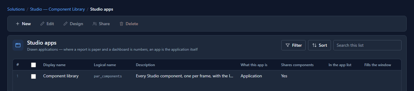
A library is an ordinary Studio app with two settings. Select it and press Edit:
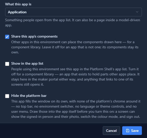
- Share this app's components is on. Every component drawn in it is offered to the other apps in this environment.
- Show in the app list is off. Nobody using the product opens a shelf of parts, so it isn't in the Platform Shell's app list. It stays in the maker portal, which is where you open it.
That's the whole definition. Any app can be a library, and most aren't: sharing is off by default, so a half-drawn app doesn't fill everybody's palette with its scratch shapes.
What's in it
Press Design. Each part sits in its own panel, with a caption saying whether it works yet: LIVE means it does, DRAWN means it's still a picture, and PART LIVE is a drawing holding real controls.
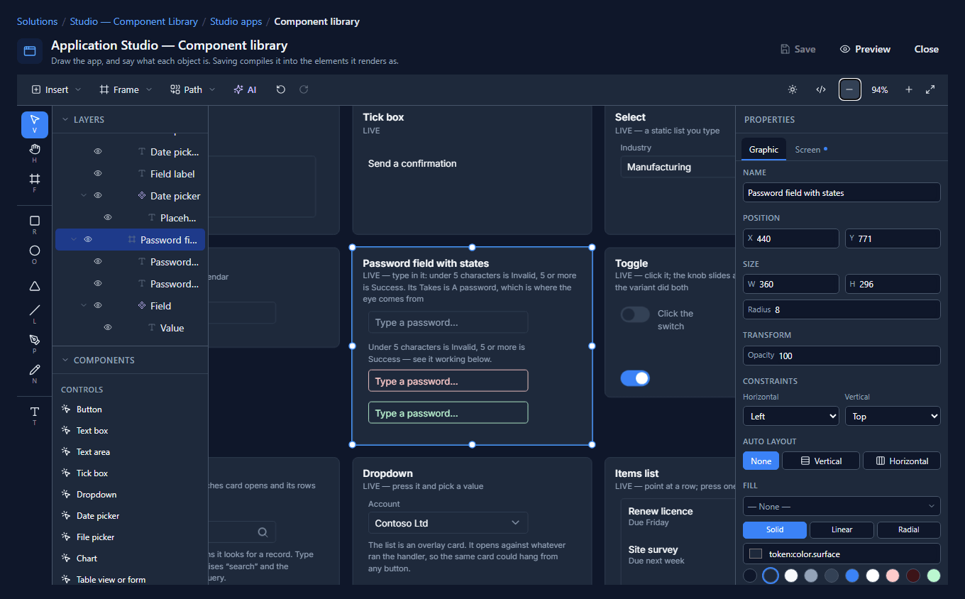
The parts that have states keep them inside their own panel. Above, the password field has its normal drawing, a red one for invalid and a green one for success, and the toggle has its off and on drawings. Nothing in those boxes appears on a screen. They are the pictures the states are made from.
Every colour in the library is a theme colour: surface, text, border, primary, error, success. That's why the parts look like the rest of the product, and why they follow dark mode and the tenant's accent without anybody drawing a dark version.
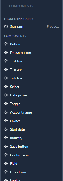
The library's own Components panel lists every part it draws:
Trying the parts
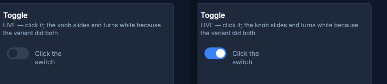
Press Preview. The parts that say LIVE react. Click the toggle and the knob slides across and turns white, because the checked drawing moved it and coloured it:
The last panel, Placed and wired, shows three parts placed on the screen and given its state, which is how an app uses them. Type three letters in the password field and it turns red and says what's wrong. Type eight and it turns green:
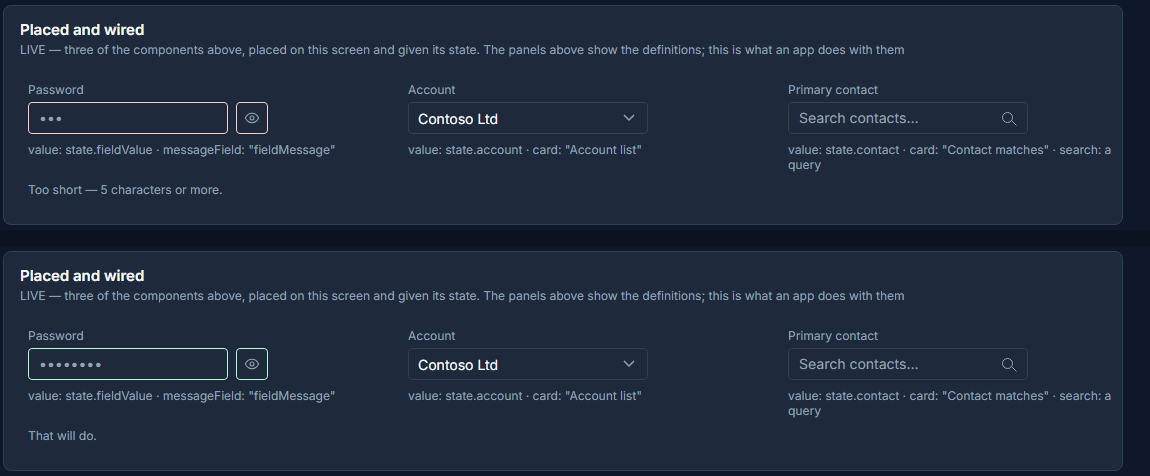
That's nine lines on the field's Value changed handler, choosing a state from what was typed. The eye at the end is the platform's own reveal button: the field's Takes is set to A password.
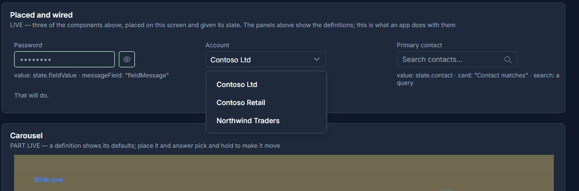
The dropdown opens a list against the box you pressed, and choosing a value puts it in the box:
Preview has no environment behind it, so the Table panel shows no rows and the Lookup finds nobody. Placed in an app that's open in the Shell, both read real records.
Using the library in another app
Open any other Studio app in the same environment. Its Components panel now has a group called
From other apps, with the library's parts and the app each one comes from. This is the
Support desk from the studio-starter-app sample:
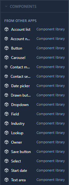
Drag one onto a screen, or select it and press Enter to put it in the middle of the view. What lands is an instance, which you can move, resize and give its properties like any other.
Changing a part once
The Support desk already places three of the library's parts: a field, a dropdown and the lookup. Because the library was imported after it, the next time the Support desk opened, the designer said so:

That's the point of a library. Fix a part in one place and save, and every app that places it picks up the change the next time it's opened. The app keeps a copy of each part it uses, so it still works on its own, and it's only rewritten when somebody saves it. Nothing changes behind a maker's back.
A part that reads its own app's screen state can't be placed elsewhere, because the other app has no such state. The palette shows it greyed and names the expression. Give it a property instead, as the library's field, dropdown and lookup do, and the app that places it fills it in.
What we fixed
- No false alarm in Preview. Opening the library in Preview showed "Bindings kept re-running each other more than 2 times", and nothing in it loops. Two independent updates arriving at once were being counted as one chain. They're counted separately now, and a real loop is still caught.
- A password field stays the size it was drawn. The placed field was 45 pixels tall in a box drawn 32 tall, and covered the line under it. It fills its box now, with the eye inside it.
- Enter places a part where you're looking. Pressing Enter on a part from another app put it far to the left of the drawing, off the screen you were looking at. It lands in the middle of the view now, inside the frame there.
Try it
Import Studio — Component Library and open it with Design. Press Preview, click the toggle, and type in the placed password field. Then open another app's designer, find the library under From other apps, and place a toggle on its screen.
Next: undo, history and export.