Parsware Platform
Components: draw once, use everywhere
Make a component from what you selected, place as many copies as you like, change the original and every copy follows, even in another app. Trying it, we fixed a component that left its words behind when you typed a new position, a menu that named the command differently from everywhere else, and text that started out in the wrong font.
این مقاله فقط به انگلیسی در دسترس است.
A top bar on every screen, a status chip on every row, a card on two dashboards. Drawn as copies, they drift apart the first time somebody changes one and forgets the others. A component is drawn once. Every place it's used is an instance of it, and changing the original changes them all.
This article starts with the Shared components sample (studio-shared-components), which you
can import into any environment. It has two Studio apps, Products and Orders, and one Stat
card that both use.
The original and its copies
Open Studio apps in the sample, select Products and press Design. The card is on the screen, and the same card sits beside it, outside the screen:
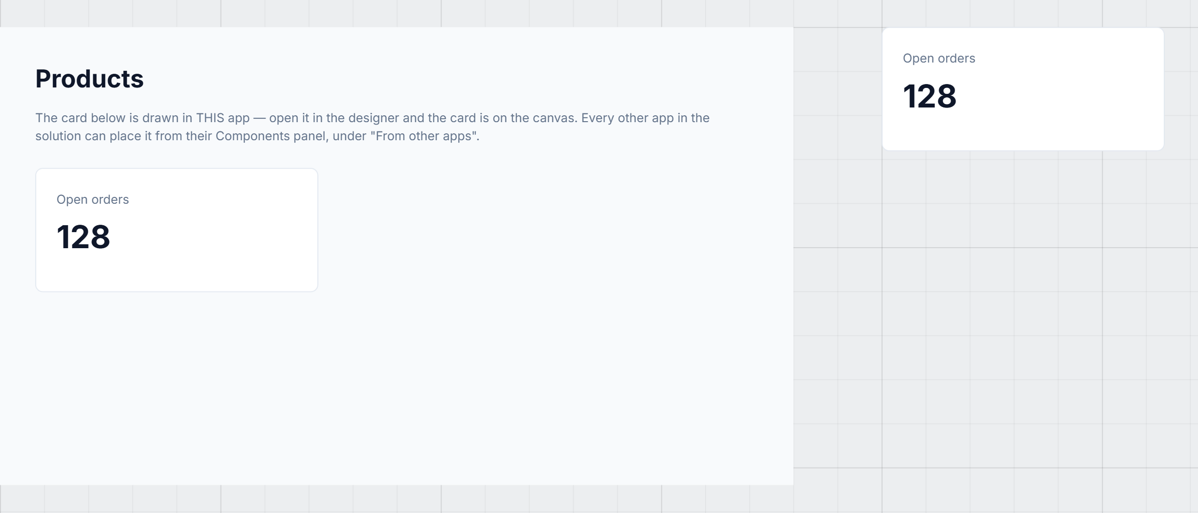
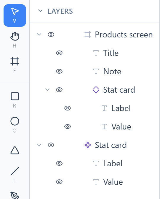
The one beside the screen is the main component, the original. The one on the screen is an instance. Layers marks them differently so you can tell without clicking: four diamonds for the original, one hollow diamond for an instance.
Only the instance is part of the running screen. The original can sit anywhere on the canvas.
Making one
On an empty part of the same canvas we drew a frame called Ticket list, and in it a status chip: a green pill named Chip with the word Open on it. We selected both, right-clicked, and chose Make component:
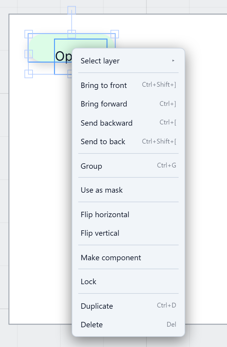
Two shapes became one component, wrapped in a frame because a component needs one outer box. Select a single shape or a single frame instead and that shape becomes the component itself, with no wrapper. We renamed it Status chip, and Properties shows it as a component:
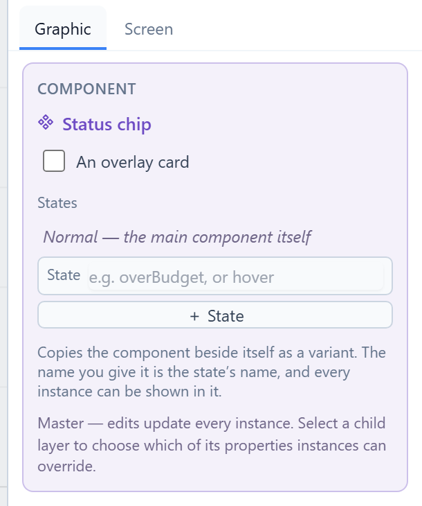
It was also added to the Components list at the bottom of the left panel, under Components.
Placing copies
Drag the component out of that list onto the canvas, or click it and it lands in the middle of the view. We placed two and typed their positions so that the three sat in a column:
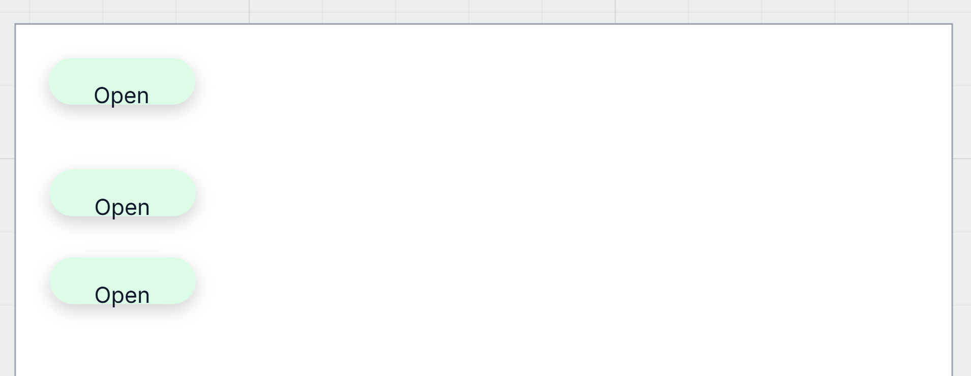
Then we selected the Chip inside the original and changed its fill to pink. All three changed:
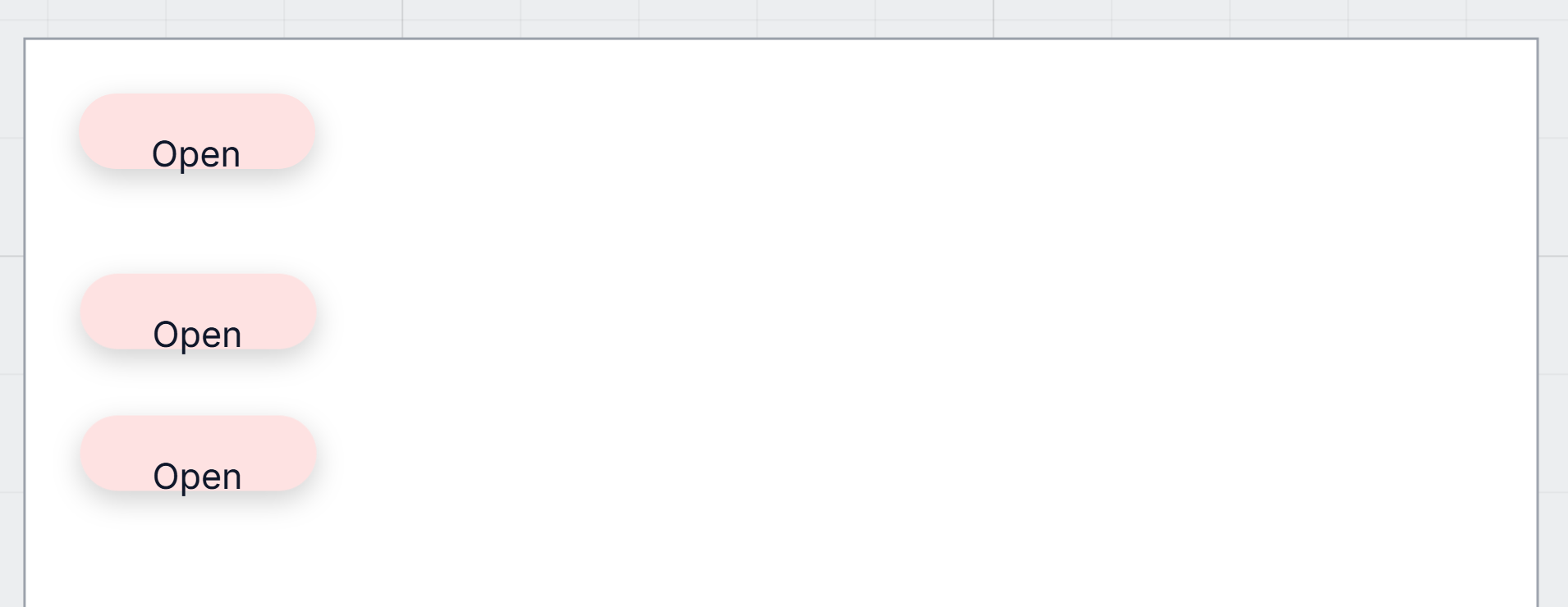
That's what a component is for. You change it in one place, and only once.
Letting a copy be different
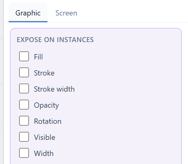
An instance is locked to the original until you say which parts it may change. Select a shape inside the original and the Graphic tab begins with Expose on instances. We selected the word and ticked Text & font:
Now each instance can have its own word. We selected the word in the second chip and typed Closed:
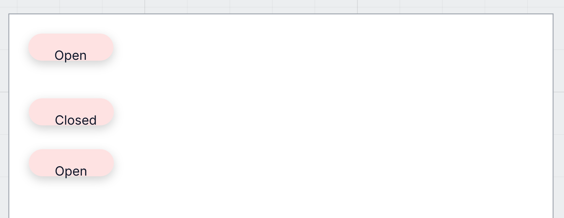
Everything we didn't tick stays the original's. Change the pink again and all three follow, the Closed one included. Only its word is its own.
The instance menu
Right-click an instance and the menu has three more commands:
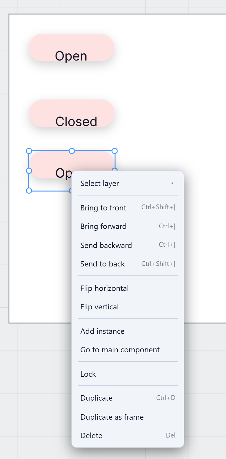
- Add instance places another copy.
- Go to main component selects the original and brings it into view. An instance can't be edited where it sits, so this is how you get to the thing you edit.
- Duplicate as frame gives you a plain copy that follows nothing: ordinary shapes you can change freely. Use it when a card is nearly right and you want your own version, not another copy.
Delete on the original asks first, and counts what goes with it: every instance, wherever they are on the canvas.
In another app
This is the part the sample is really about. Its Products app ticks Shares components, so its components are offered to the other apps in the solution:

Open Orders in the designer and the card is in its Components list, under From other apps, with the app it comes from:
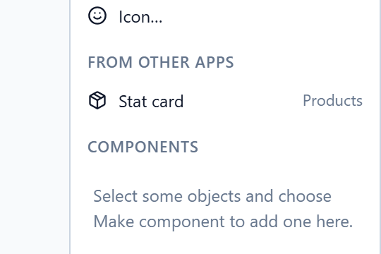
Orders places it like any other component. Change the card in Products and save, and the next time Orders is opened the designer says its copy was brought up to date. The sample's README walks through it. It's opt-in: an app that doesn't tick Shares components keeps its components to itself.
What we fixed
- Typing a new position moves the whole component. Select an instance or an original and type a new X or Y, and the outer box moved but its contents stayed where they were, until something else happened to redraw it. Dragging always moved everything. Typing does now too.
- One name for the command. The menu said Create component, while the designer's own hints and the help said Make component. It's Make component everywhere now.
- Text starts in the right font. When the designer opened, text on the canvas could appear in a serif font until something made it redraw. The designer's font is now registered so the canvas hears when it has loaded.
- The help names the right list. The Components list's group for other apps' components was called Shared parts in the help, in every language. It says From other apps, as the panel does.
Try it
Import Shared components, open Products in the designer and find the original card beside the screen. Then, somewhere empty, draw two shapes, select them and choose Make component. Drag it out twice, change the original's colour, and tick Text & font on a word inside it so one copy can say something different.
Next: component states and parts: hover, states of your own, and properties an instance is given.