For Power Apps
Components in Power Apps designs
A top bar, a menu or a footer that appears on every screen should be drawn once. In the Parsware designer that is a component, a main drawing with copies placed on each screen, and changing the main one changes every copy. Here is how components work in a Power Apps design, using the Starter app that ships with the samples.
هذا المقال متاح بالإنجليزية فقط.
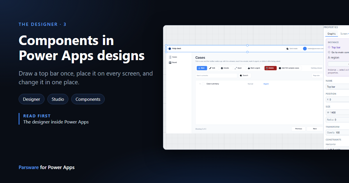
The Starter app in the samples has three screens, and each one has the same top bar and the same menu down the left. Drawn three times, they'd be three things to keep in step, and the day somebody renames the app, one of them would be missed.
So they're drawn once, as components. A component is a main drawing plus any number of copies placed on screens. Change the main one and every copy follows. This article shows how, in the Starter app. Nothing here was saved, so you can follow along on your own copy.
1. Where components are listed
At the bottom of the Components panel, below the controls and elements, is a group of the same name. It lists every component in the design:
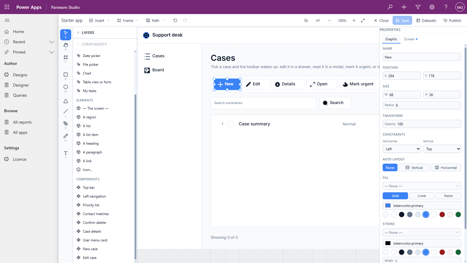
Drag one onto a screen to place a copy of it. Top bar and Left navigation are the chrome every screen shares. The others are overlay cards, the dialogs and drawers the screens open; an overlay card is a component with An overlay card ticked (see Modals and drawers from a form).
2. The main component
The main drawings sit on the canvas beside the screens rather than on any one of them. The Starter app keeps its top bar and menu to the right of the last screen. Select Top bar at the top of the layers list, and the properties panel says what it is:
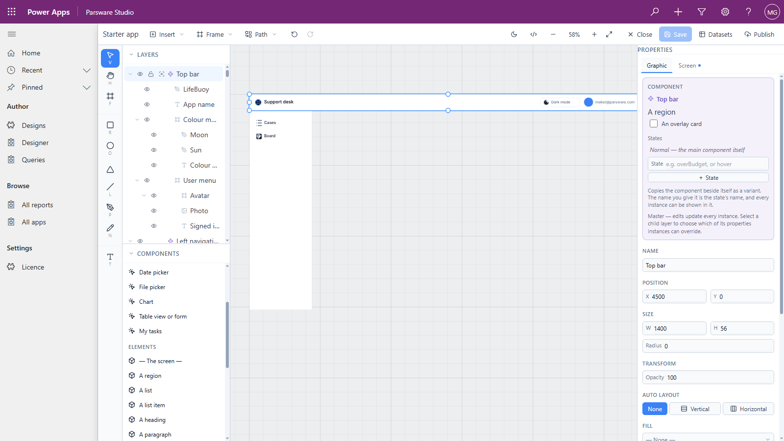
The layers list marks a main component with a cluster of four diamonds, and a copy with a single outlined one.
3. Change it once
Select the App name text inside the main top bar and change it. We typed Help desk over Support desk:
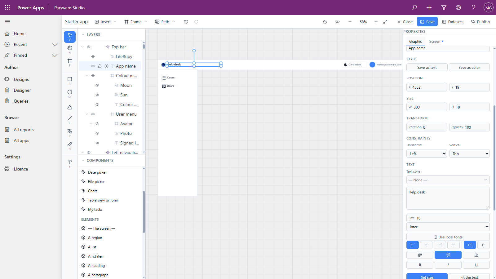
Now scroll to the Cases screen. Its top bar says Help desk too, and so does every other screen's:
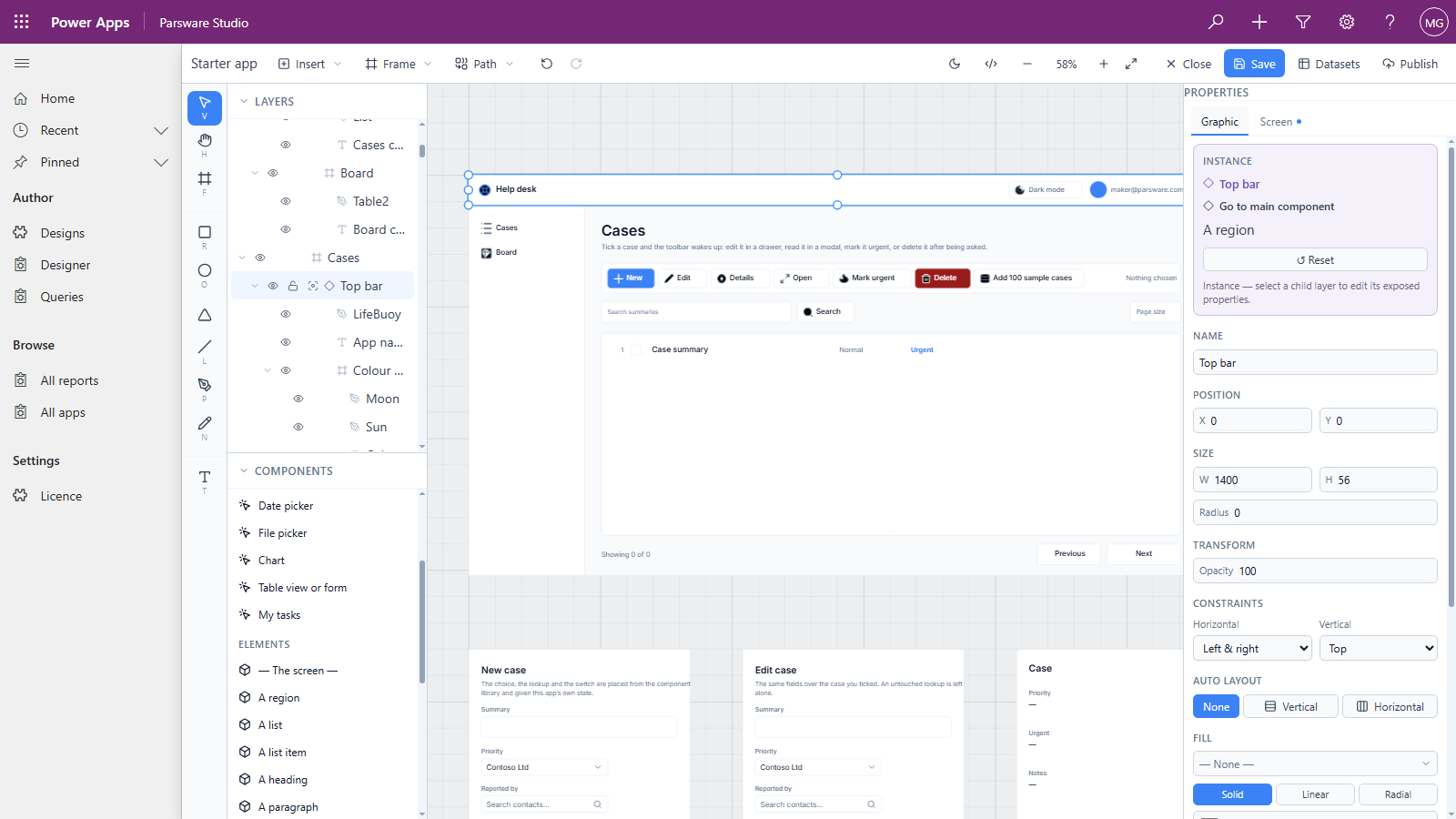
Selecting a copy says Instance. From there:
- Go to main component selects the main drawing, wherever it is on the canvas.
- Reset throws away anything changed on this copy and makes it match the main one again.
4. Make one of your own
Draw the part as an ordinary frame, then right-click it on the canvas and choose Create component. We used the Cases screen's toolbar:
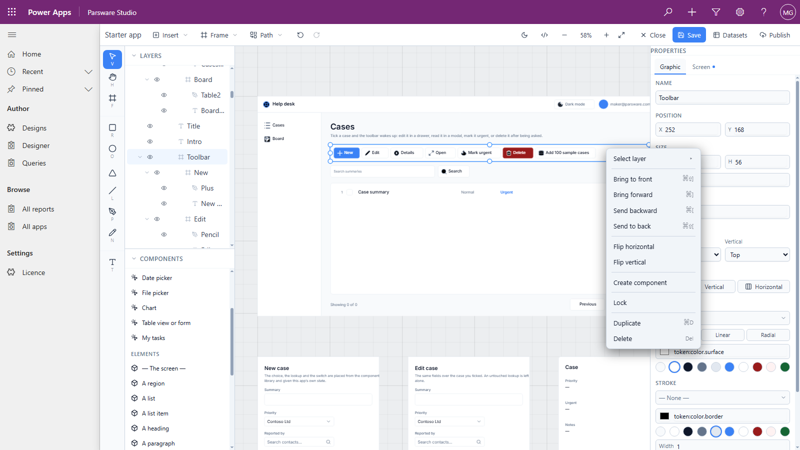
What you clicked becomes the main component, where it is, and the Components list gains it:
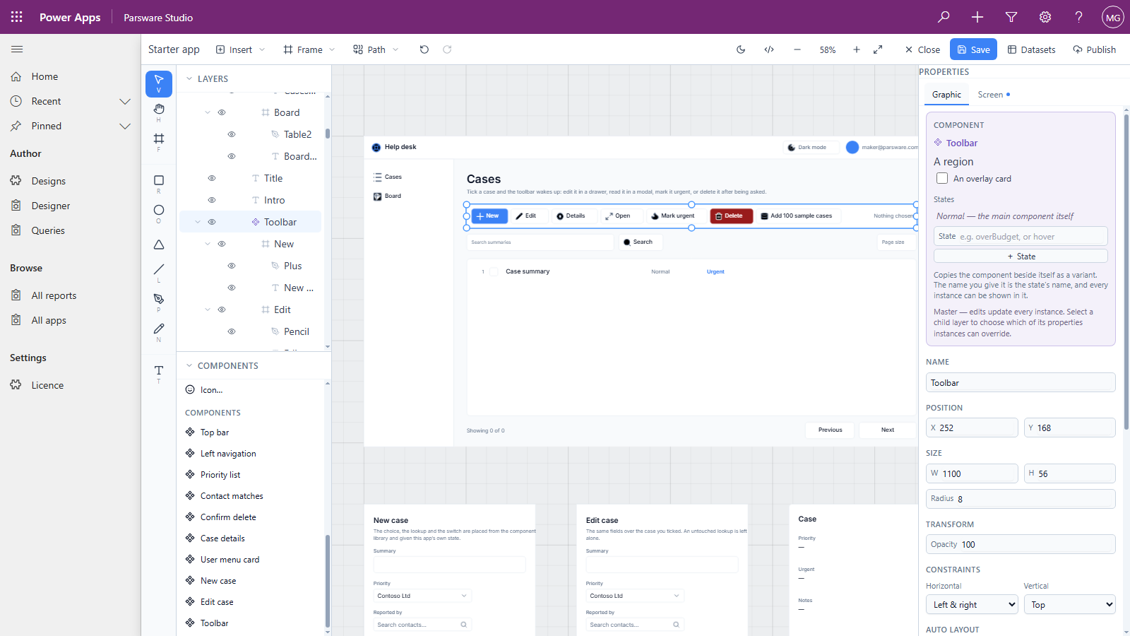
Drag Toolbar from the list onto the Board screen and you have a second copy. If the main one should live off the screens, as the top bar's does, move it there.
5. Let a copy differ
Every copy follows the main one, except where you allow otherwise. A screen's title, say, needs to differ from screen to screen, while the bar around it doesn't.
- A drawn property. On the main component, select a layer inside it and tick the properties copies may change, such as a text's words. Each copy then edits its own version on the canvas, and everything else still follows the main one.
- A value property. Select the main component, open the Screen tab and add one under
Component interface, then Properties. Inside the component it's read as
props.<name>; each copy sets it with an expression, such as"Cases"orstate.title. - An event. Under Events, name something the component can report, such as
changed. A handler inside the component raises it withemit("changed", value), and each screen that places the component decides what to do about it.
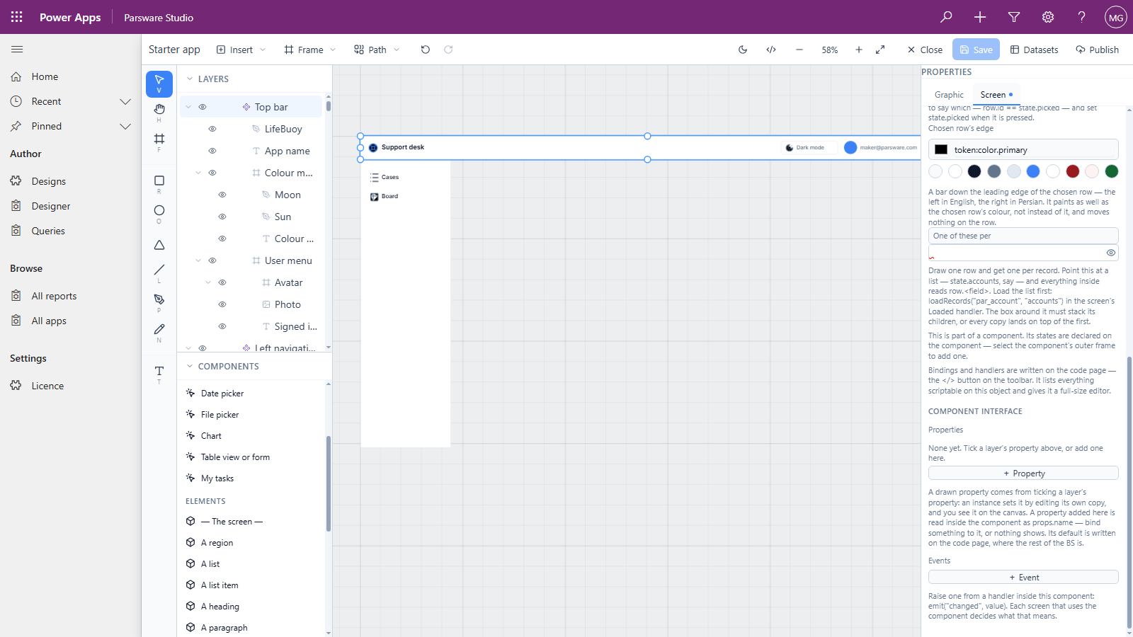
States belong to the main component too. + State copies it beside itself as a variant, and
the name you give it is the state's name. A state of your own, such as overBudget, can be chosen
on each copy; one called hover is turned on by the pointer instead.
Good to know
- Code goes on the main component. Bindings and handlers are written on the main drawing, so every copy runs the same script. On a copy, the code page asks you to select the main one.
- Components belong to their design. Every screen of the Starter app can use its top bar, but another design can't place it. Sharing components between designs, through a library in your solution, isn't in Parsware for Power Apps yet.
- Close without saving to undo the lot. Everything in this article was thrown away that way, and the Starter app is as it shipped.
Next
Right-to-left designs: a report in Persian or Arabic, and what follows the reader's language. The whole series is in the reading list.