For Power Apps
The designer inside Power Apps
Every Parsware report and screen is drawn in one designer, which runs as a page inside the Parsware Studio app. This is a tour of it, from the list you open a design from to the toolbar, the layers, the components, the canvas and the properties panel, and what changes between a report and a screen.
هذا المقال متاح بالإنجليزية فقط.
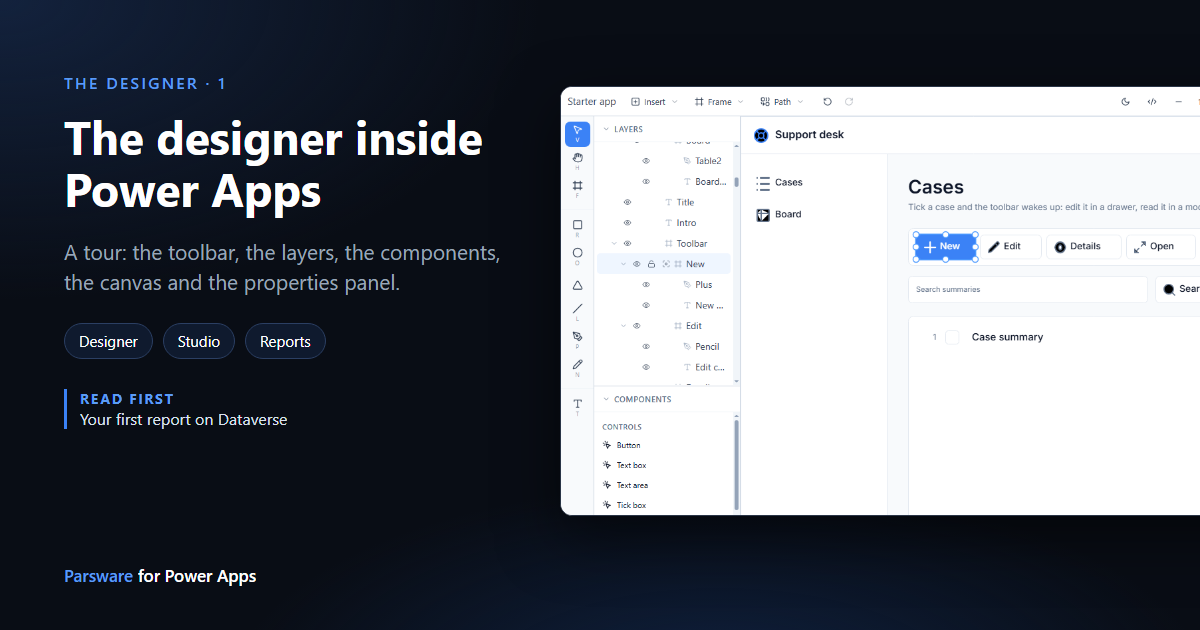
Every report and every Studio screen in this series was drawn in the same place: the Parsware designer. It isn't a separate tool you install or sign in to. It's a page inside the Parsware Studio app, so it runs in your Power Apps session and reads your environment as you.
This article is the tour we skipped in the earlier ones. We'll open the Starter app, a design the samples solution ships, and go round the screen once.
1. Open a design
In Parsware Studio, choose Designer in the navigation. It opens on the list of designs you can open: reports, Studio apps and saved queries, each with its kind under its name.
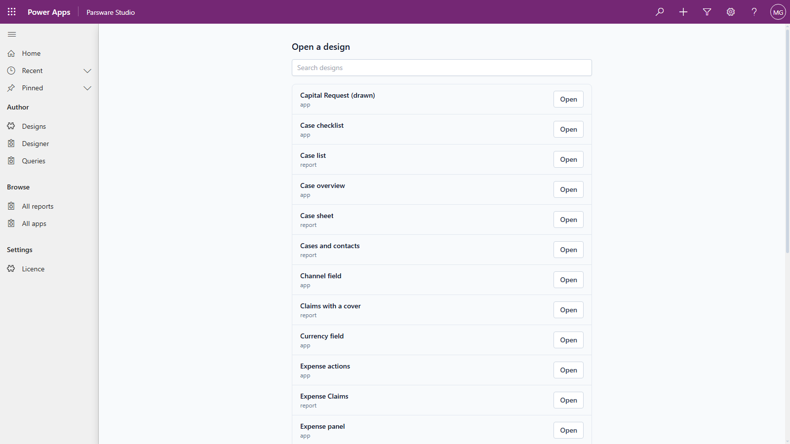
Type in the search box to narrow the list, and press Open. A new design starts as a row in Designs, with a name and a kind (see Your first report on Dataverse), and then appears here.
2. The five parts of the page
The canvas takes the whole page:
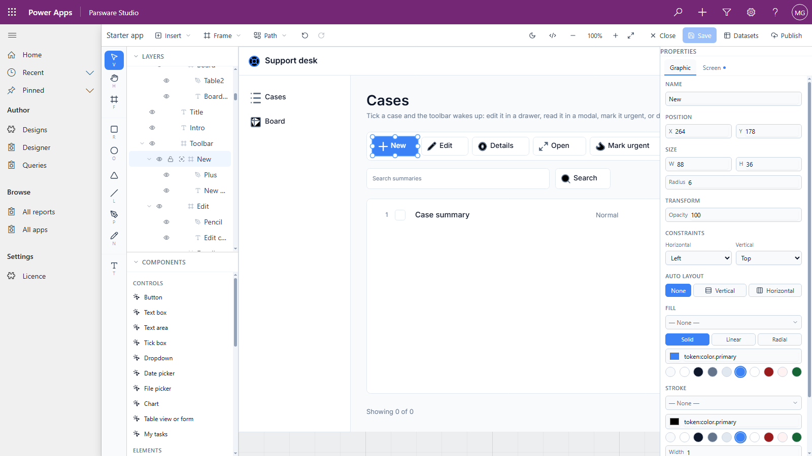
| Part | Where | What it's for |
|---|---|---|
| Toolbar | Across the top | The design's name, what you can add, and the commands that act on the whole design |
| Tools | The narrow strip on the left | Select, hand, frame, rectangle, ellipse, triangle, line, pen, pencil and text. Each has a key: V, H, F, R, O, L, P, N, T |
| Layers | Top of the left panel | Everything on the canvas as a tree. Click a name to select it, the eye to hide it, the lock to stop it moving |
| Components | Bottom of the left panel | Ready-made controls to drag onto a screen, and the components you've made yourself |
| Properties | The right-hand panel | Everything about what's selected |
The canvas in the middle scrolls and zooms. Hold the space bar, or pick the hand, to drag it; the −, + and percentage on the toolbar zoom it. Drag the line between Layers and Components to give either more room, or click a heading to fold it.
3. The toolbar, left to right
- Insert adds an image, the design's default styles, a report page, a sample report to start from, a chart, a barcode or a QR code.
- Frame adds a frame at a preset size: phones, tablets, desktops, paper and social images.
- Path combines the selected shapes into one.
- Undo and Redo, also Ctrl+Z and Ctrl+Y.
</>opens the code page for the selected object (see Scripts on a screen).- The zoom controls, and full screen, which hands the whole browser window to the canvas.
- Close goes back to the list. It doesn't ask about unsaved changes: whatever you haven't saved is thrown away, so save first.
- Save keeps your draft. It's greyed out until something has changed.
- Datasets says where a design's rows come from.
- Publish releases the design into one of your solutions (see Publish: drafts versus what users see).
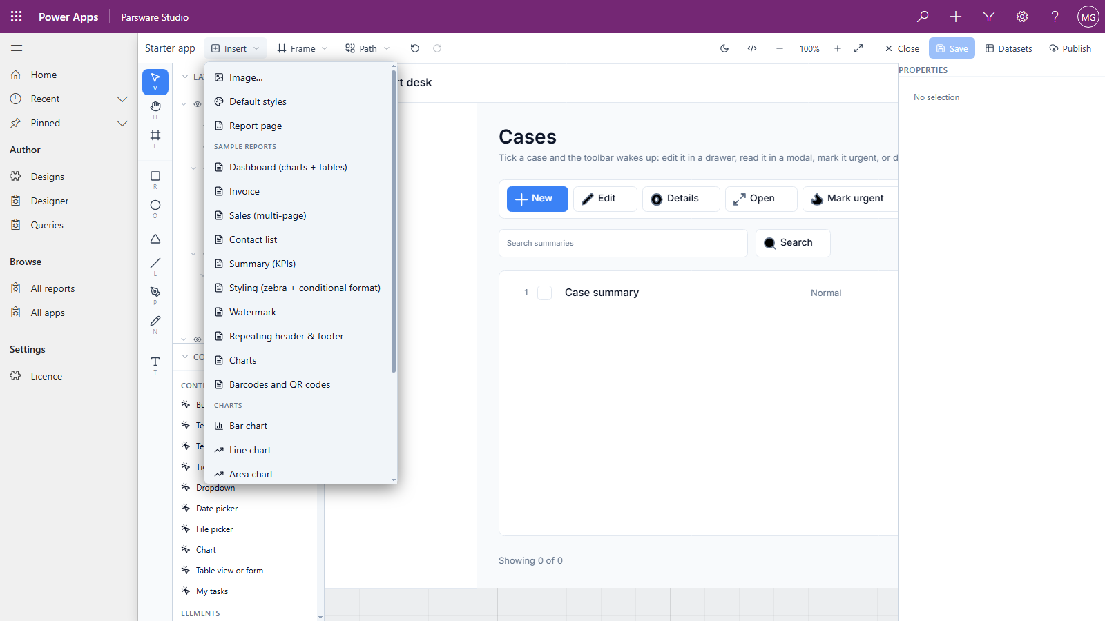
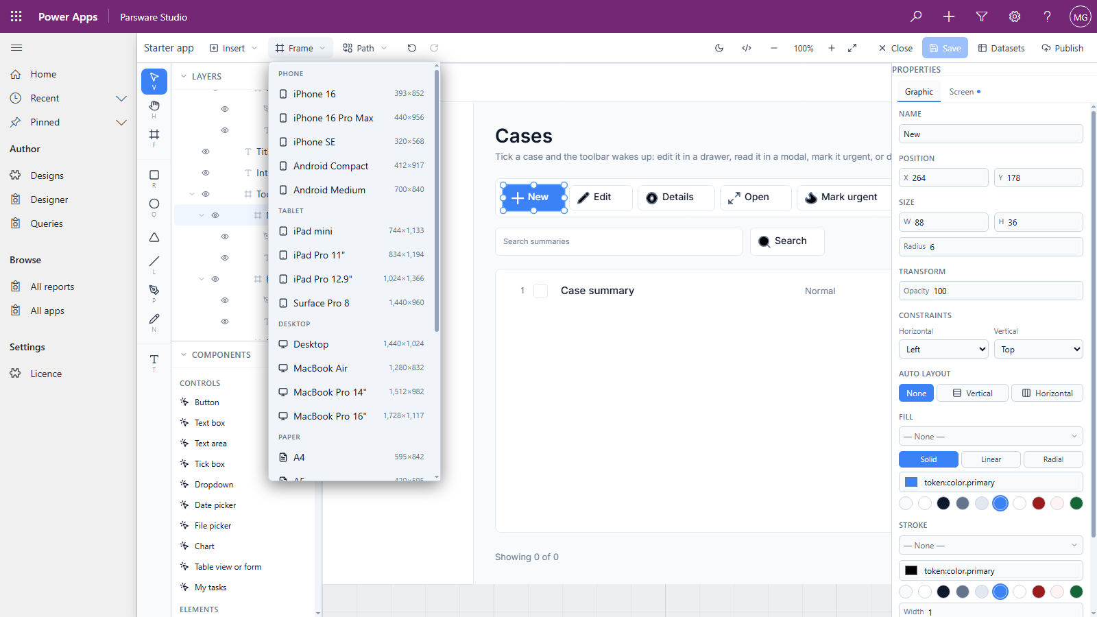
4. The properties panel has two tabs
The Graphic tab is about how the selected object looks: its name, position, size, constraints, fill, stroke, shadow and, for text, the font and alignment. It's the same for every design.
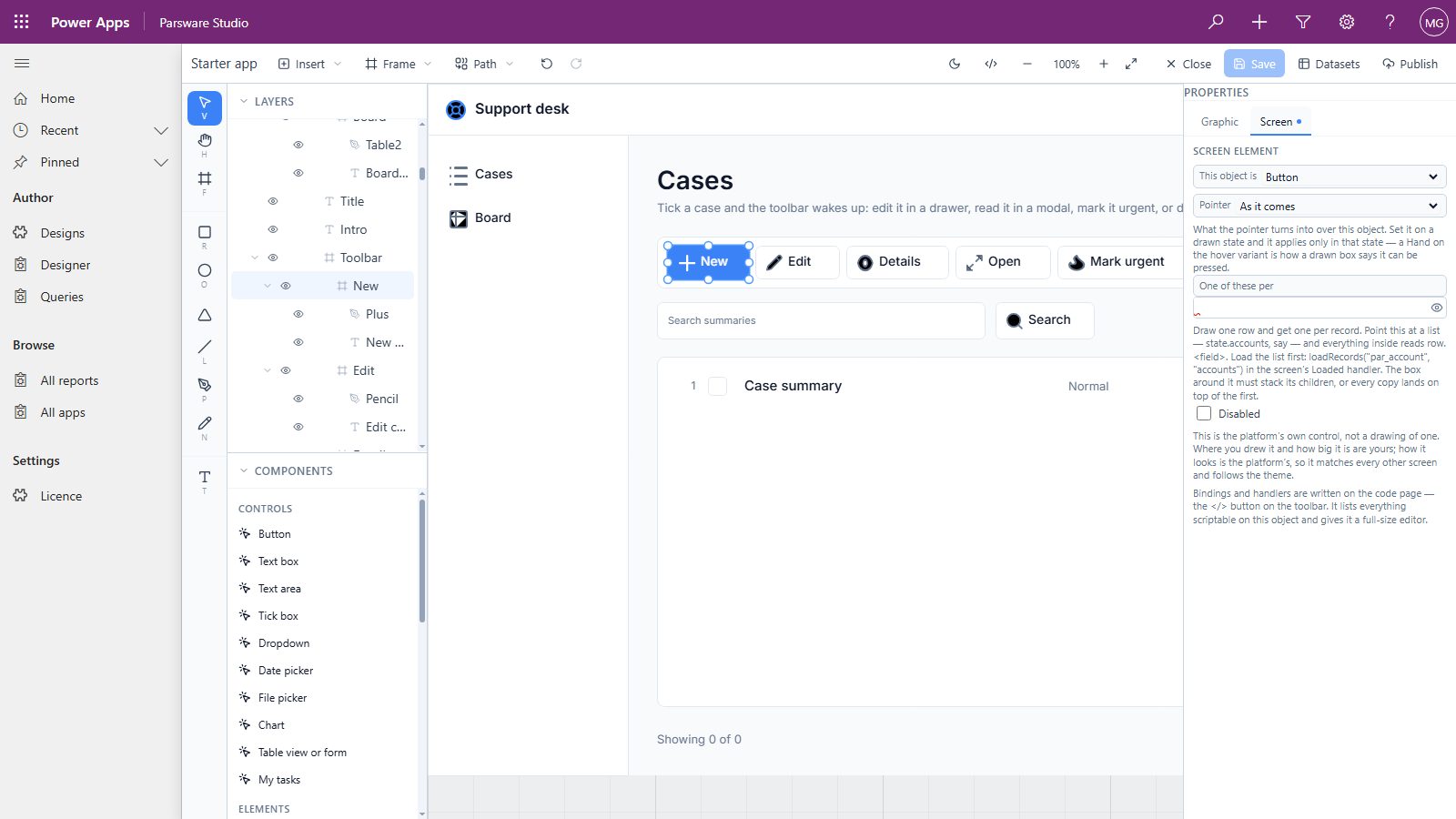
The second tab depends on what you're drawing. In a Studio app it's Screen, and it says what the object is. Our New button is a Button, so a screen will render it as a real button that can be pressed, focused and read by a screen reader:
5. A report is the same designer, with three differences
Open a report and the page looks the same, except:
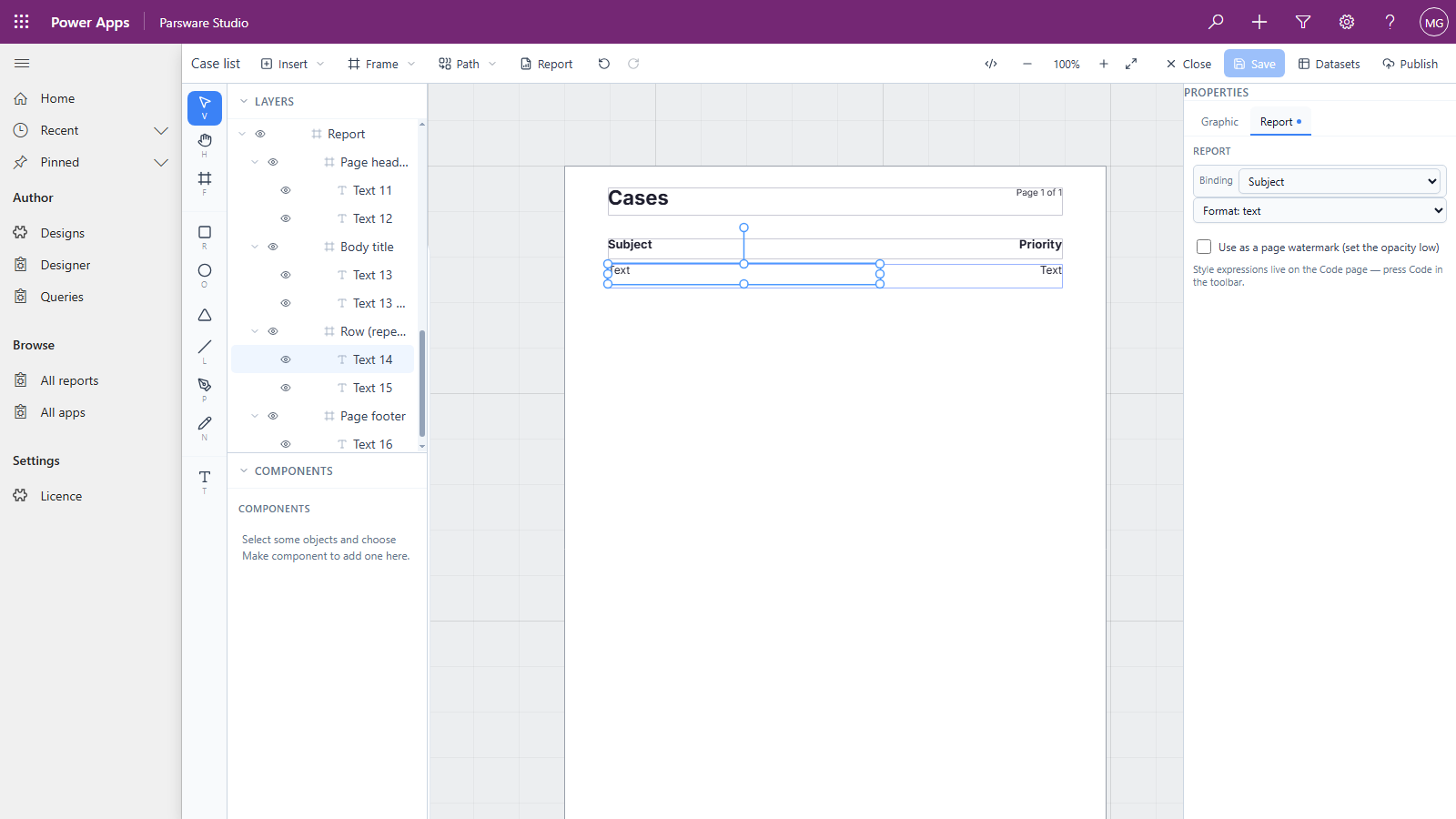
- The second tab is Report. It says which part of the page a frame is (page header, repeater, page footer and so on) and which column a text box prints.
- There's a Report button on the toolbar, which previews the report with real rows.
- There's no moon. A Studio app can be previewed in dark mode; a report is printed, and paper has no dark mode.
Good to know
- Saving is a button, not automatic. Close without saving and the change is gone, with no question asked. That makes trying something out free, and it makes forgetting to save costly.
- The pickers read your environment. Tables, views and columns are chosen from lists, not typed. That's the next article.
- Two controls don't work in Power Apps yet. The Components list offers Table view or
form and My tasks, which belong to the Parsware Platform. On a Power Apps screen they show a
note instead of rows. To show a table's rows on a screen, use
loadRecords, as in Screens that read Dataverse rows. - Only makers need the designer. Parsware Studio lives in your development environment; your users open what you published, in your own apps.
Next
Tables, columns and views in the pickers: every place the designer asks for something in your Dataverse environment, and the list it offers. The whole series is in the reading list.