For Power Apps
Modals and drawers from a form
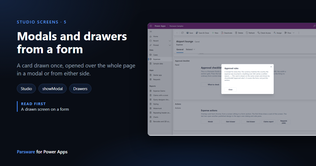
A screen on a form doesn't have to fit everything in its section. It can open a card in a modal over the whole page, or slide one in from either side as a drawer, and close it again. Each card is drawn once, beside the screen, and opened by name.
هذا المقال متاح بالإنجليزية فقط.
A form section is a fixed strip of the page. Some things a screen wants to show don't belong in it: the rules for approving an expense, the person's last few claims, a guide to the currency codes. Those are better over the form for a moment and then gone.
A Studio screen can do that from a form, three ways:
- a modal, centred over the whole page with the form dimmed behind it;
- a start drawer, sliding in from the side a line of text starts on;
- an end drawer, from the other side.
This article uses the Expense actions screen from the samples solution. Import it as in The samples, and sample data, open Expenses in the Parsware Samples app and pick any expense.
Press the buttons
Near the bottom of the form, the Actions section is a drawn screen with five buttons. The first three open overlays:
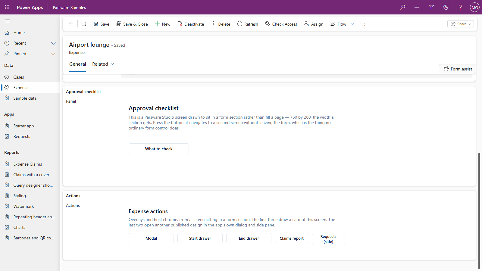
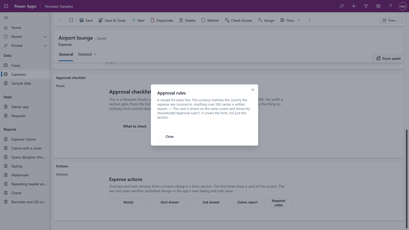
Modal shows the Approval rules card over the page. The form behind it is dimmed, and Close, the cross, Escape or a click on the dimmed form puts it away:
Start drawer slides Recent claims in from the left, and End drawer slides the Currency guide in from the right. Both run the full height of the window:
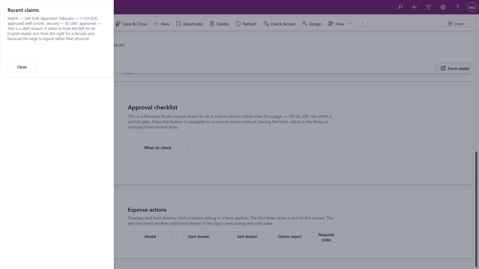
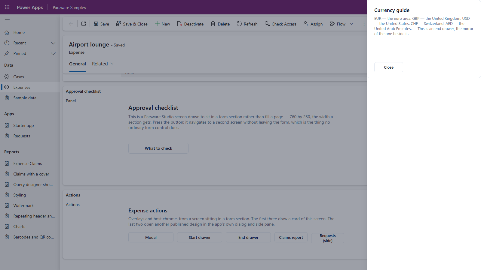
The modal and the drawers cover the whole page, not just the section the screen sits in. A card has the room it needs however small the screen that opened it.
How it's built
Open Expense actions in the Parsware Studio Designer. Beside the screen, outside its frame, are three cards: Approval rules, Expense history (headed Recent claims) and Currency guide.
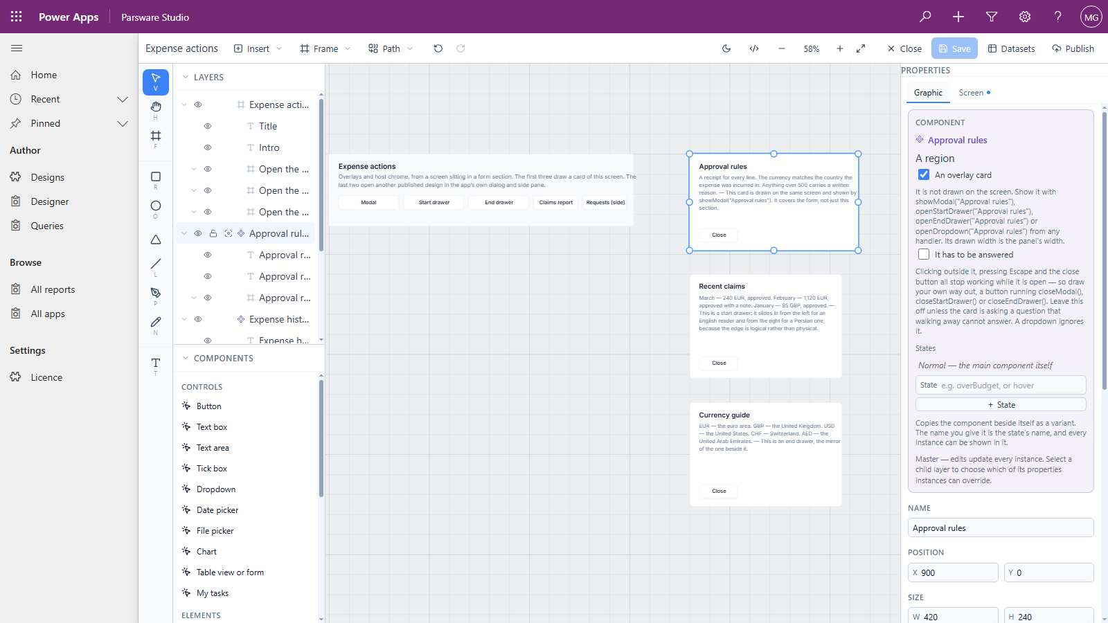
Each one is set up the same way:
-
Draw the card beside the screen, where there's room: a frame with a heading, a paragraph and a Close button.
-
Make it a component: right-click it and choose Make component. The component's name is the card's name.
-
Tick An overlay card in the component's box on the Graphic tab. It stops being drawn on the screen and becomes something a button can show.
-
Open it from a button. On the button's Pressed:
To Write show it centred over the page showModal("Approval rules");slide it in from the start side openStartDrawer("Expense history");slide it in from the end side openEndDrawer("Currency guide");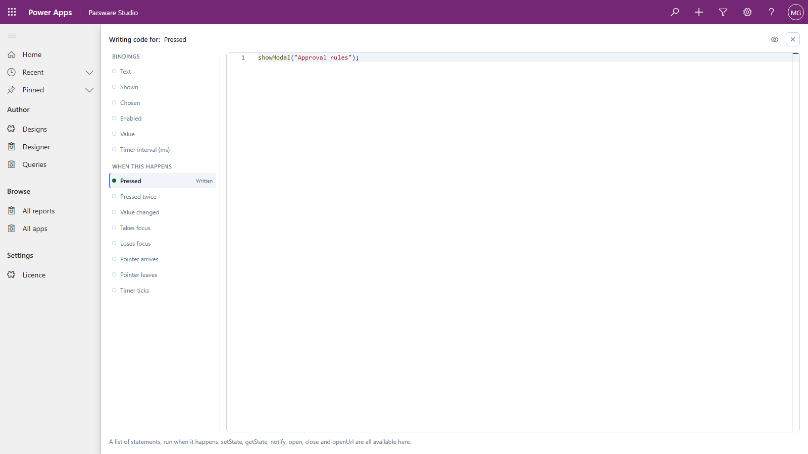
-
Give it a way out. The card's own Close button calls
closeModal();,closeStartDrawer();orcloseEndDrawer();. A drawer has no close button of its own, so draw one.
The same card can be opened either way: which of the three calls you use decides where it appears, not where you drew it.
Start and end, not left and right
The drawers are named by the side a line starts on, not by left and right. For an English
reader a start drawer comes in from the left. For a Persian or Arabic reader, whose page runs right
to left, the same openStartDrawer brings it in from the right, so the drawer always comes from the
side the reader's eye starts on. You write the screen once.
Good to know
- One of each at a time: a screen has one modal and one drawer on each side, and any card can be shown in any of them.
- A card that has to be answered. Under An overlay card there's a second tick, It has to be answered: clicking outside, Escape and the cross then stop working, and only your own buttons close it. Keep it for questions such as Delete these four records?
- Cards can be scripted like the screen. A card's buttons can do anything a screen's can: write a record, change the screen's state, then close.
- A card is part of this design. To open a different design over the form, such as a report
or another app, use
openDesign. That's the next article.
Next
Open another design: a button on a form-hosted screen opening a report in Power Apps' own dialog, or an app in its side pane. The whole series is in the reading list.