Parsware Platform
Auto layout
Rows and columns that arrange themselves: a frame that lines up what is in it with one gap and one padding, keeps it lined up as you add things, and lets one child take the spare room. Trying it, we fixed Ctrl+D, which used to drop the copy on top of the next item instead of into the row.
هذا المقال متاح بالإنجليزية فقط.
Snapping and alignment lines shapes up once. Auto layout keeps them lined up. A frame with auto layout arranges what is in it into a row or a column, with the gap and padding you choose. Add something, remove something or resize something, and the rest moves to make room.
It's how tab bars, toolbars, menus, forms and lists of cards are drawn. On a running screen it becomes the browser's own row and column layout, so what you see on the canvas is how the screen behaves.
We worked in a 760 by 420 frame on an empty part of the Starter app sample's canvas, without saving.
A row
We drew a frame called Tab bar and three blue tabs inside it, placed by hand and a little untidy:
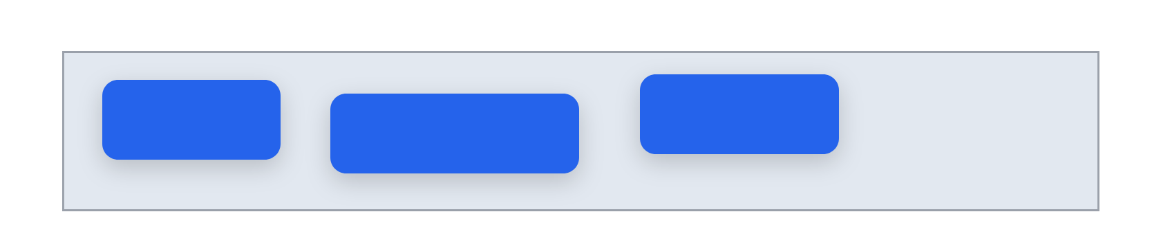
Select the frame and Properties has an Auto layout section. It starts on None:
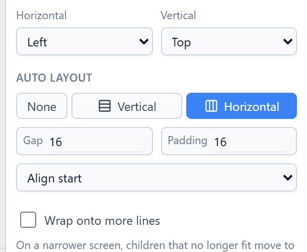
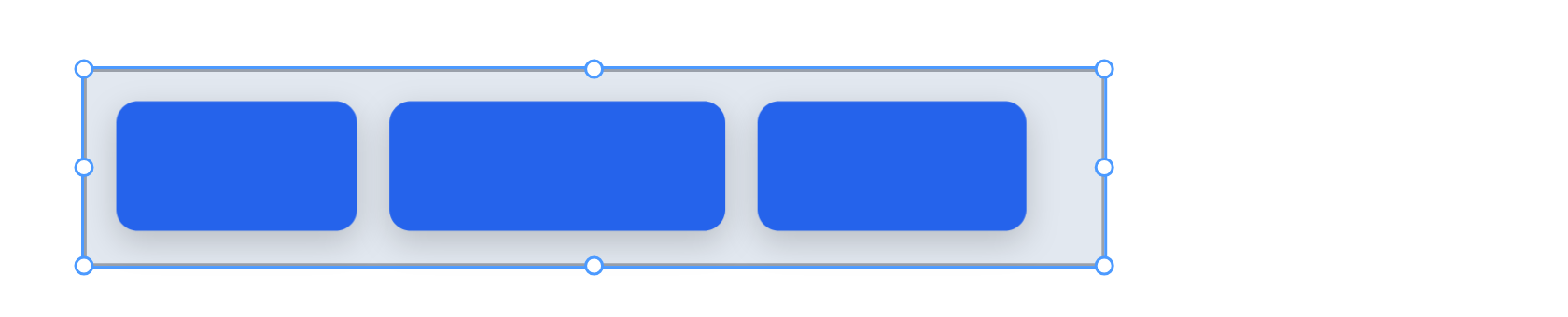
We pressed Horizontal. The tabs moved into a row, 16 apart, 16 in from the edges, and the bar shrank to fit them:

Two things happened that are worth knowing:
- The tabs are now the bar's height, less the padding. In a row, each child stretches to fill the height, and in a column, the width. That is what makes a row of buttons line up whatever height you drew them.
- The frame fitted itself to its contents once, when you turned auto layout on. After that its size is yours again. Drag its edges or type a width, and the contents are laid out inside it.
Gap is the space between children and Padding the space inside the frame's edges. We set both to 12:
Adding to the row
Draw or drop a shape into the frame, and it joins the row. Select a tab and press Ctrl+D, and the copy goes in right after it:

The bar keeps the size you gave it, so a fourth tab runs past its edge until you widen it. That's deliberate: a frame that grew every time you added something would push the rest of the screen around.
To move a child along the row, drag it on the canvas and let go where it should be. The row puts it in that place and closes up behind it.
New: a copy joins the row. Ctrl+D used to put the copy 16 pixels down and right of the original, on top of the next tab, and the row only took it in when something else made it lay itself out again. It goes straight into the row now, after the tab you copied.
Spreading the row out
The dropdown under Gap and Padding says where the children sit along the row when there's room to spare:
- Align start, Align center or Align end: packed together at one end or in the middle.
- Space between: the first and last against the padding, and the space shared out between the rest.
- Space around: the same space on both sides of every child.
We widened the bar to 680 and chose Space between:

One child takes the spare room
Select a child of an auto layout and the Graphic tab has a Resizing section:
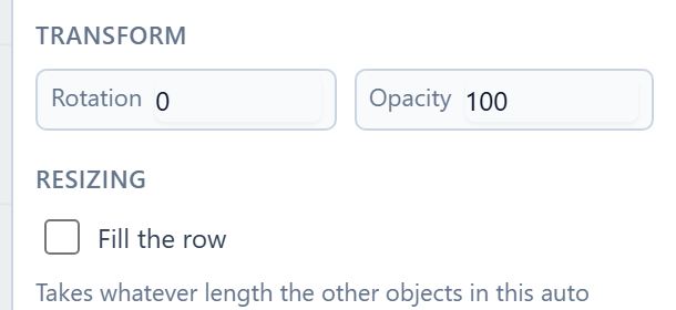
Tick Fill the row (or Fill the column in a column) and that child takes whatever length the others leave. It gives it back when there is less. We put the bar back to Align start and let the second tab fill:

This is how a website's top bar works: the site name fills the row, so the links stay against the far edge however wide the window is.
Under Resizing too:
- Max width, for a frame inside a column: it stretches across a narrow screen and stops at that width on a wide one, centred. It's how a sign-in card is drawn once for a phone and a desktop.
- A horizontal frame's Wrap onto more lines: when the screen is too narrow for the whole row, the children that don't fit move to the next line. Three cards across a desktop become one above another on a phone.
A column
Vertical does the same thing downwards. We drew a sign-up form: a frame, two white fields and a green button, and turned on Vertical with a gap of 12 and padding of 16:
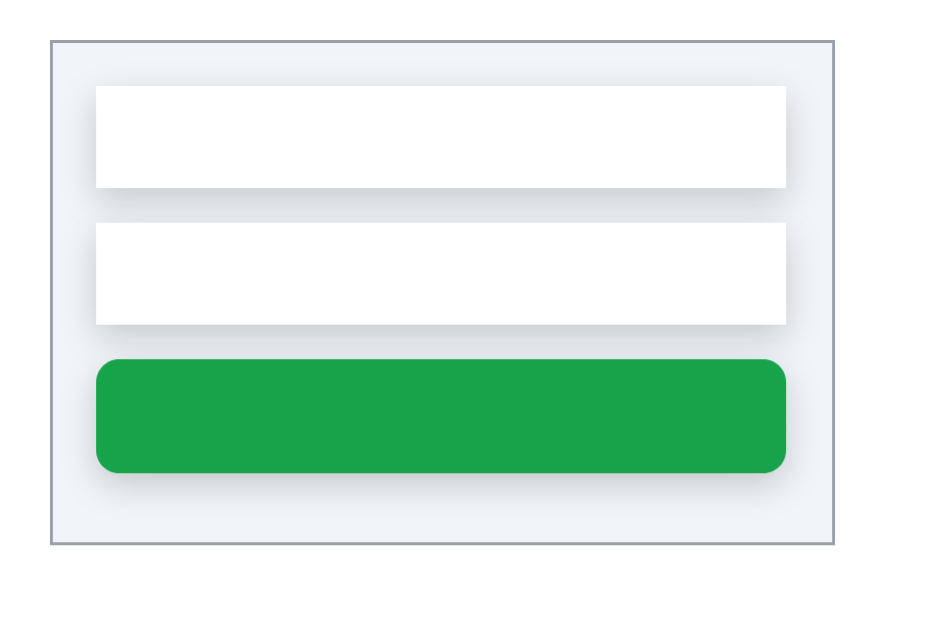
All three are now the width of the form, less its padding, so the fields and the button line up without measuring.
Frames inside frames
A child of an auto layout can be a frame with an auto layout of its own: a row of buttons inside a column, inside a card. That's how whole screens are built, and each level lays itself out.
Inside an auto layout, the layout decides where things go, so Constraints don't apply there. Resizing is the only question left. In a frame with auto layout set to None, each child has Constraints instead, as in Frames and screen sizes.
Try it
Draw a frame with three rectangles of different sizes in it and press Horizontal. Set the gap to 12, select a rectangle and press Ctrl+D, then widen the frame and try Space between. Tick Fill the row on one rectangle. Then draw a second frame, put three rectangles in it and make it a Vertical column.
Next: resize constraints.