Parsware Platform
Frames and screen sizes
A frame is a screen, a page or a box that holds other things. Start one at a phone's size, draw inside it, and turn it into a tablet: what's inside follows the rules you give it.
هذا المقال متاح بالإنجليزية فقط.
Everything on the canvas lives in a frame or is one. A screen of a Studio app is a frame. So is a page of a report, a drawer, a modal, a card on a screen and a row in a list. A frame is a box that holds other things: move it and they move with it, resize it and they follow rules you give them.
We drew on an empty part of the Starter app sample's canvas and didn't save, so the sample is unchanged.
A frame at a known size
The Frame menu in the toolbar adds an empty frame at a standard size, in the middle of what you're looking at: phones (iPhone 16, iPhone SE, Android Compact…), tablets (iPad mini, iPad Pro, Surface Pro 8), desktops and laptops, and paper (A4, A5, Letter…). We picked iPhone 16, 393 by 852, and renamed it Phone screen:
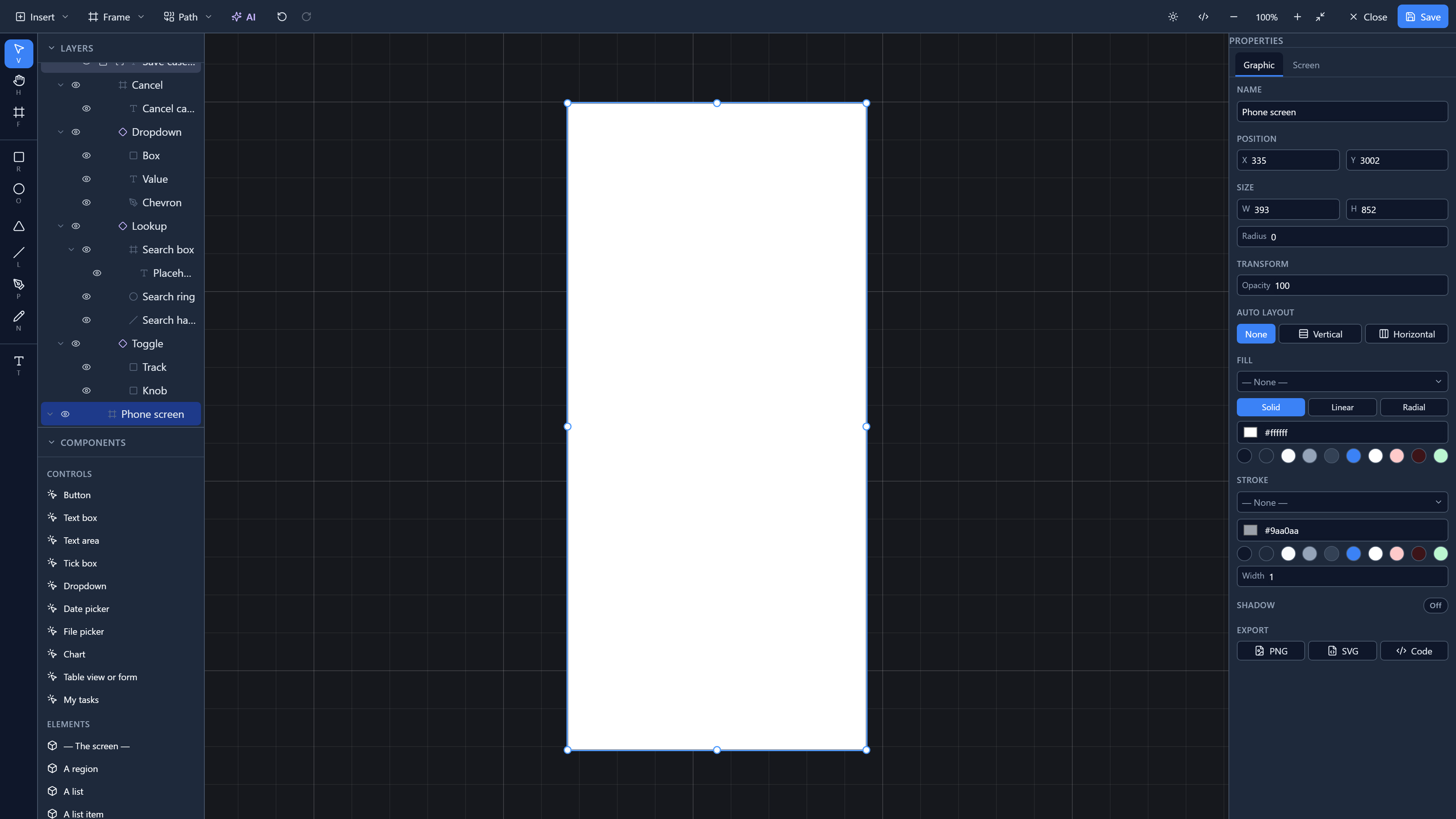
Sizes are in the units a browser uses for CSS pixels, so a 393-wide frame is a 393-wide phone screen. Paper sizes are in points: A4 is 595 by 842.
The Frame tool (F) draws a frame of any size: drag out a box, like a rectangle.
Drawing inside it
Anything you draw or drop with its centre inside a frame goes into the frame. We drew a rectangle across the top for a header, a frame inside the frame for a card with a circle in it, and a rectangle at the bottom for a button:
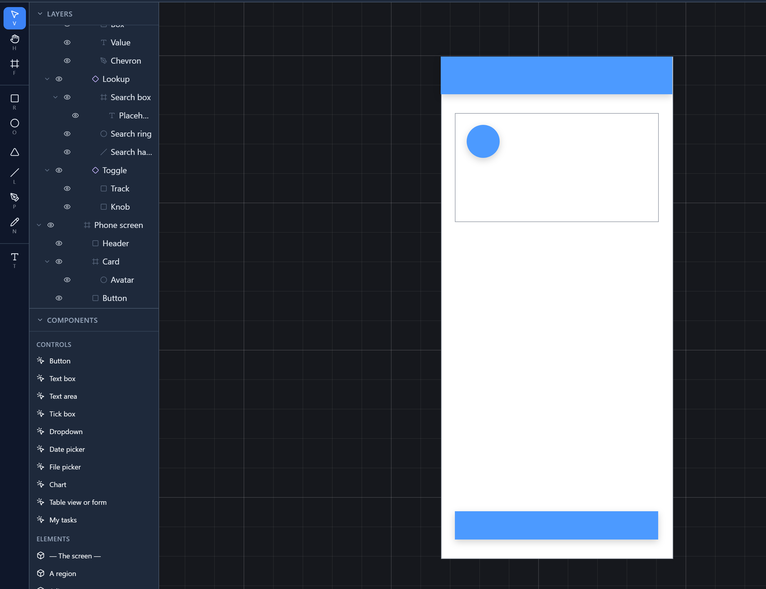
Layers shows it as a tree: Phone screen holds Header, Card and Button, and Card holds Avatar. A frame inside a frame is the usual way to build a screen: a card, a toolbar, a row.
Selecting the frame itself
Clicking inside a frame selects what's drawn there, because that's what you usually want. To select the frame, click once on an empty patch of it, or click its row in Layers. A drag from an empty patch draws a selection box around its contents instead.
A selected frame has its own properties:
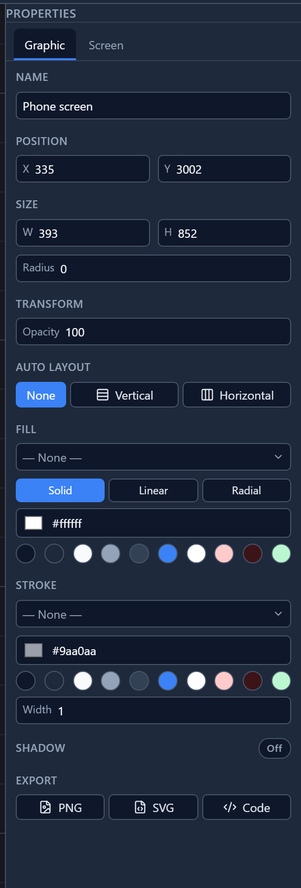
Two things differ from a shape. There's no Rotation: a frame doesn't turn, because a screen doesn't. And there's Auto layout, which arranges what's inside into a row or a column for you; it has its own article later in the series.
Changing the size
Drag a frame's handles, or type a new W and H. Each thing inside it then follows its Constraints, which you set on the thing, not on the frame:
- the header: Left & right, so it stretches to the new width;
- the card: Left & right, the same;
- the button: Left & right, and Bottom, so it stays on the floor.
We typed 744 by 1,133, the size of an iPad mini:
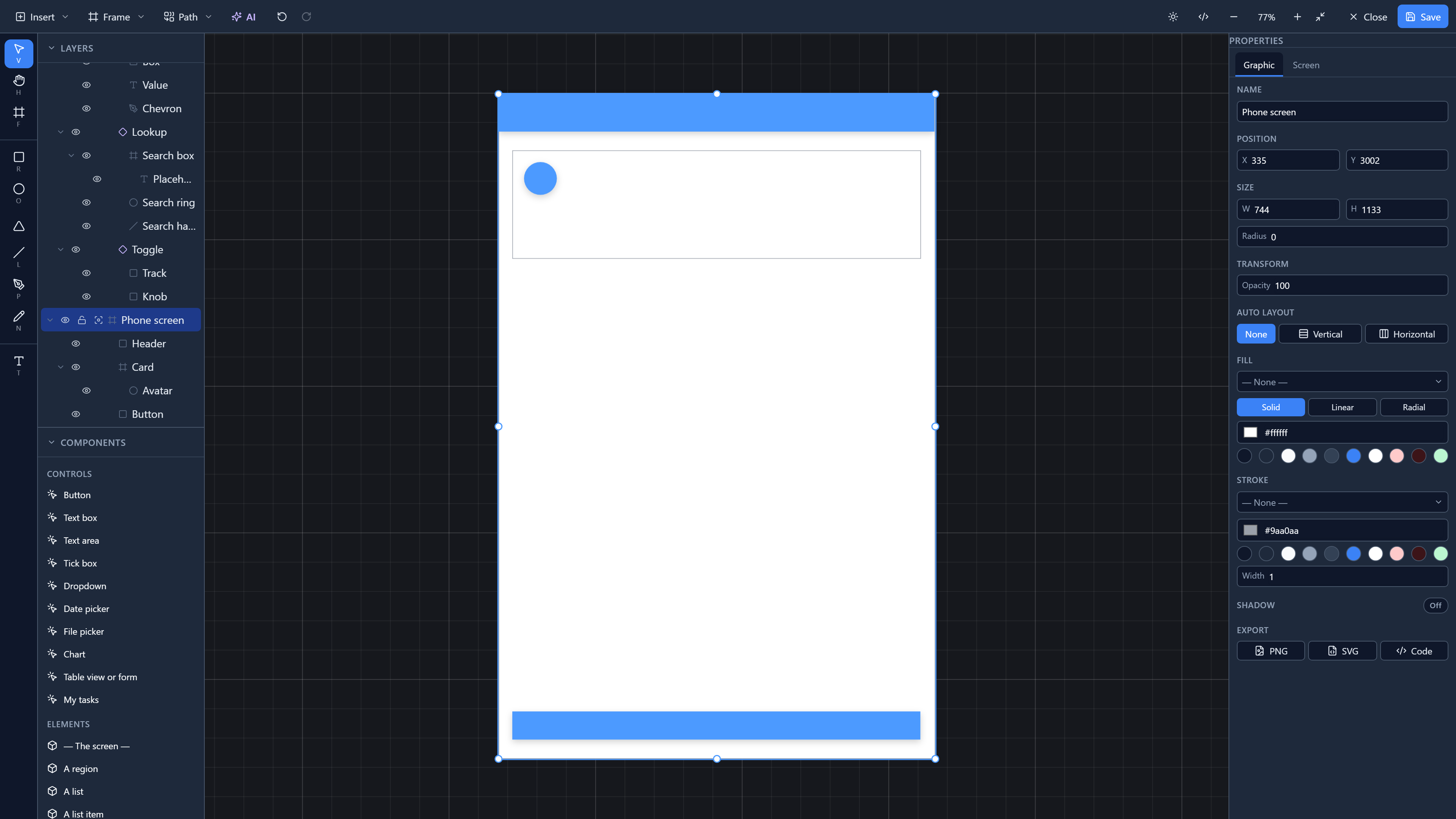
The circle kept its size and its place: it's pinned to the top left of its card, which is the default for anything you draw. Constraints have an article of their own later in the series.
Try it
On an empty part of any canvas, choose Frame → iPhone 16. Draw a rectangle across its top and set its horizontal constraint to Left & right. Click an empty patch of the frame, type a new W, and watch the rectangle follow.
Next: shapes, selecting them, and moving, resizing and turning them.