Parsware Platform
Read a chart
The charts on a Parsware dashboard do more than sit there. Hover over a bar or a slice for its exact number, and select a legend entry to hide that series, so the rest can be read on its own. Here is what each one tells you, and the one thing to watch for.
این مقاله فقط به انگلیسی در دسترس است.
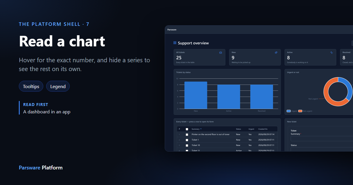
A dashboard answers "how many?" at a glance. The charts on it also answer the next question, "how many exactly?", if you know where to point. This article is for the people who read dashboards rather than build them.
We used the Support overview app from the studio-dashboard sample, the same dashboard 034 built (a dashboard in an app). Every picture is the real product.
The dashboard
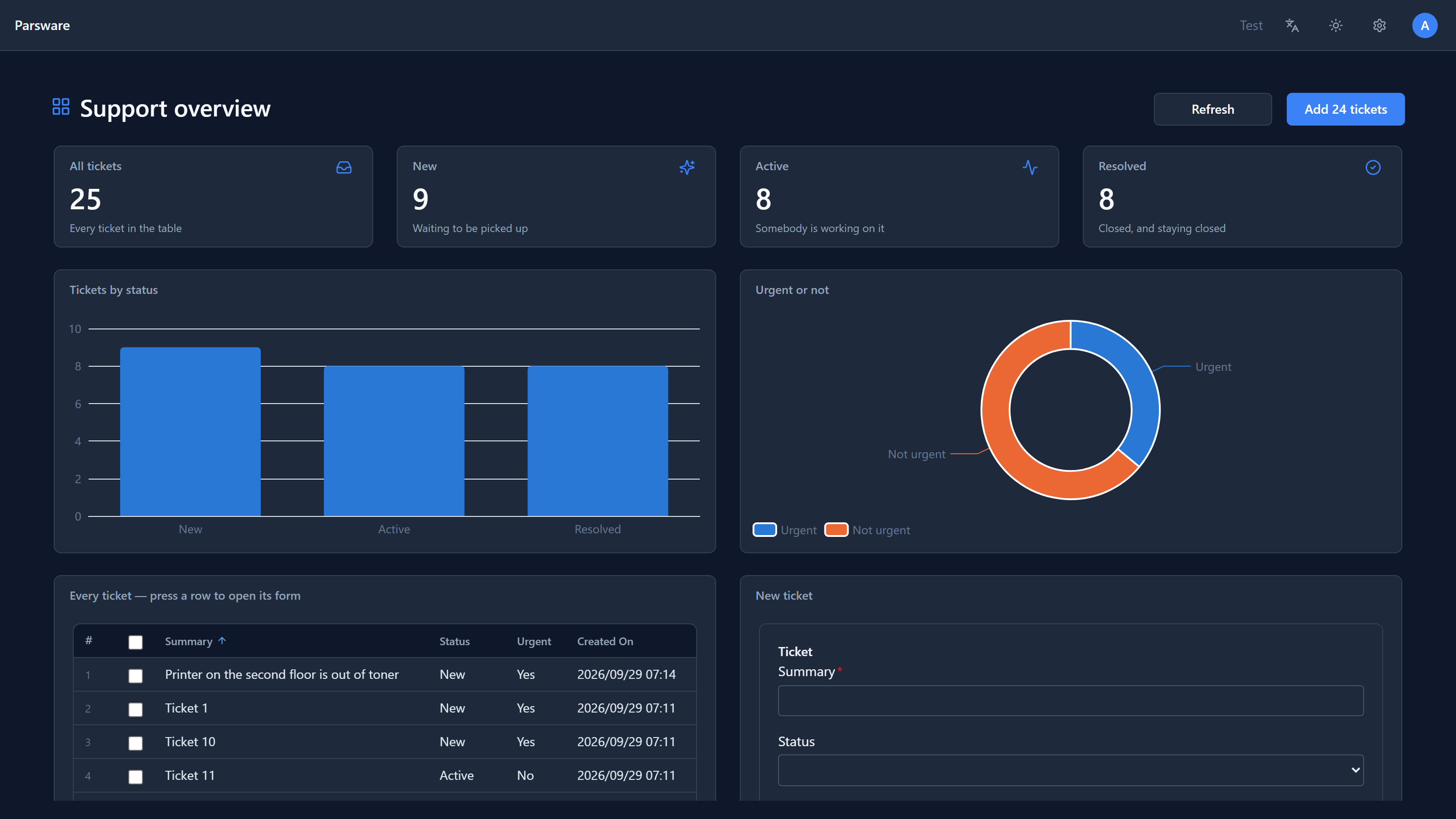
The tiles along the top are single numbers. The two charts below them break the same tickets down: Tickets by status as bars, Urgent or not as a ring. The numbers come straight from the tickets table each time the page loads, and Refresh at the top fetches them again.
Hover for the exact number
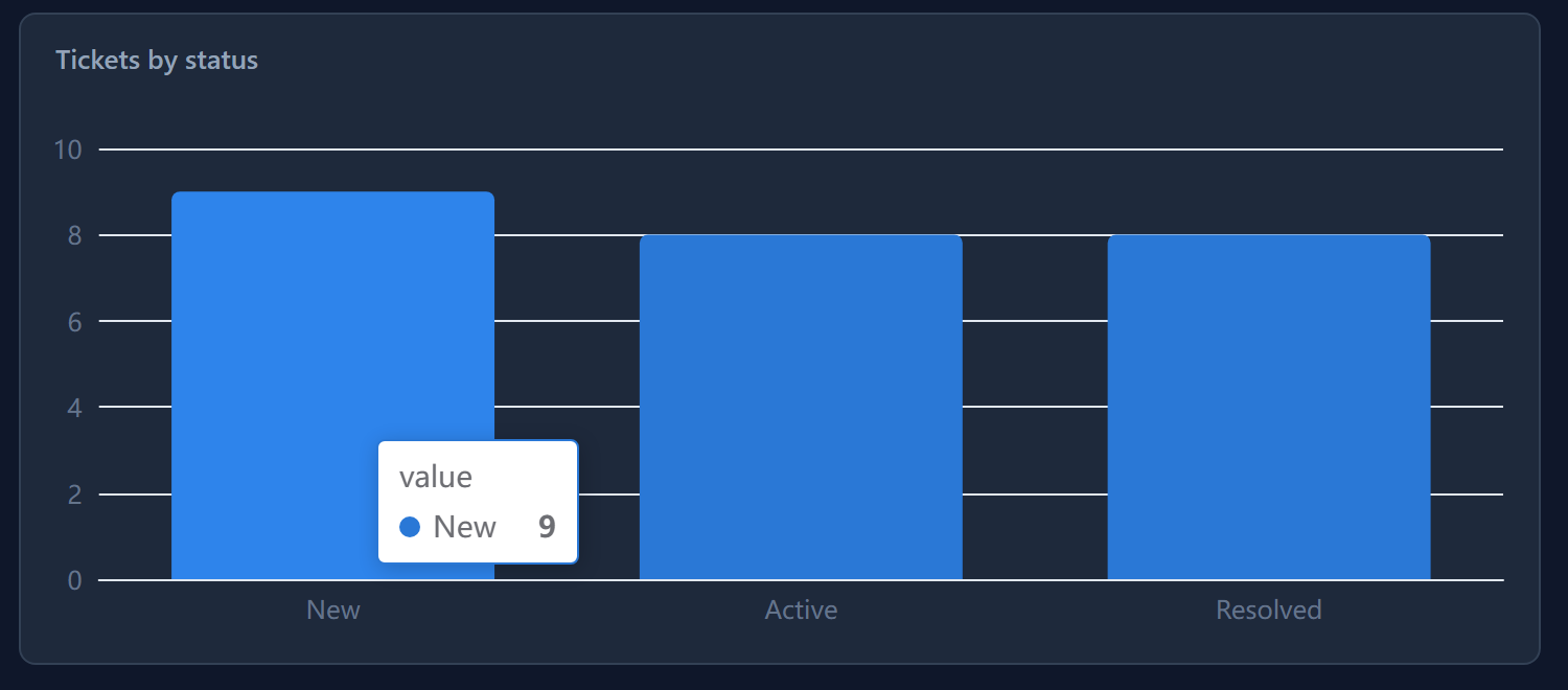
An axis tells you roughly how tall a bar is. Point at the bar and it tells you exactly:
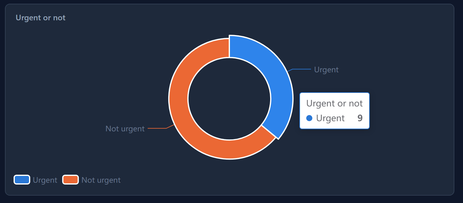
The same works on a slice of the ring:
Hide a series with the legend
The small coloured keys under a chart are its legend. Select one and that series is hidden; its key turns grey. Select it again to bring it back.
We hid Urgent:
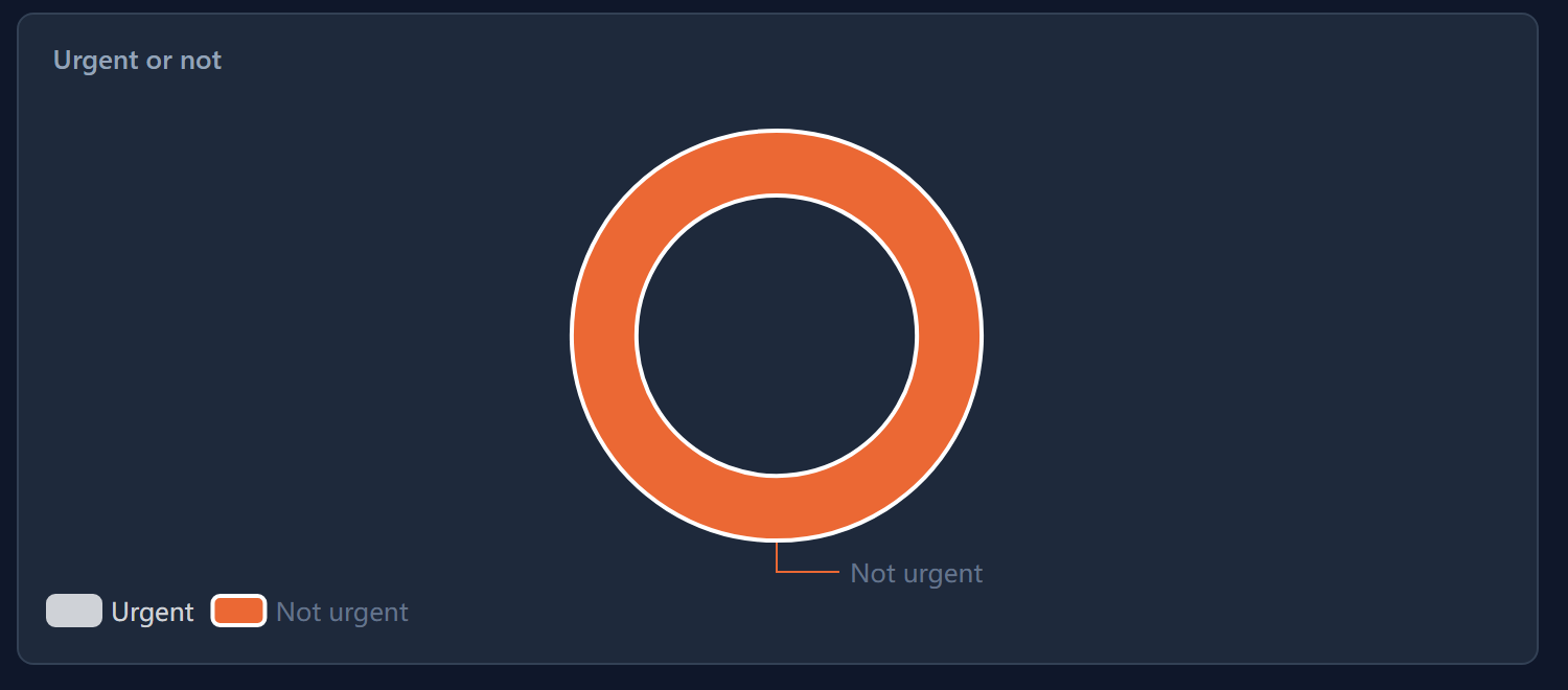
This is useful when one series is so large the others are hard to read, or when you want to compare two series without a third in the way.
Watch the ring, though. A ring always adds up to a whole circle. With Urgent hidden, Not urgent fills all of it, which reads as "every ticket is not urgent" if you forget you hid something. The grey key is the only reminder, so check the legend before you read a ring.
Hiding a series is yours alone. It changes nothing for anybody else, and it goes back to normal when you reload the page.
What the chart counts
A chart shows what its maker asked the platform to count: here, tickets grouped by status, and by whether they are urgent. It counts only the records you are allowed to see, so two people can see different numbers on the same dashboard. That isn't a fault. It's the same rule every list in the app follows.
If a number looks wrong, open the list behind it. The grid on this dashboard shows the same tickets, and filtering it (work with records in a view) is the quickest way to check a count by hand.
Next: designing a query, the question a chart, a report and a script can all ask.