Parsware Platform
Choose the control a field uses
A field's type decides what it stores. Its control decides how people fill it in. Turn a yes-or-no field into a switch with its own words, show a date in the Persian calendar, and put a control you built yourself on a form.
Este artículo solo está disponible en inglés.
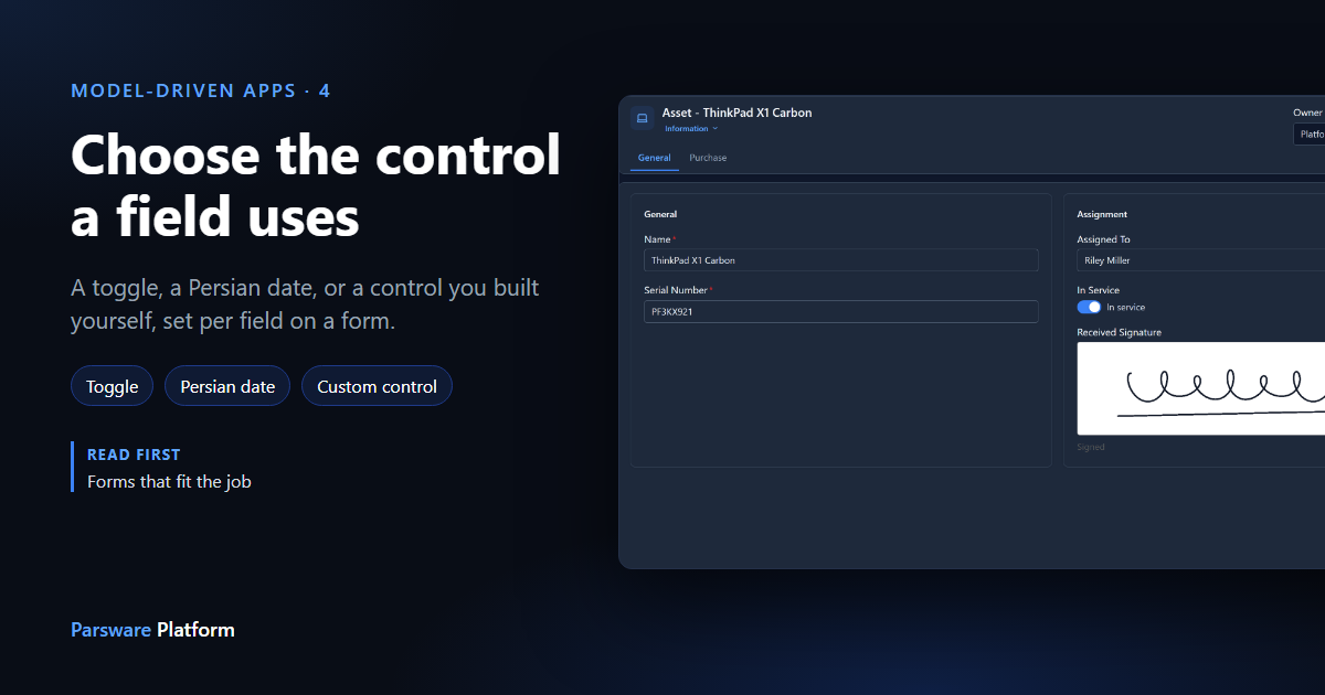
The same field can be filled in more than one way. A yes-or-no field can be a checkbox or a switch. A date can be written in the Gregorian calendar or the Persian one. And some fields need something the platform doesn't ship, such as a box to sign in.
In Required, read-only and default controls we gave a field a default control, used on every form. This article sets the control on one form only. We carry on with the Asset table's Information form from Forms that fit the job. Every picture is the real product.
A switch with its own words
Open the form in the Form Designer and select In Service. The Control list offers the controls that suit a yes-or-no field: Check and Toggle. It starts on Default (Check), which means it follows the field.
Choose Toggle. Two more boxes appear, Yes label and No label: the words shown beside the switch. We used In service and Retired, which say more than Yes and No.
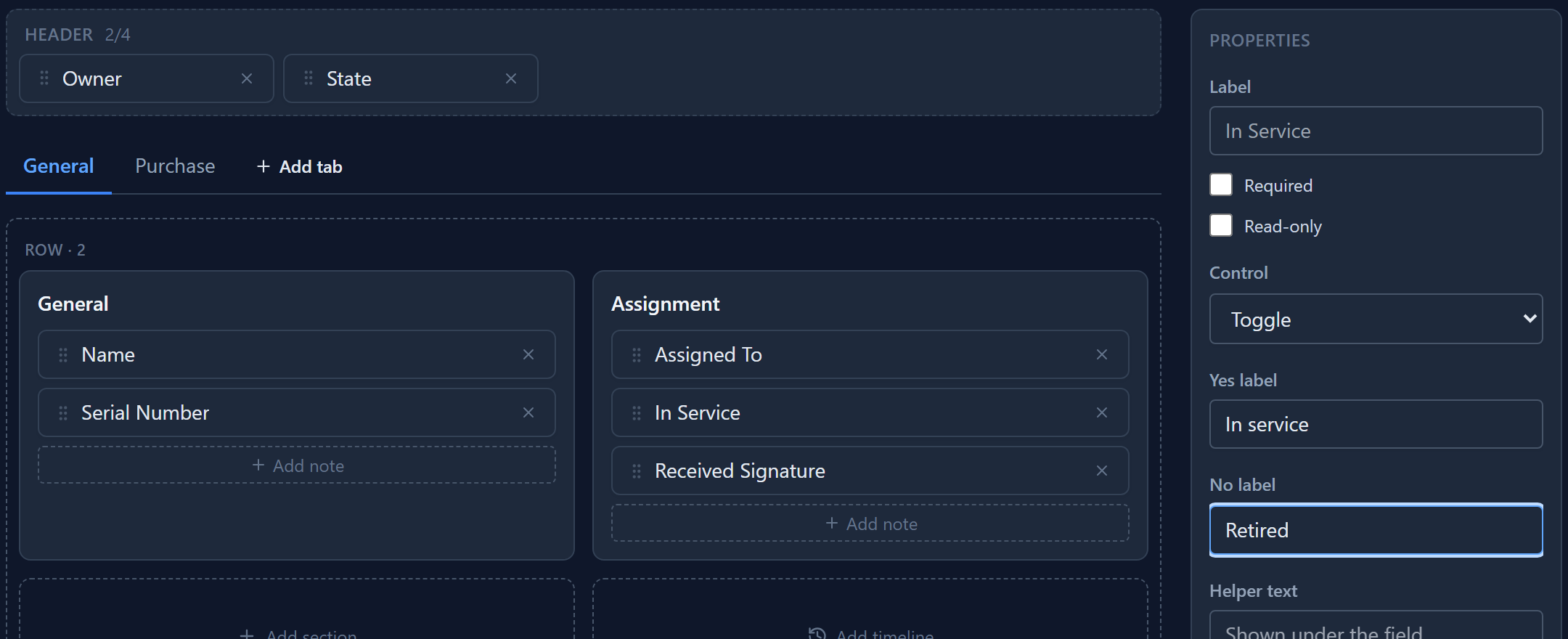
The list only offers controls that fit the field. A text field gets Text and Text Area, a date gets the date controls, and a lookup gets the record picker. You can't give a date a checkbox.
A date in the Persian calendar
On the Purchase tab, select Purchase Date. Its controls are Date, Date and Time and Time, and each has a Persian version. Choose Persian Date.
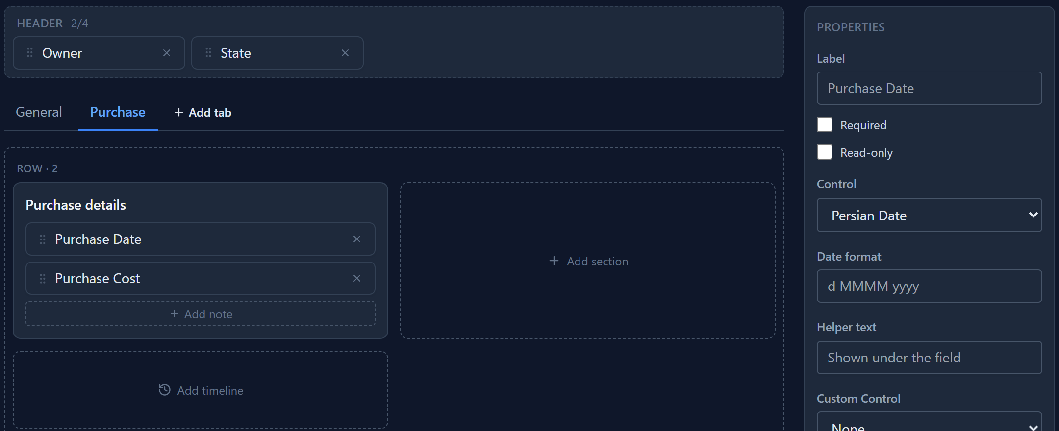
Naming a calendar here means this field always uses it, whatever the app's calendar setting says. Leave the control on Default and the field follows the app's setting instead (Settings → Calendar), so one switch changes every date in the app.
Date format is optional. Leave it empty and a Persian date is written in full, such as ۲۲ بهمن ۱۴۰۳. The date is stored the same way whichever calendar shows it, so changing the control never changes the data.
A control you built
When no built-in control fits, you can build your own and put it on a field. Custom controls are React components, packed into one file and added to your solution under Custom Controls. Building one gets its own article later in this series; here we use the Signature Pad sample that comes with the platform.
We added a Received Signature field (multiline text, since a signature is stored as a picture written out as text) and placed it under In Service. Select it and a Custom Control list appears below the others, offering the installed controls that can stand in for this field. Choose Signature Pad.
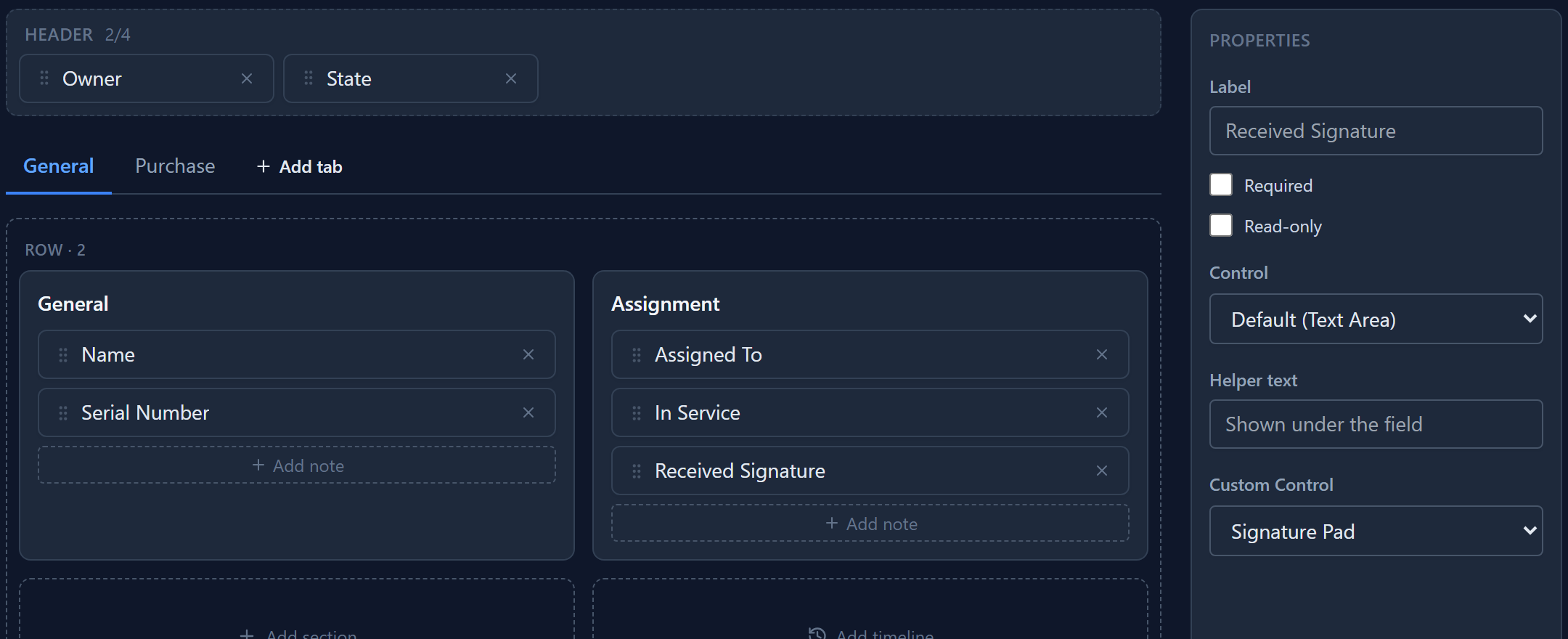
A custom control replaces the field's own control, so it wins over whatever Control says. If the control isn't installed in an environment, for example because its solution wasn't imported, the field falls back to its own control and the form still works.
What people see
Save the form and open an asset in the app. In Service is a switch that says In service, and whoever takes the laptop signs for it on the form:
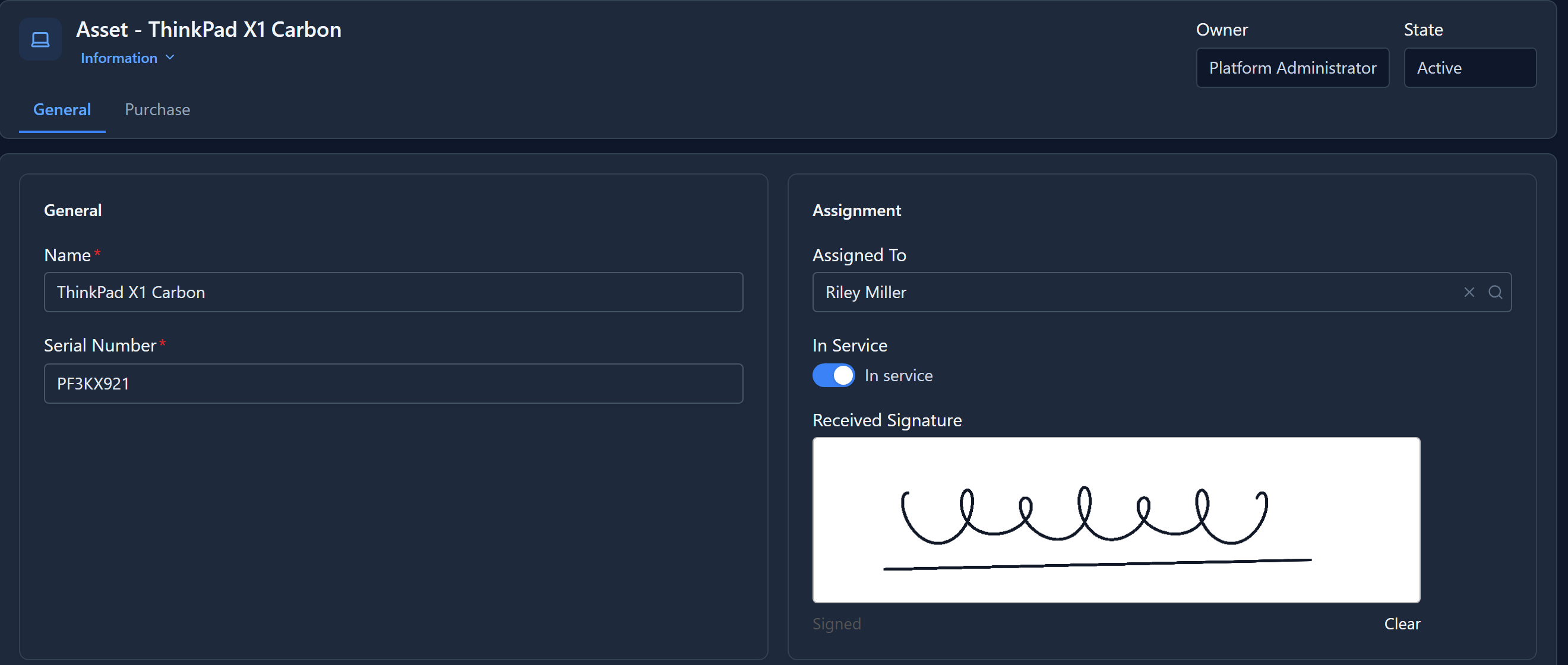
The signature is saved with the record like any other value. On the Purchase tab, the purchase date is in the Persian calendar:
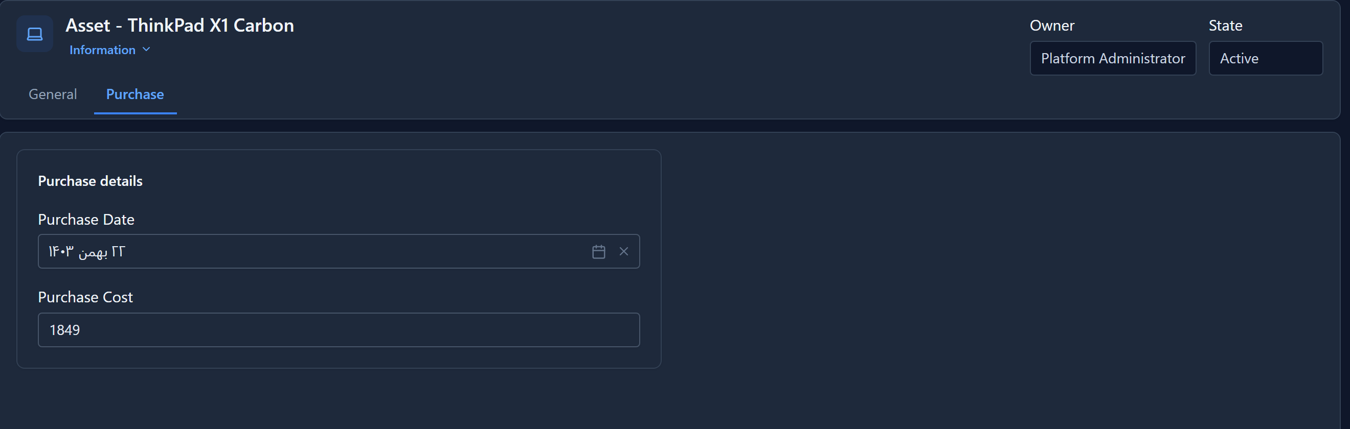
Two things we fixed while writing this article. Any click inside the signature box used to reach its own Clear button, so a signature was wiped the moment you let go of the mouse. And on an English page a Persian date was shown in the wrong order, with the year before the month. Both work as shown here now.
In short
| You want | Choose |
|---|---|
| A switch instead of a checkbox | Toggle, with a Yes label and a No label |
| One date always in the Persian calendar | Persian Date (or Persian Date and Time, Persian Time) |
| Every date to follow the app's calendar | Default |
| A control the platform doesn't have | A Custom Control from your solution |
The control is saved with the form, so it moves with your solution to Test and Production.
Next: views, the lists people work in.