Parsware Platform
Shared styles and design tokens
One colour, text style or shape style used everywhere and changed in one place, and design tokens that make it follow light and dark mode. Trying them, we fixed three things in the style dropdown: it ignored the keyboard, showed every token as the same blue, and squeezed its own banner.
Cet article n’est disponible qu’en anglais.
A brand colour picked for one card has to be picked again for the next one, and the one after that. When the colour changes, every card has to be found and changed by hand. Shared styles end that. You define a colour, a text style or a shape style once, other shapes follow it, and a change to it reaches all of them.
Design tokens go one step further. A token stands for a job, like Primary or Surface, rather than a colour, so whatever follows a token also follows light and dark mode.
We worked on an empty part of the Starter app sample's canvas, without saving.
The style guide
Insert → Default styles drops a frame called Styles onto the canvas. It's a style guide made of ordinary shapes: colours, text styles from Heading 1 to Caption, and two shape styles, Card and Pill.
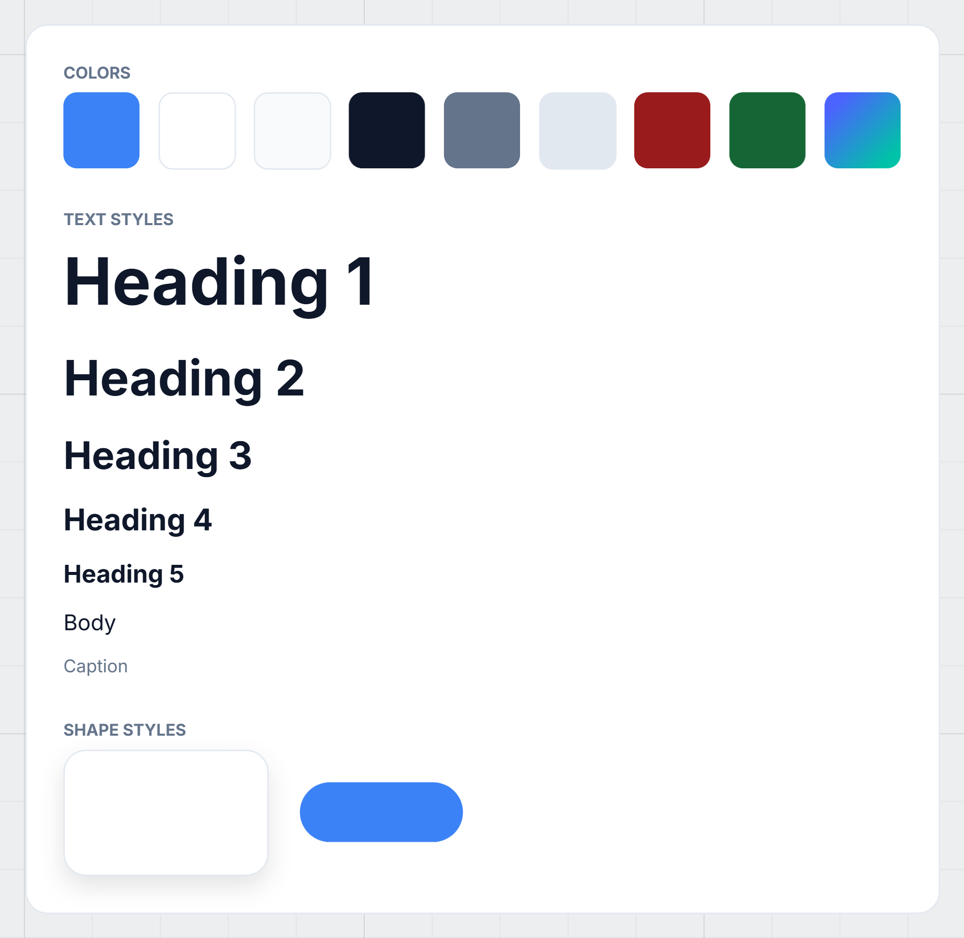
Each one is a real shape you can select and edit. That's the whole idea: the shape is the style. There's no separate list of styles kept somewhere else. A style is a shape that has been marked as one, and it lives on the canvas where you can see it.
The colours in this frame are design tokens rather than fixed colours, so everything that follows them comes out right in both light and dark mode.
Making a style of your own
We drew a small rectangle, named it Brand teal and filled it with #0d9488. Under Style,
Properties offers two buttons:
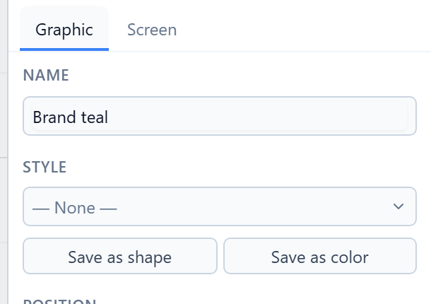
- Save as color makes the shape's fill a colour style.
- Save as shape makes its whole look a shape style: fill, border, corner radius, opacity and shadow.
A text has Save as text instead, for its font, size and weight.
We pressed Save as color. The Style section now says what the shape is, and how many shapes follow it:
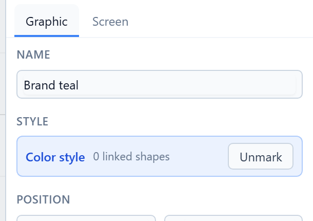
Unmark turns it back into an ordinary rectangle. Anything that followed it keeps the colour it had.
Following a style
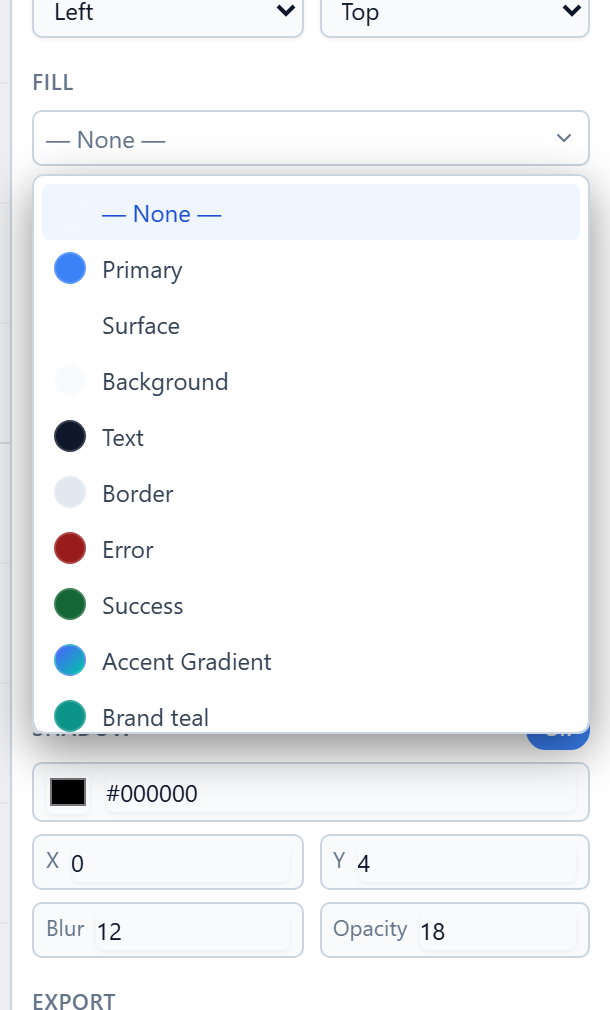
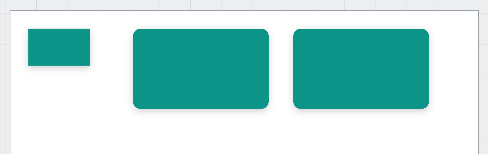
We drew two cards, selected the first and opened the dropdown above Solid, Linear and Radial in the Fill section. It lists every colour style on the canvas: the tokens from the style guide, then Brand teal.
We chose Brand teal for both cards:
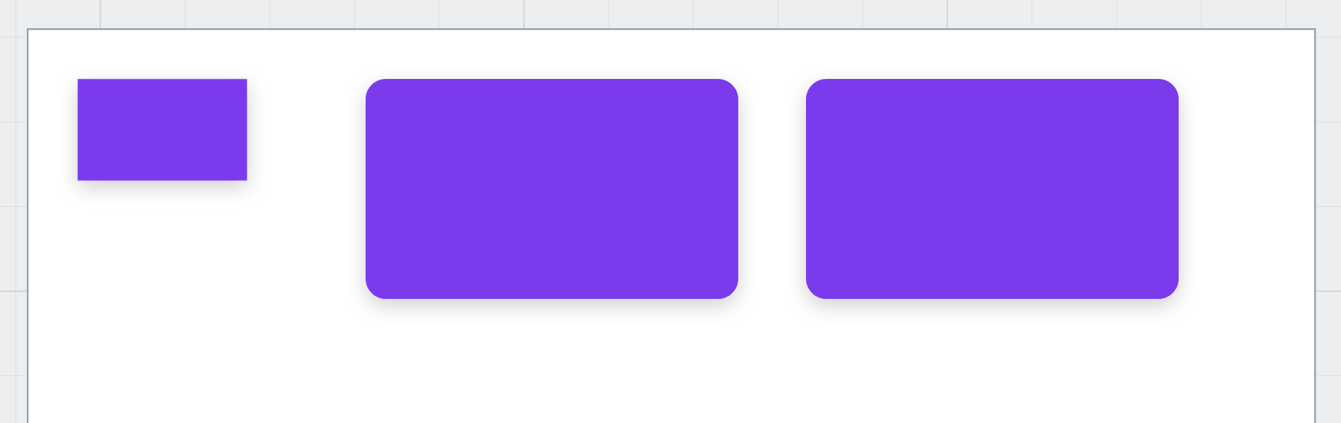
Then we selected Brand teal itself and changed its fill to violet. The banner now read 2 linked shapes, and both cards changed with it:
A style name with a slash in it, like Brand/Teal, is listed under a Brand heading. That keeps a
long list of styles readable.
Changing one by hand
Give a following shape a colour of its own and it stops following. We typed an orange into the second card's fill:
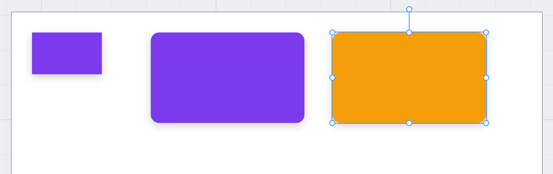
Its Fill dropdown went back to None. The next change to Brand teal reached the first card only. That's deliberate. A shape you changed on purpose shouldn't be changed back without you knowing.
Text styles
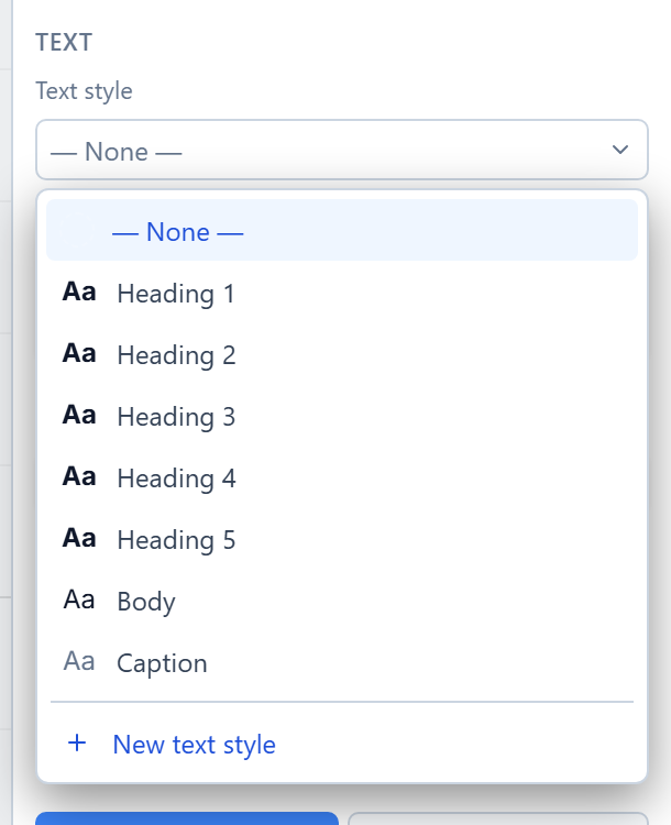
A text's style dropdown is in its Text section. We typed Quarterly report and opened it:
Heading 2 set the size, the weight and the colour in one go:
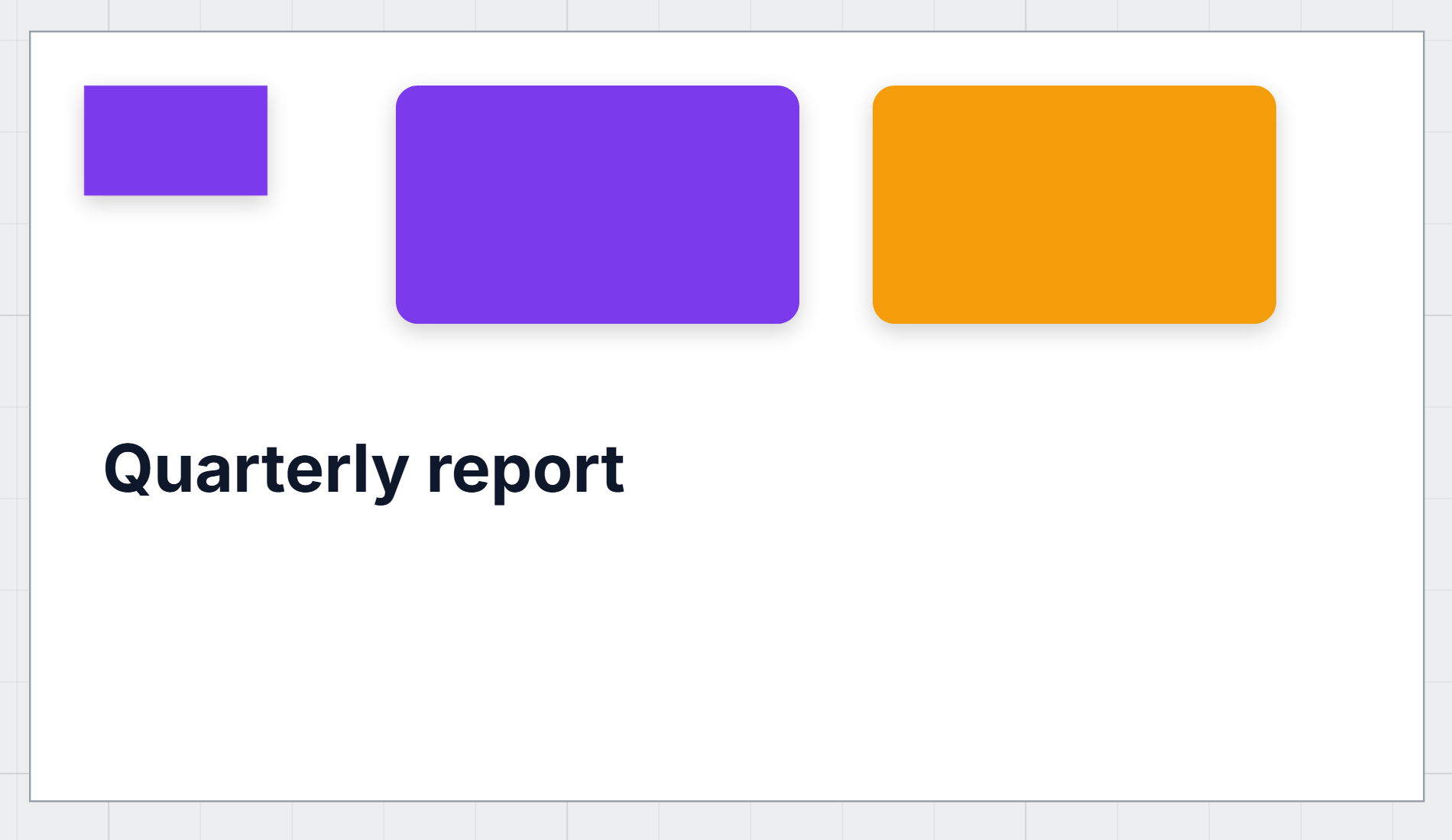
Change Heading 2 in the style guide and every heading that follows it changes too.
Tokens and dark mode
We pointed Brand teal at the Primary token, using the round swatches under its fill. The cards that follow it went blue. Then we pressed the moon in the toolbar to see the drawing in dark mode:
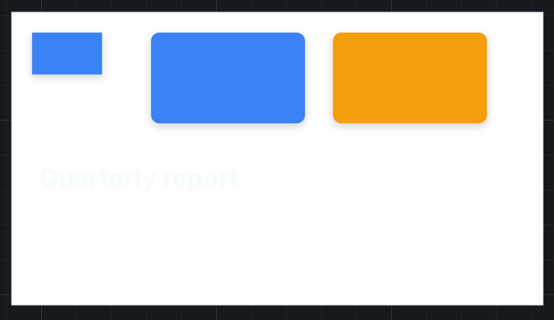
Our headline almost disappeared. Heading 2 is painted with the Text token, which turns light in dark mode, but our frame still had the fixed white it started with. Half the drawing followed the theme and half didn't.
We gave the frame the Surface token:
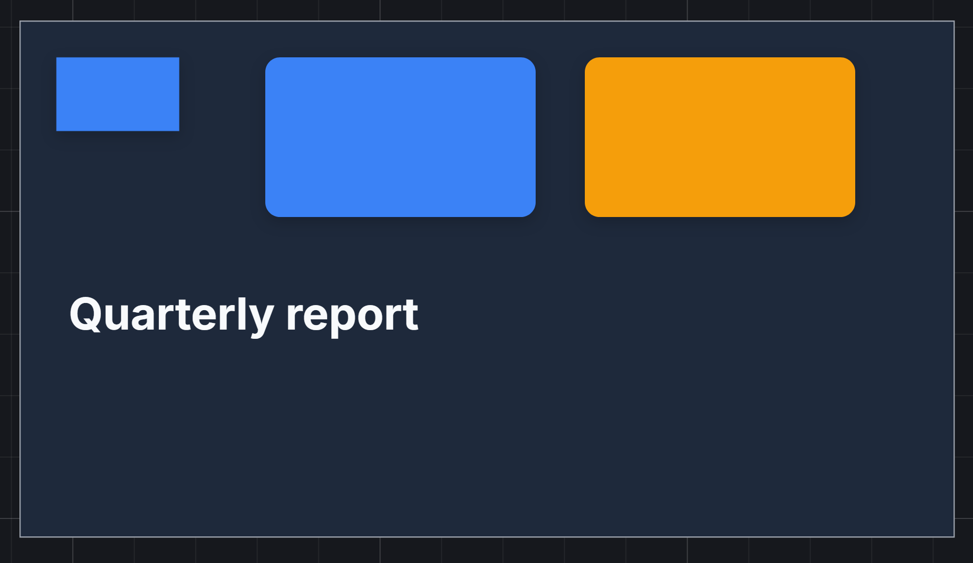
Now everything follows. That is the rule for anything a person will read: backgrounds, text and borders get tokens. Fixed colours are for things that should look the same in both modes, like a brand logo or a chart's series colours.
Primary also follows the tenant's chosen accent colour, so a screen drawn with it matches the rest of the product even after the accent changes.
What actually happens underneath
When a shape follows a style, the style's values are copied onto it, along with a link to the style. The drawing always holds real colours and sizes, so the screen it compiles to, an export, or the code panel never needs to look a style up. The link only decides what changes next time the style does.
What we fixed
Trying this, we found three things in the style dropdown and fixed them:
- It now works from the keyboard. It was drawn by hand rather than built on the platform's menu component, so Escape didn't close it, the arrow keys didn't move through it and focus never went into it. It's a proper menu now.
- Each token shows its own colour. Every token in the list showed the same blue dot, because a token is stored as a name rather than a colour and the dot didn't look it up. Error is red now and Success green.
- The banner fits. Unmark stretched across the banner and pushed Color style and the count into a squashed column. It's the width of its word now, and translated, where before it was English in every language.
Try it
Choose Insert → Default styles. Draw three rectangles, make one a colour style with Save as color, and choose it from the other two's Fill dropdown. Change the style's colour, then give one of the others a colour of its own and change the style again. Finally, point the style at Primary, press the moon, and give the frame the Surface token.
Next: components, drawn once and used everywhere.