Parsware Platform
Component states and parts
A component that looks different when pointed at, or in a state your screen decides, and an interface each copy is given: properties it shows and events it raises. Drawn, not coded, and nothing runs when the pointer moves.
Este artículo solo está disponible en inglés.
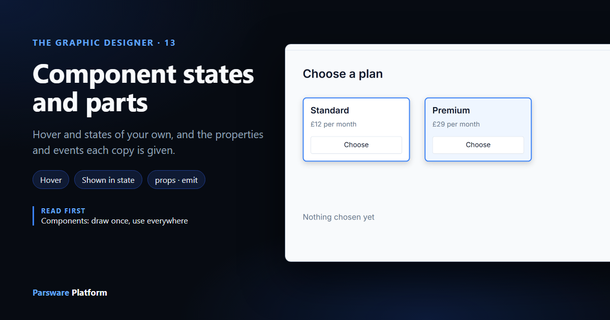
Components keep copies the same. This article is about how they differ. A component can have states, pictures of how it looks when pointed at or when your screen says so. It can also have an interface, the properties each copy is given and the events it tells the screen about.
It uses the Choose a plan sample (studio-component-parts): one plan card, placed twice, showing
two different plans.
The sample
Open Studio apps in the sample, select Choose a plan and press Design:
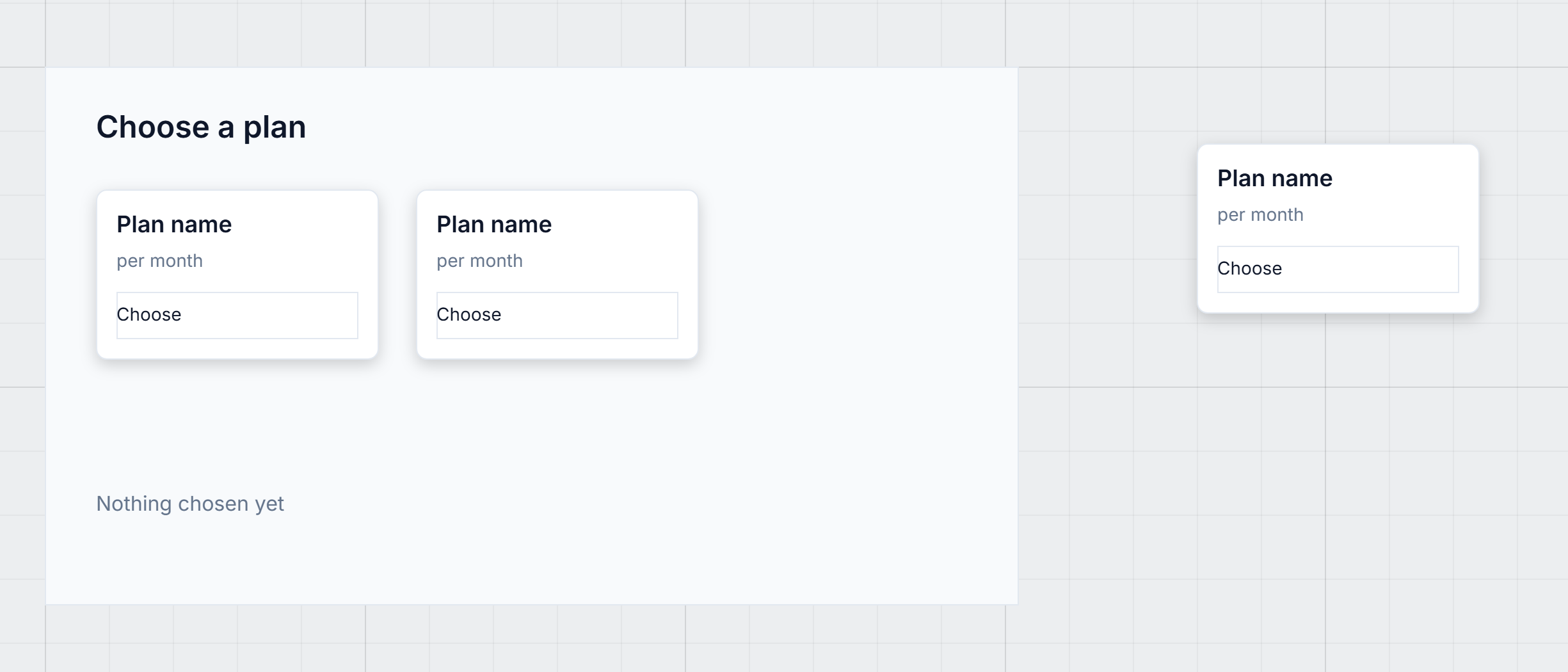
Both cards on the screen say Plan name. That's a placeholder. The words come from the screen when it runs, which is the second half of this article. First, how a component looks different.
States
Select the original, the card beside the screen. Its Component panel lists its states:
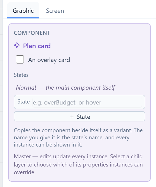
Normal is the original itself. There's nothing to draw for it. To add a state, type a name in the State box and press + State.
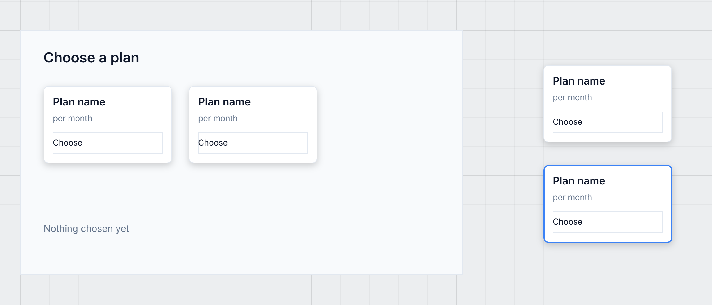
We typed hover. A copy of the card appeared directly under the original, called Plan card —
hover. That copy is the state: change its colours, and that's how the card looks in it. We gave
its border the Primary token and a width of 2:
Select the copy and its Screen tab shows what it is:
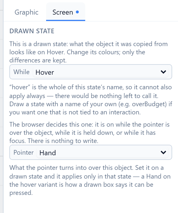
- While says when the state is on: Always, or while the card is pointed at (Hover), held
down (Pressed) or has the keyboard (Focused). A state named
hoveris the hover state, so it's already set. - Pointer is what the mouse pointer turns into. We chose Hand, so the card shows it can be pressed before anyone clicks it.
The browser does all of this by itself. Nothing in your screen runs when the pointer moves, so a screen with fifty hover states costs nothing.
A few rules keep states simple:
- Only the differences count. We changed the border, so that is what the hover state means. Resize the original later and the state follows.
- Moving the copy doesn't matter. Where it sits on the canvas isn't part of the state.
- The copy must have the same parts. Add or remove a shape in it and Save names the problem. To show something extra in a state, draw it in the original, hide it there, and show it in the copy.
A state of your own
The interactions are fixed: hover, pressed and focused are the browser's. Every other state is
named by you, after what your screen actually has: invalid, overBudget, awaitingApproval.
We added featured, gave its card a pale blue fill and the same border, then selected the
right-hand card on the screen and set Shown in state to featured:
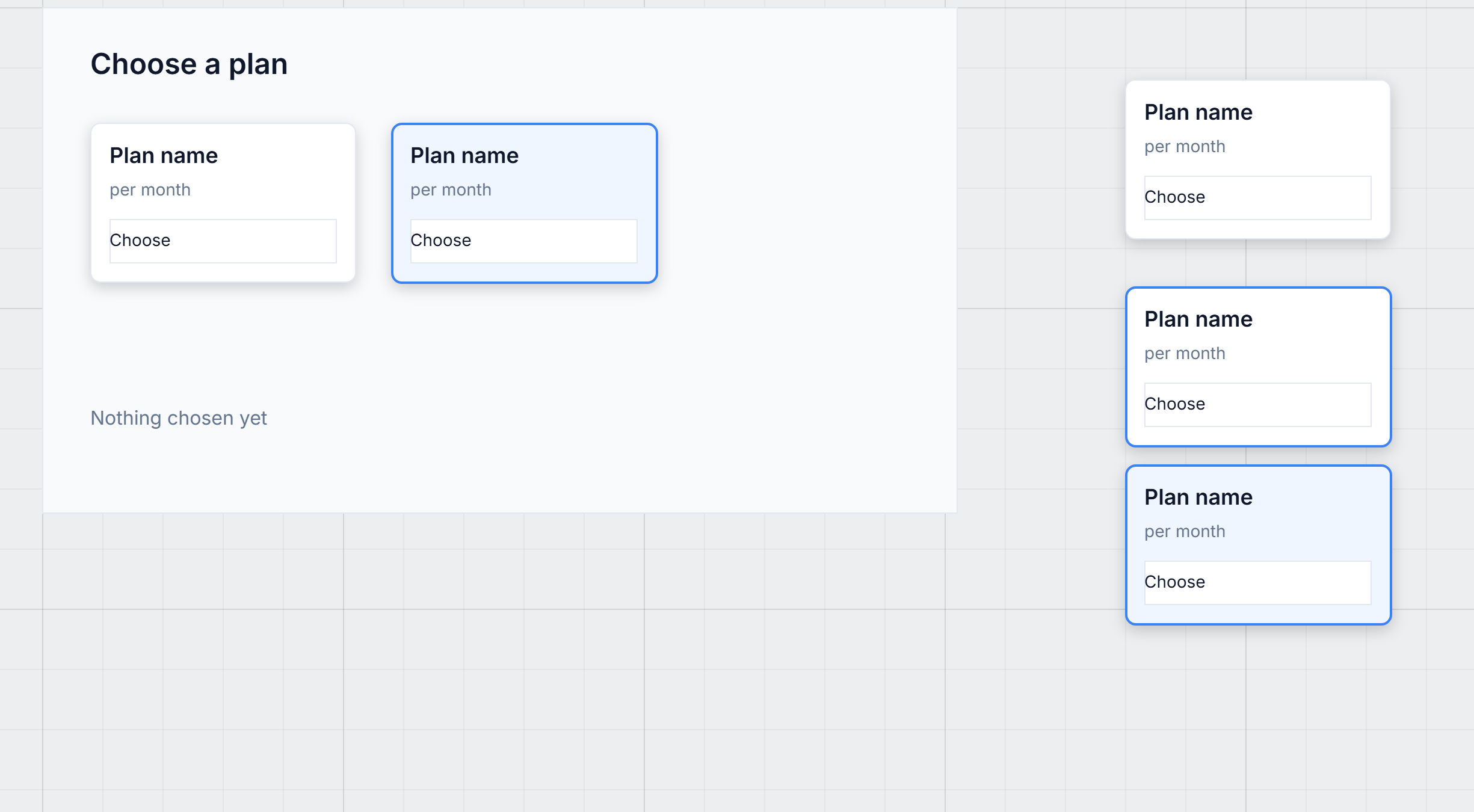
Shown in state pins one copy to a state while you lay out the screen. When the screen runs, one line of code changes it from a handler, such as a button's click:
setVisualState("featured");
setVisualState("") puts it back to Normal. One name is special: a state called disabled comes on
by itself whenever the control is disabled, with nothing to write.
The parts each copy is given
Now the words. Select the original and open its Screen tab. Under Component interface it declares what every copy can be given and what it can say:
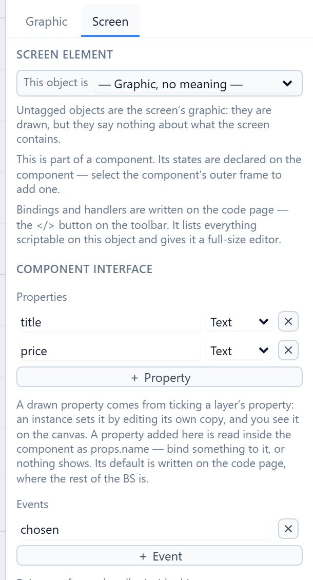
- Properties are values a copy is given. Inside the card, the title's text is bound to
props.titleand the price toprops.price. - Events are things the card tells its screen. The card's button runs
emit("chosen", props.title). It says what happened, not what to do about it.
Select the right-hand card on the screen and its Screen tab shows this copy's side:
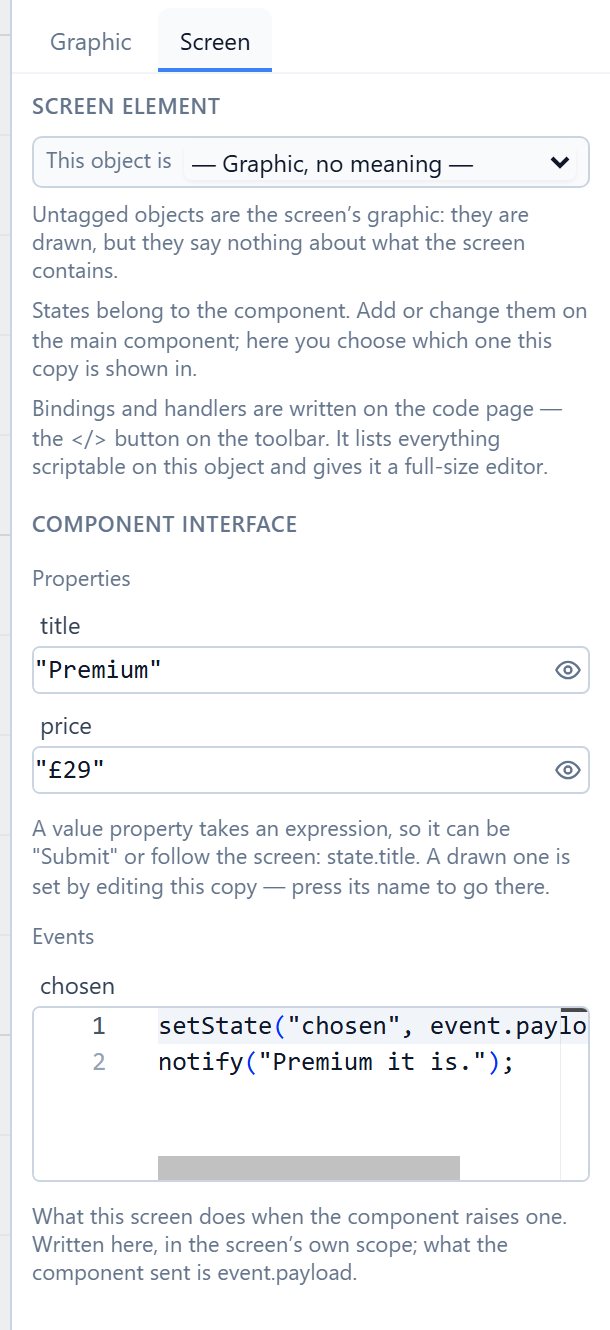
This card is given "Premium" and "£29". Its answer to chosen records the choice and also shows
a message. The left card is given "Standard" and "£12" and only records the choice. It's the same
component and the same event, with a different answer on each copy.
A property can be any expression, so it can follow the screen as well as being typed in:
state.chosenPlan, for example.
There are two kinds of property. The ones in the last article,
ticked under Expose on instances, are set by editing the copy on the canvas. The ones here are
values the screen passes in, and only these can be read with props. in an expression.
Trying it
We pressed Preview, without saving, and pointed at the Standard card:
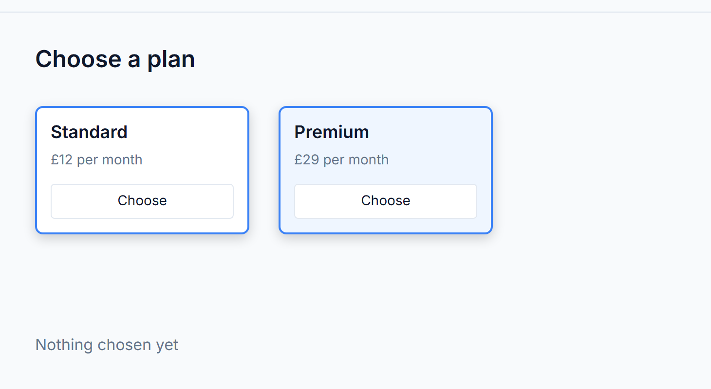
Standard wears its hover border. Premium is pinned to featured. Both show the plan they were given. Then we pressed Choose on Premium:
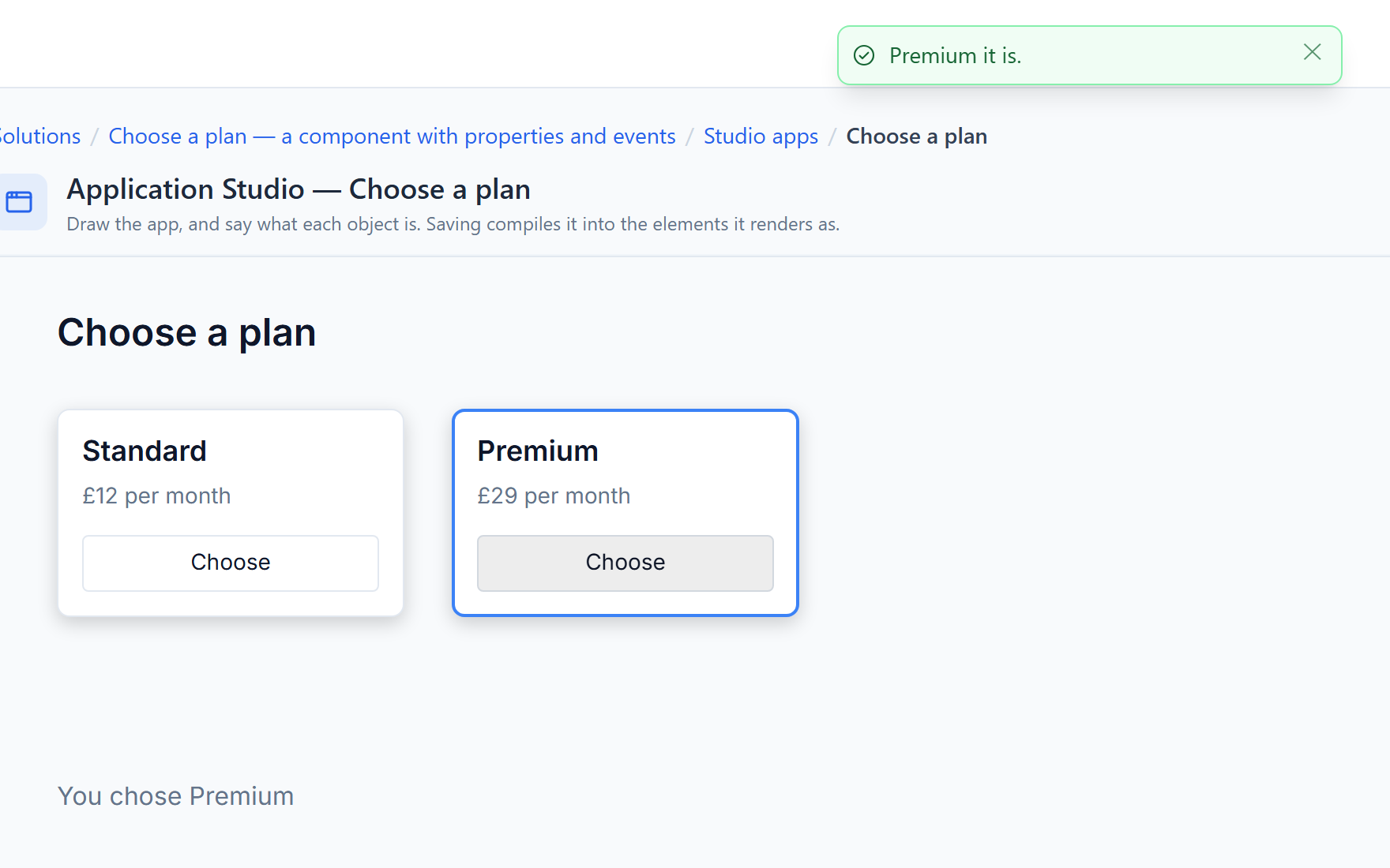
The card raised chosen and the screen answered: the line underneath changed, and Premium's own handler showed its message.
Try it
Import Choose a plan and open it in the designer. Select the original card, add a hover state,
and give its copy a coloured border and a Hand pointer. Add a state of your own, pin one card to
it with Shown in state, and press Preview. Then change one card's title property and
preview again.
Next: a component library, shared across designs.