Parsware Platform
Resize constraints
How a shape behaves when its frame changes size: pinned to an edge, stretched between two, kept in the middle, or scaled with the frame. Set once, it holds on the canvas and on every screen size the app runs on. Trying it, we found the ten choices were English in every language, and fixed that.
Dieser Artikel ist nur auf Englisch verfügbar.
A screen is drawn once and shown on a phone, a tablet and a wide monitor. Every time its frame changes size, each thing inside it has to decide where to go. Constraints are how you tell it: stay against this edge, stretch between those two, keep to the middle, or grow with the frame.
Frames and screen sizes showed constraints in passing. This article goes through all of them, and the one mistake everybody makes once.
We worked on an empty part of the Starter app sample's canvas, without saving.
The Constraints section
Select anything inside a frame and Properties has a Constraints section, with one choice across and one down:
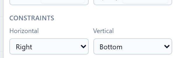
| Horizontal | Vertical | When the frame changes size, the shape… |
|---|---|---|
| Left | Top | keeps its distance from that edge, and its size. This is the default. |
| Right | Bottom | keeps its distance from the other edge, and its size. |
| Left & right | Top & bottom | keeps its distance from both edges, so it stretches. |
| Center | Center | keeps its distance from the middle, and its size. |
| Scale | Scale | moves and grows in proportion, as a share of the frame. |
The two directions are separate. A button that sits in the bottom-right corner is Right and Bottom. A header is Left & right and Top.
A dialog
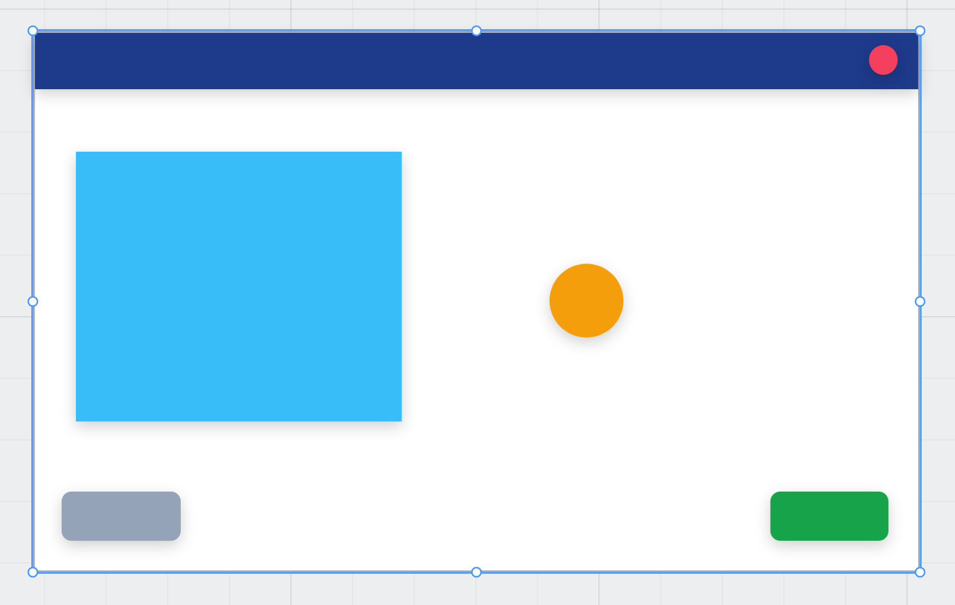
We drew a 480 by 320 frame called Dialog and set each part as we drew it:
- a dark Title bar across the top: Left & right, Top;
- a red Close dot in its corner: Right, Top;
- a blue Picture: Scale, Scale;
- an orange Badge: Center, Center;
- a green OK button: Right, Bottom;
- and a grey Note in the bottom left, which we forgot about.
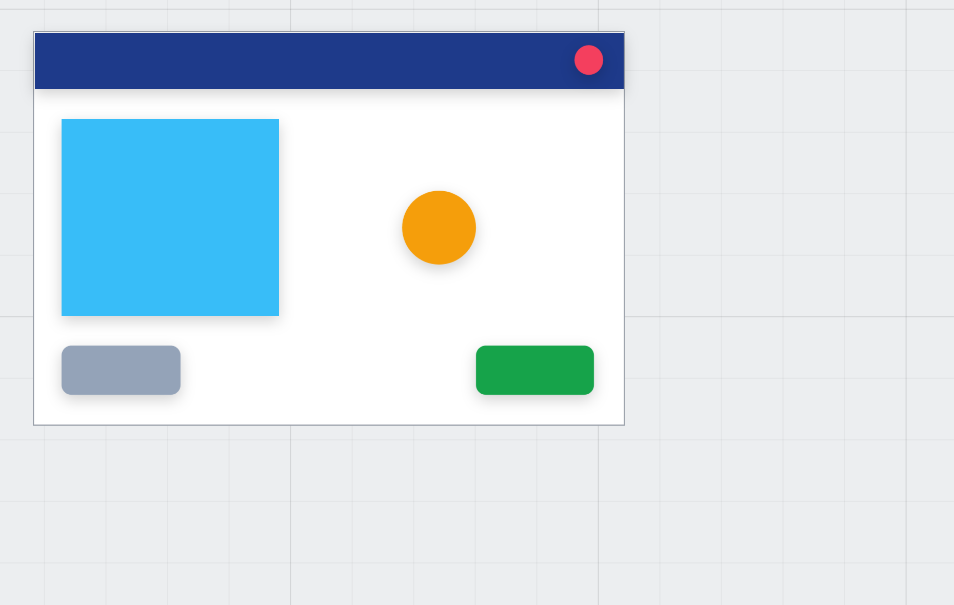
Then we selected the frame and typed a new size, 720 by 440:
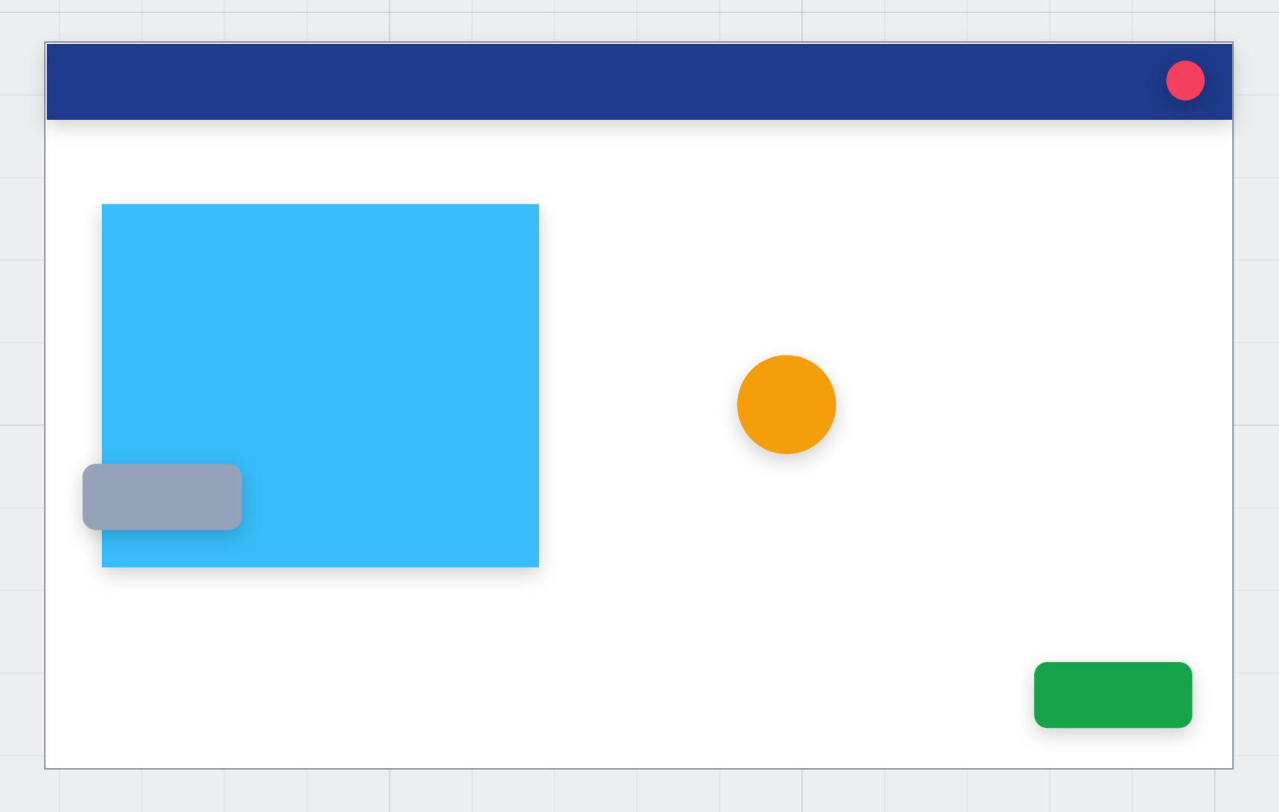
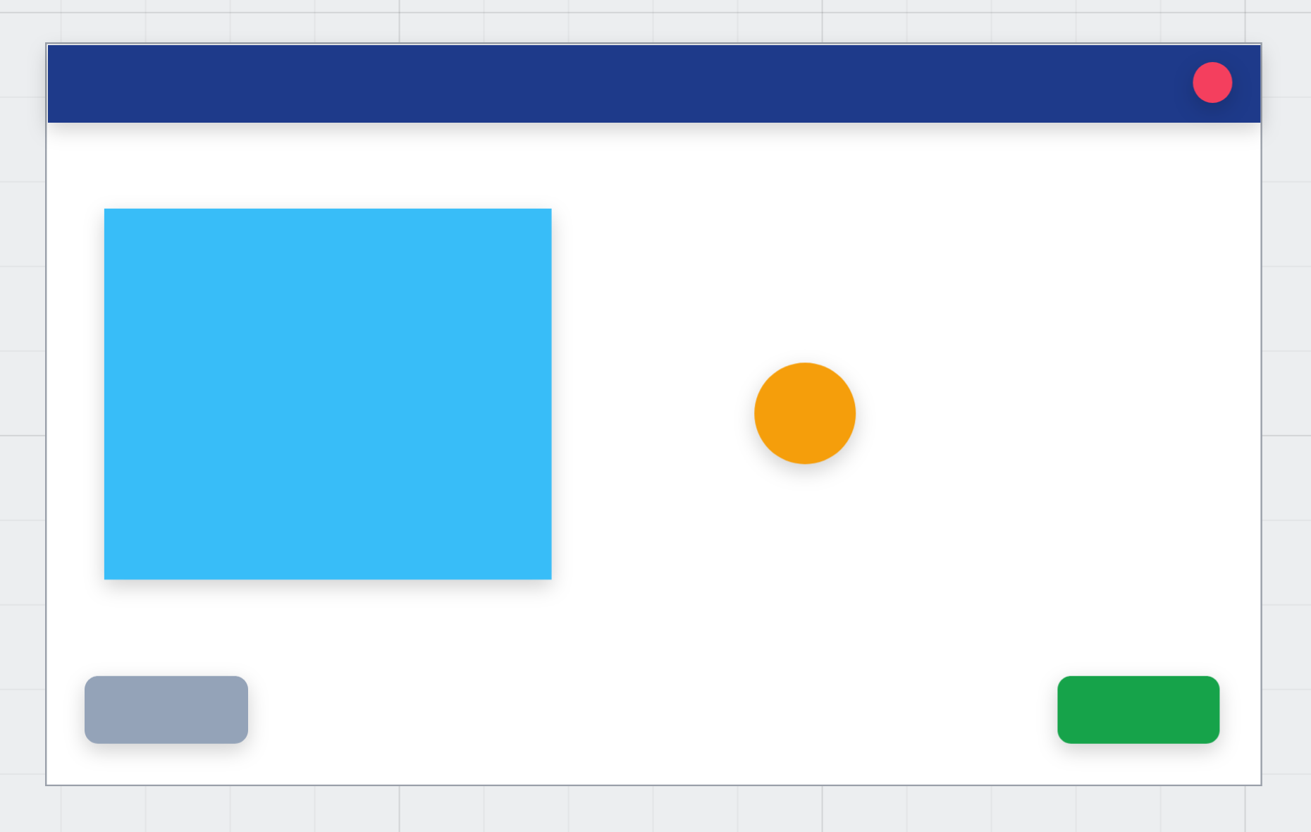
Five parts did what we asked. The title bar stretched and the close dot stayed in its corner. The picture grew by the same share as the frame, the badge stayed in the middle, and the OK button stayed in the bottom-right corner.
The note didn't move. It was still Left and Top, the default for anything you draw, so it kept its distance from the top while the picture grew down over it.
Fixing the note
We pressed Ctrl+Z twice to put the dialog back, selected the note and set its vertical constraint to Bottom:
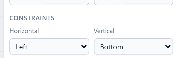
The order matters. Bottom keeps the distance from the bottom that the shape has now. Set it after the resize and the note stays where it got stuck.
This time we dragged the frame's corner instead of typing. The parts follow the drag as it happens:
The rules worth remembering
- Give every shape its constraints as you draw it. The default is right for things in the top left and wrong for everything else, and you don't see that until the screen changes size.
- A frame inside a frame passes it on. Its own children follow their constraints inside it, so a footer pinned to the bottom can hold a button pinned to the right.
- A group moves as one. Constraints set on the group decide its new box, and the shapes inside are scaled into it.
- Inside an auto layout there are no constraints. The layout decides where things go, and the Resizing section takes their place. See Auto layout.
- The running screen does the same. Constraints become the browser's own positioning, so a screen you checked by resizing the frame behaves the same way when the window changes.
New: the choices are in your language. The ten options in the two dropdowns were English words in every language the designer ships. A Persian maker read Left & right in an otherwise Persian panel. They're translated now, in all seven languages.
Try it
Draw a frame and put four rectangles in it: one across the top, one in the bottom-right corner, one in the middle and one on the left. Give them Left & right, Right and Bottom, Center and Center, and Top & bottom. Drag the frame's corner and watch each one follow its own rule.
Next: shared styles and design tokens.