Parsware Platform
Fills, gradients and icons
Solid colours, design tokens that follow light and dark mode, linear and radial gradients, and icons from the platform's library. Trying them, we found every icon drawn as a solid blob on the canvas, and fixed it.
Dieser Artikel ist nur auf Englisch verfügbar.
Colour is most of what makes a drawing look like a product. This article covers what can go inside a shape: a solid colour, a design token, a linear or radial gradient, and how to put one of the platform's icons on a screen.
We worked in a 760 by 420 frame on an empty part of the Starter app sample's canvas, without saving.
The Fill section
Select a shape and Properties has a Fill section. Text has the same section, called Color.
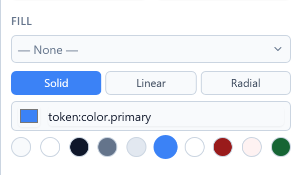
- The dropdown at the top applies a saved colour style. Shared styles have their own article.
- Solid, Linear and Radial choose the kind of fill.
- For a solid fill, click the square to pick a colour, or type it, such as
#f97316. - The round swatches underneath are the design tokens.
Colours and tokens
We gave one rectangle an orange we typed in, and the other the Primary token:
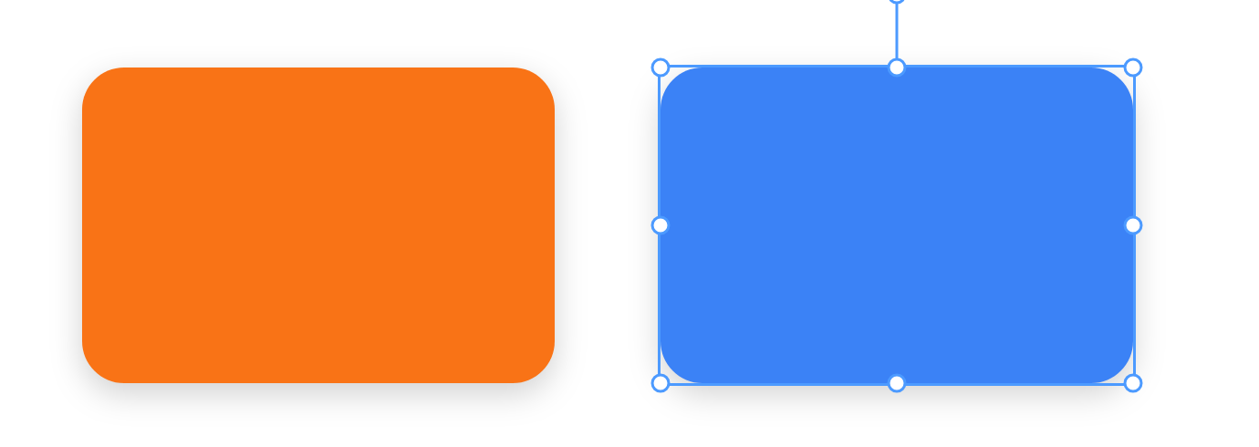
They look the same kind of thing, but they aren't. The orange is a colour, and it's orange everywhere. A token names a job rather than a colour: Primary, Surface, Text, Border. What it looks like depends on where the screen is shown:
- in light or dark mode, the token switches with the reader's choice. A Surface card is white in one and dark grey in the other;
- if the colours change, everything using the token changes with them.
There are ten: Background, Surface, Text, Secondary text, Border, Primary, On primary, Error, On error and Success. Hover a swatch for its name. Click the chosen one again to turn it back into an ordinary colour.
Use a token for anything that should follow the theme, like backgrounds, body text and borders. Use a colour for things that should stay put, like the orange in a logo. The moon button in the toolbar switches the canvas between light and dark, so you can check both.
Gradients
Press Linear and the fill becomes a gradient from one colour to another, with a preview bar, an Angle and a list of stops:
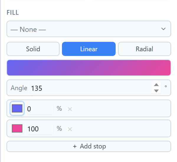
Each stop is a colour and how far along the gradient it sits, from 0% to 100%. Add stop adds another, and × removes one. A gradient needs at least two. The angle is the direction it runs: 0° goes up, 90° goes right, and 135° runs from the top left to the bottom right:
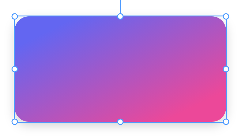
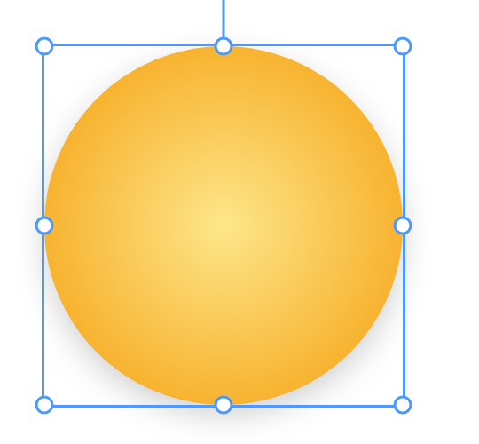
Radial runs from the centre outwards. A pale yellow centre and a deeper amber edge make a circle look lit:
Gradient stops are colours, not tokens. A gradient looks the same in light and dark mode.
Icons
Components → Icon… opens the platform's icon picker, the same one used everywhere else in Parsware, with the whole Lucide set. Type to search:
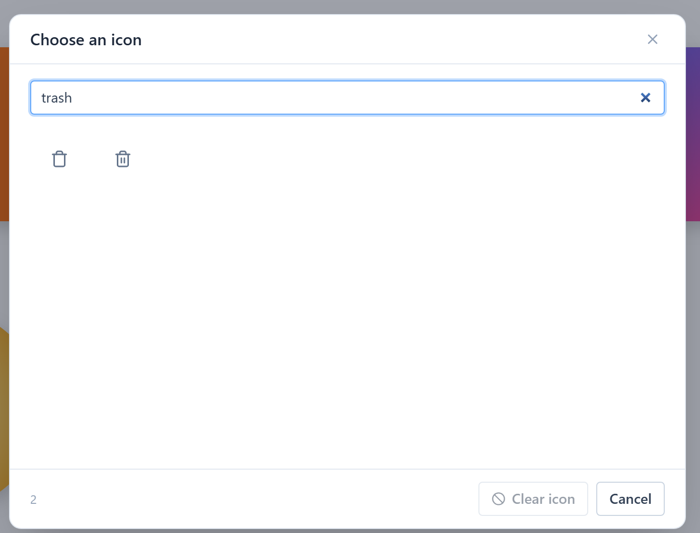
The search matches icon names and the other names an icon has had. Trash finds the bins. A word for what an icon means, such as bin or delete, may not, so try a few names.
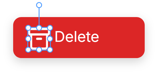
Pick one and it lands on the canvas, 24 by 24. We drew a red button with the word Delete, placed the bin in it and gave its outline a white colour:
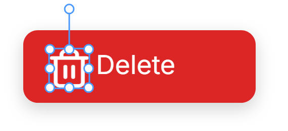
An icon is an ordinary shape once it's on the canvas: a path drawn with an outline and no fill. Its colour is in the Stroke section. It arrives in the Text token, so it follows light and dark mode. Resize it, move it, give it a state for hover: nothing about it is special.
Changing the icon
Picked the wrong one? Select it and Properties has an Icon field above Style:
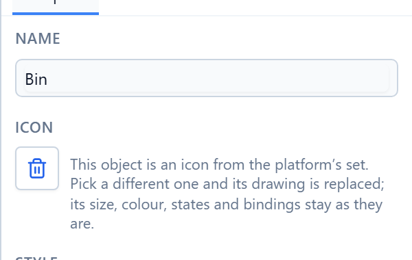
Click it and choose another. Only the drawing changes. The size, colour, position, states and bindings stay as they were. We swapped the bin for an archive box:
A shape you drew yourself with the pen has no Icon field, because there's no icon name behind it to swap.
A button with only an icon in it will warn when you save, because a screen reader has nothing to read out. Keep a word beside the icon, as here.
New: icons are line drawings on the canvas too. Every icon from the picker used to draw as a solid blob on the canvas. The bin was a dark slab with two slits in it. Its fill is none, and the canvas was treating none as a colour it didn't know, and so kept the last colour it had used. The running screen always drew the outline. The canvas does now too, and so does a PNG exported from it.
Try it
Draw two rectangles. Give one a colour you type and the other the Primary token, then switch the canvas to dark mode with the moon button and compare. Give a third a Linear gradient at 135°. Then use Components → Icon… to put a bin in a button, and change it to another icon from its Icon field.
Next: auto layout.